Tabish Khan the @LondonArtCritic loves art and visits hundreds of exhibitions a year. But every now and then he comes across something in the art world that doesn’t meet his approval.
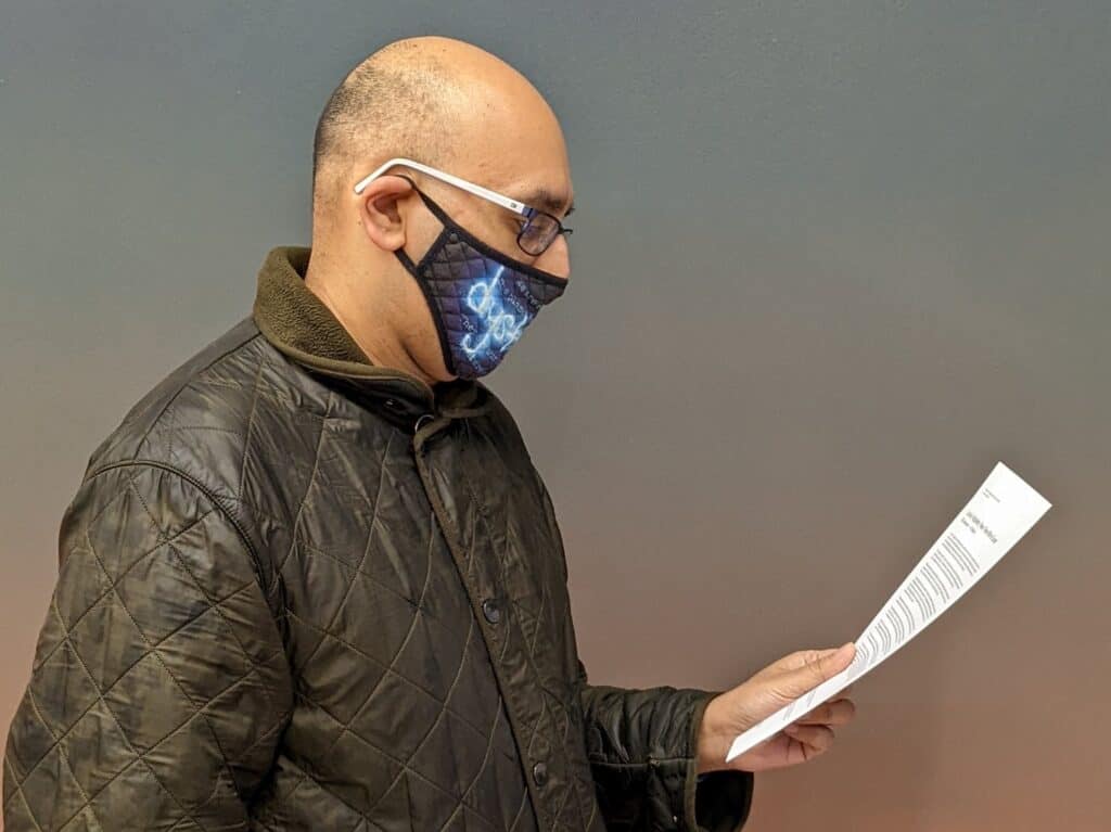
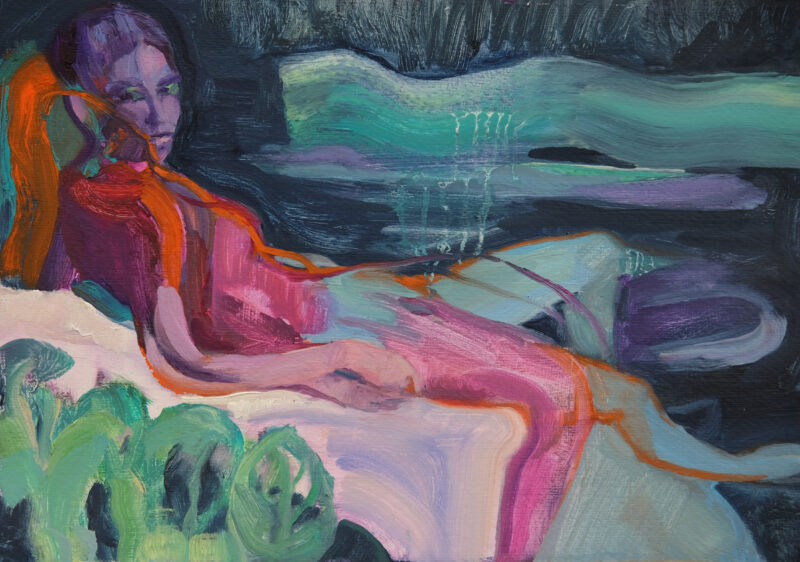
I’m walking around the exhibition of highly regarded young artist Harrison Pearce’s show at Carl Kostyal gallery in Mayfair and I’m intrigued by the paintings so I grab the press release.
After spending a minute making sure this is indeed the press release for this show — it’s not entirely clear at first — I navigate through the dense language and then come across the phrase ‘Cogito, ergo sum’. Having not studied Classics at Oxford, I whip out my phone to Google the phrase and find out its Latin for the well known philosophical quote ‘I think, therefore I am’. I’m baffled as to why the English translation couldn’t have been used given most will be familiar with it — it’s almost as if the press release is trying to make the reader feel dumb and ensure most people are made to feel as if art isn’t for them.
Now it would be unfair to solely target one specific press release and gallery because on the whole the quality can be so sketchy in galleries that there are running jokes between art professionals about the newest intern writing the press release and others suggesting nobody should read them. One of my former editors wanted me to direct him to art jargon filled press releases and I sent him to the Sadie Coles website — he wasn’t disappointed.
It’s only a problem for smaller commercial galleries as the press releases for big museums shows that are presented to journalists are usually of a high quality; straightforward and readable — often with bullet points, and I love bullet points. Press release is arguably a misnomer when it comes to smaller galleries as they are seldom used to pitch to press and largely treated as a guide for any visitors — and exhibition text would be a more accurate description for what they are.
Defenders of these academically dense documents may argue that it’s not for the general public but the arts professionals such as curators and critics to use and reference. Though when arts professionals visit they seldom come unannounced, though I like to, and will therefore often have a personal tour of an exhibition negating the need for a piece of paper to read. On many an occasion I’ve decided to not cover an exhibition because I’ve turned up unannounced, wanted to know more about the art, grabbed the text and was put right off.
So the main consumer of the text is the casual visitor to the exhibition who will likely be left perplexed by what they’ve read and made to feel rather dumb — given that’s often how I feel and I’ve been reading press releases for a decade. It’s another hurdle to making art accessible, and regular readers will know I hate anything that makes art inaccessible. The irony being if you speak to most gallerists they will tell you they want everyone to feel welcome in their space, not realising their press release / exhibition text is doing the opposite.
When done right the text can make the works come alive by providing additional context to the works, something that’s often needed for conceptual works. Or it can be a creative outlet as with Louis Appleby’s show at Castor where it creatives a fictional narrative to accompany the works.
I’m hopeful that any gallery professional reading this will commit to writing press releases in plain English and taking the time to ensure it is something anyone can digest — including those visitors who haven’t studied art history and those who want to know more about the art they’re looking at without needing a thesaurus or a degree in Classics.
For more in this series, see my thoughts on experience as art, commercial as a dirty word, new galleries opening in London, video art at home, the Hockney roundel, art finds a way, art being free, Online exhibitions, Turner Prize 2019, artist’s request for feedback, the reaction to the shredded Banksy, #FriezeWeek, Blockchain hype, Finding art, Private views, Art itself, Appointment only exhibitions, Artificial Intelligence replacing artists, Everyone’s a Critic, Photo London, The Turner Prize, Art for art’s sake, Conceptual art is complicated, Condo, How performance art is presented in museums, Frieze week floozies, too much respect for an artist’s legacy, opinions not being welcome, an exhibition across three countries, tackling race and gender in art, artist-curators, art fair hype, top 5s and top 10s, our political art is terrible, gap left by Brian Sewell, how art never learned from the Simpsons, why artspeak won’t die, so-called reviews, bad reviews are bad for business, the $179m dollar headline, art fairs appealing to the masses, false opening hours, size matters and what’s wrong with video art.
