Tabish Khan loves art and visits hundreds of exhibitions a year. But every now and then he comes across something in the art world that doesn’t meet his approval.
You may have heard the expression ‘the art speaks for itself’, when you enter an exhibition and there’s scant or no information about the artworks or the context behind the works. Or when you ask about the work you may be told using one of my most hated en vogue artspeak terms that the artist doesn’t intend for the work to be so didactic – i.e. the artist wants you to draw your own conclusion, not be led by what the artist was thinking when creating the work. Often this can leave the average gallery visitor scratching their heads as to what they’re looking at.
Now there’s nothing wrong with this approach when the art does speak for itself. For example you don’t need reams of wall text to understand the political satire of Banksy or be astounded by the majesty of a Baroque or Renaissance masterpiece. Labels and press releases can be helpful in either giving us more background on an artist and / or so we can understand why the artist created the work, but they aren’t always necessary.
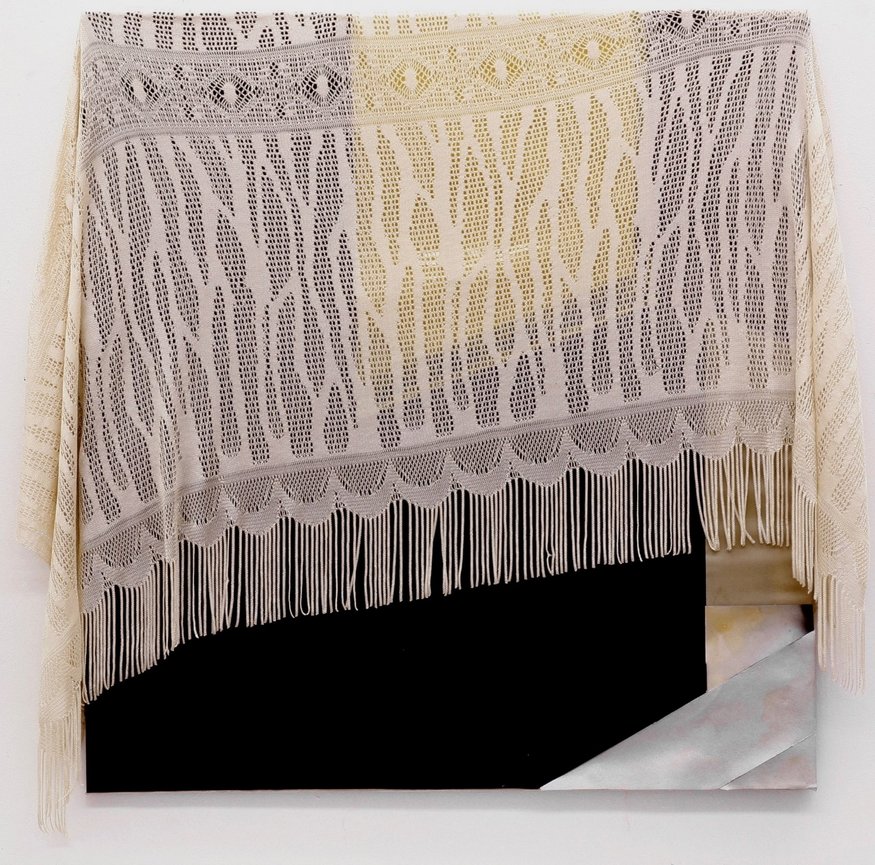
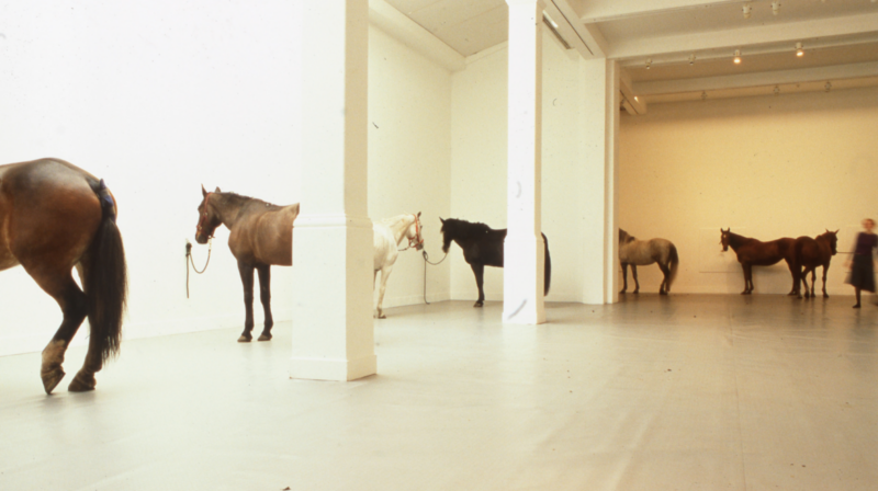
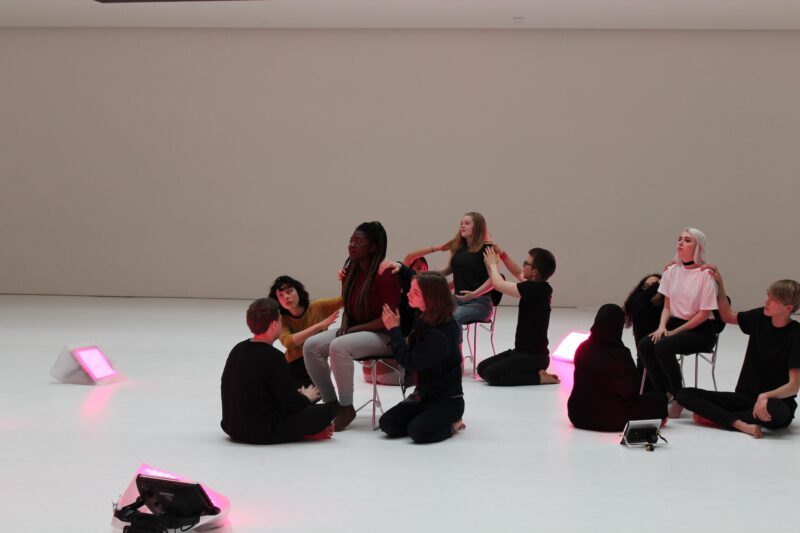
However, sometimes they are essential when without context it’s impossible to really understand and appreciate the work. Case in point with the Kai Althoff exhibition at Whitechapel Gallery where I wandered round for 15 minutes largely clueless as to what I was seeing – why has he chosen this style and subject to the painting, and what is the installation above my head about. As far as the paintings are concerned I instantly forgot almost all of them on exiting the building. Honestly wasps stuck in shop windows have probably looked less confused than I was when aimlessly exploring the show.
Now the works did have some merit and there were paintings that I’d like to know more about, but there was nothing forthcoming. When I asked about it I found out that it was the artist’s request to keep it this way suggesting it’s the artist who wants to keep everyone in the dark. Often it is curators who have insisted on this approach in past exhibitions I’ve seen, citing some semblance of a ‘purist’ stance. If you go to an exhibition and feel like you should have read up about it extensively before visiting, then in my mind that exhibition has failed.
While this type of exhibition is frustrating for me, the effect it has is even worse for the general public who come to an exhibition with no foreknowledge of who Kai Althoff is and the art he creates. Visitors will struggle to engage and this barrier to engagement is the last thing we need when the percentage of people who see art is already limited and art is under pressure to prove it is essential in these difficult economic times.
In my opinion this is where curators need to step in and over-rule the artist. Though I understand curators can be in a tough position if the artist insists on a particular approach and has greater weight with the gallery.
When I first started writing these types of confusing elitist exhibitions were few and far between, and over the years they have become extremely rare — anyone remember the ghastly Conceptual Art in Britain at Tate Britain? Occasionally there’s a perplexing show in a commercial gallery, though I’m a little less forgiving of those as it’s the buyers who are the primary audience, the public comes second. But at public institutions like Tate and Whitechapel Gallery such approaches should be consigned to an elitist past that has no place in contemporary art.
For more in this series, see my thoughts on Online exhibitions, Turner Prize 2019. artist requests for feedback, reaction to the shredded Banksy, #FriezeWeek, Blockchain hype, Finding art, Private views, Art itself, Appointment only exhibitions, Artificial Intelligence replacing artists, Everyone’s a Critic, Photo London, The Turner Prize, Art for art’s sake, Conceptual art is complicated, Condo, How performance art is presented in museums, Frieze week floozies, too much respect for an artist’s legacy, opinions not being welcome, an exhibition across three countries, tackling race and gender in art, artist-curators, art fair hype, top 5s and top 10s, our political art is terrible, gap left by Brian Sewell, how art never learned from the Simpsons, why artspeak won’t die, so-called reviews, bad reviews are bad for business, the $179m dollar headline, art fairs appealing to the masses, false opening hours, size matters and what’s wrong with video art.
Image copyright Kai Althoff – Kai Althoff. Untitled, 2005. Fabric, enamel, spray and oil paint, plastic, adhesive foil. 95.3 x 86.4 cm


