De La Warr Pavilion, Marina Bexhill On Sea East Sussex TN40 1DP 24th Jan – 10th May www.dlwp.com
Ladybird, ladybird, fly away home, your house is on fire and your children all gone;
All except one and that’s little Ann and she has crept under the warming pan!
Nostalgia – a sentimental yearning for the happiness of a former place or time; seen through those quintessential “rose tinted” glasses.
Well if you are a child of the 60s or 70s you can expect to be hit by a massive nostalgia bomb when you enter this exhibition!
And my top tip – make sure you pay for at least 2 hours parking as you will need to visit “nude”, the exhibition on the first floor and the café, to rebalance your equilibrium. I had to “phone a friend” to bring more change!
For me this exhibition was bitter sweet; memories of my early school days came flooding back, but as an antithesis to this, I had a slightly nauseous sensation, as I was forced to revisit the sickly sweet stereotypes we were ritually force fed daily; of the innocence of Peter and Jane at play; of Mum the housewife and Dad the breadwinner.
So children where should we begin!
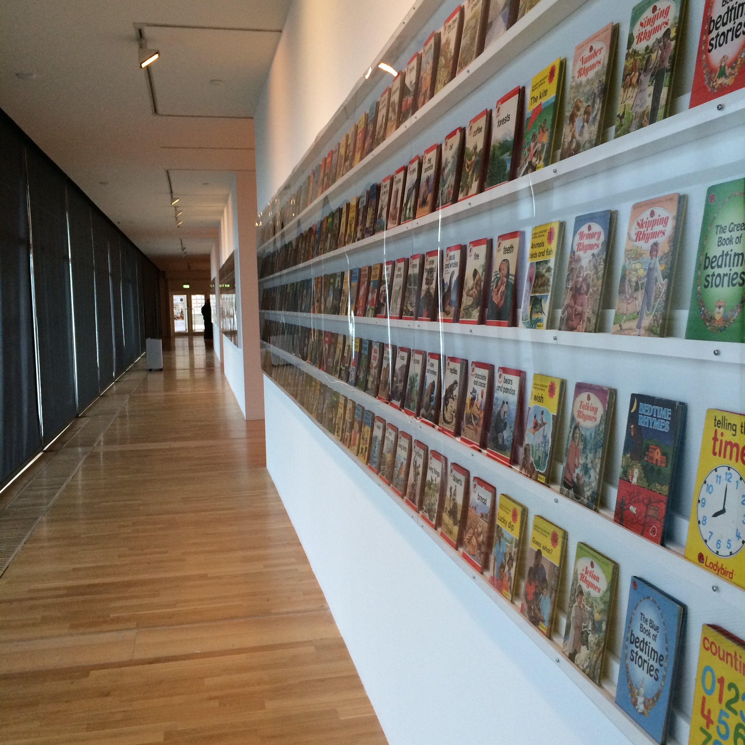
Probably best to start at the beginning, with a brief history of Ladybird; The Company traces its origins back to 1867, when Henry Wills opened a bookshop in Loughborough, Leicestershire. Within a decade he progressed to printing and publishing guidebooks and street directories. He was joined by William Hepworth in 1904, and the company traded as Wills & Hepworth.
In the 1960s and 1970s the company’s Key Words Reading Scheme (launched in 1964) was heavily used by British primary schools, using a reduced vocabulary to help children learn to read. Wills & Hepworth began trading as Ladybird Books in 1971 as a direct result of the brand recognition that their imprint had achieved.
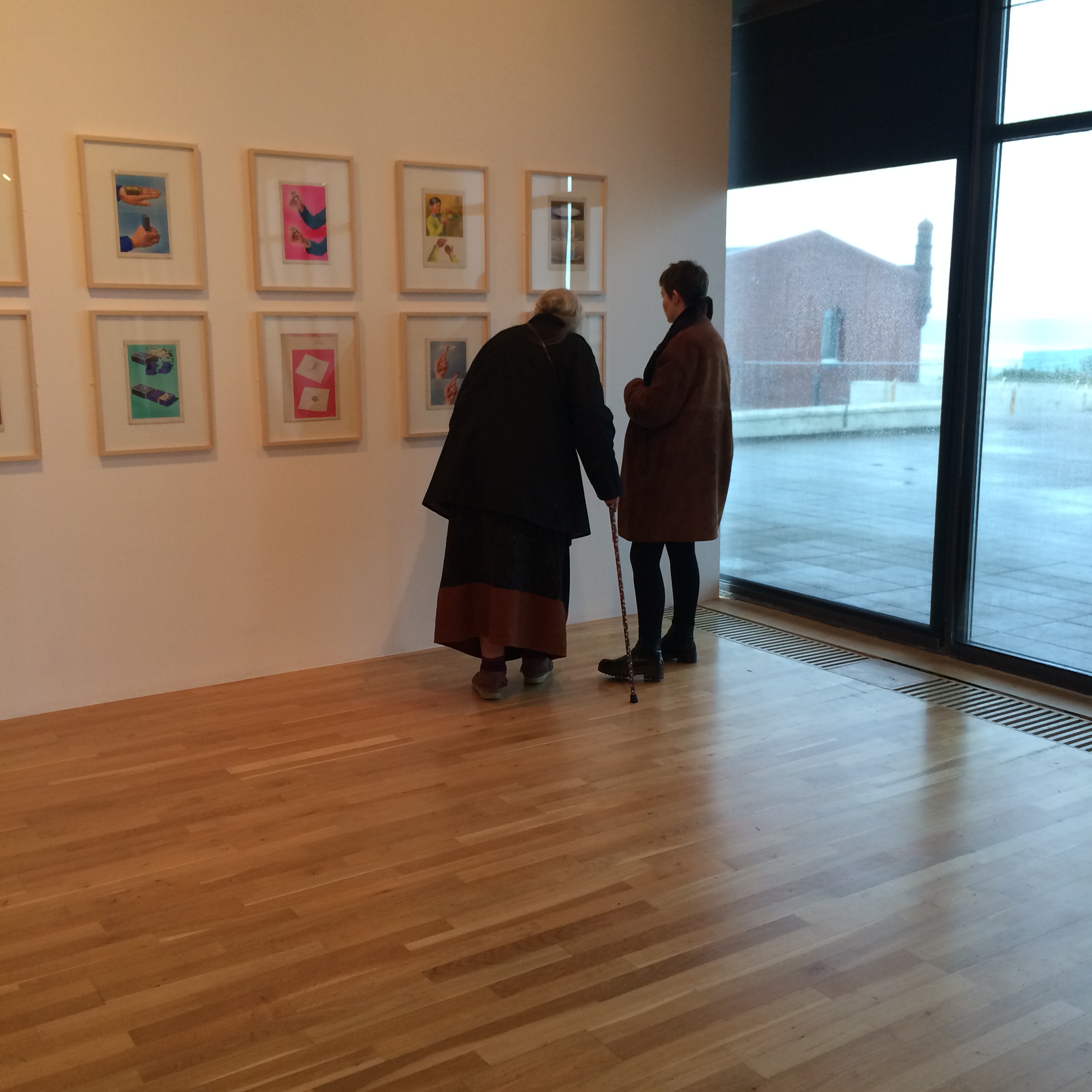
Many of the illustrations in the Key Words series were by Harry Wingfield and Martin Aitchison and the originals of these are on display in this exhibition, together with the illustrations of Eric Winter for the Well-Loved Tales series, Frank Humphris’ Historical Figures, John Berry’s People at Work and Robert Ayton’s Tricks and Magic.
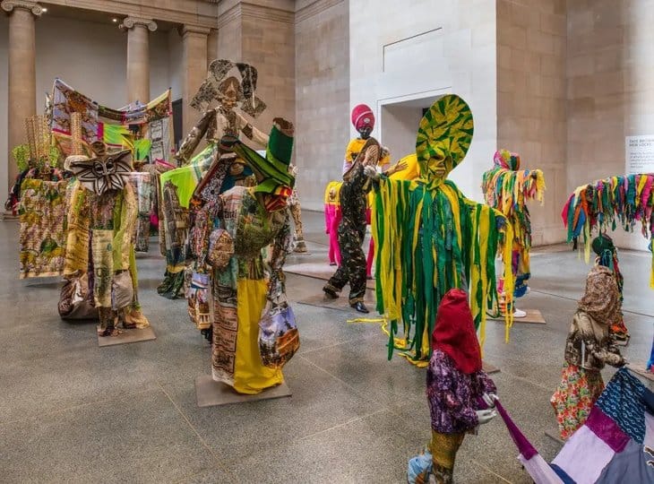
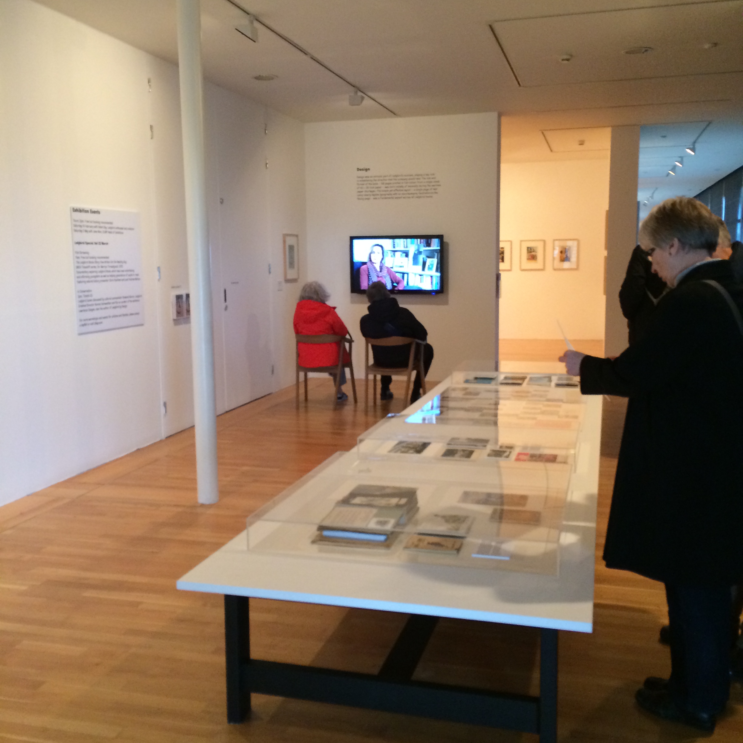
The exhibition is beautifully presented and the visitors I encountered were all clearly loving it – It was certainly the noisiest exhibition I have ever been to, with mums and daughters, grandparents, partners, friends, all sharing a mutual emotional bond; engaging with the show and each other.
This was both refreshing and reassuring, especially bearing in mind it is the 70th anniversary of the liberation of Auschwitz this week. It is critically important that we keep the memories of our collective history – good and bad – alive and real, for the good of future generations.
As Auschwitz survivor Roman Kent said on Tuesday at the Auschwitz anniversary ceremony: “We survivors do not want our past to be our children’s future.”
We have seen a profound cultural, economic, social and technological metamorphosis over the last 70 years. This exhibition exemplifies these changes – with or without those rose tinted glasses!