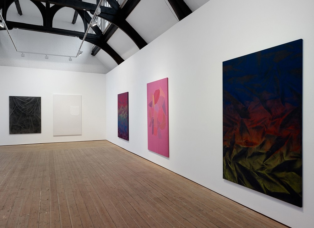
 Hannah Knox: BUFF, installation view at Ceri Hand Gallery, 2013.
Hannah Knox (b.1978) lives and works in London. In 2007, she graduated with an MA in painting from the Royal College of Art. Her work has been presented on a number of exhibitions in the United Kingdom including ‘Stoffbilder’, Take Courage, London (2012); ‘Double Vision’, Lion & Lamb Gallery, London (2012); ‘Fade Away: Painting between representation and abstraction’, Transition Gallery, London and Gallery North, Newcastle (2010/2011). In 2011 Knox was placed on the shortlist for the Marmite Prize for Painting. BUFF is her first solo exhibition with Ceri Hand Gallery.
BUFF runs through to 26 October 2013, Ceri Hand Gallery, 6 Copperfield Street, London SE1 OEP. Opening hours: Tuesday- Saturday 10am-6pm www.cerihand.co.uk.
Interview by Yvette Greslé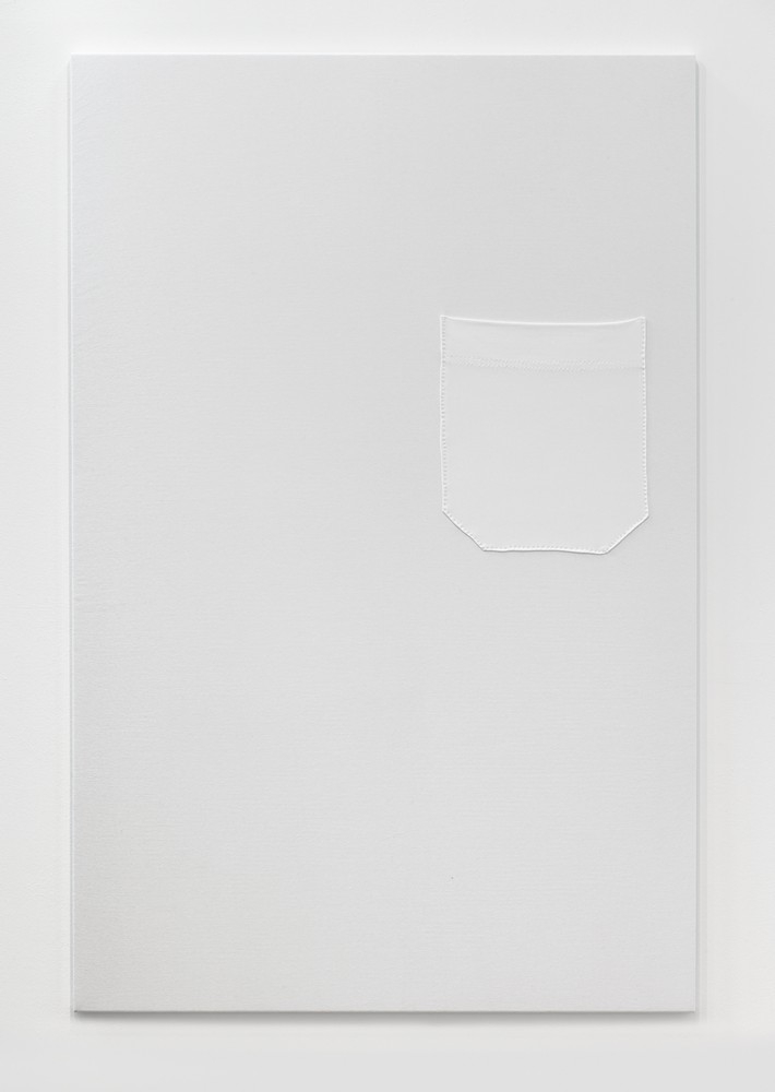 Hannah Knox, ‘Buff’, 2013, Cotton jersey pocket stitched onto cotton jersey.
What was the impetus for BUFF, which is also the title of one of the works.
While I was working towards the show at Ceri Hand I was thinking about ‘Buff’ (the actual work) as a presence within the room. A work I made for a previous show, ‘Stoffbilder’ at Take Courage, was a departure point. This work, ‘Europa and Laelaps’, was a large printed hanging figuring a human torso, with stripes above and below. I thought of the work as a matriarchal figure and as an architectural element, a Greek pillar. Within the exhibition space it functioned as a support that everything else in the show was hanging from. When it came to making work for BUFF I thought of perhaps using the same digital image. The print from that last show was on habotal silk, very thin, fragile material. I like the contradiction of something being a support while also being fragile. ‘Europa and Laelaps’ was very much about the fragility of life. When it came to BUFF, I thought it would be really nice to hang the show around a work of similar scale, that referenced the body in some way. I started to look at cultural icons and Greek Gods. I have Greek heritage which comes through in my work. There are references to Greek mythology, and I’m fascinated by story-telling. ‘Buff’ went from being an image to a large item of clothing. Hannah Knox, ‘Stoffbilder’, Installation view, 2012. ‘Europa and Laelaps’, Digital print on habotal silk and spray paint.
All of the works in BUFF are composed of fabric which you then re-imagine as artworks.
My mum was a fashion designer and so clothing and fashion shows were always a part of my life. But this hadn’t yet come through in my work in such an explicit way. I began to think about the difference between design, and craft and art. I thought about painting and what its purpose is. When I started thinking about ‘Buff’ and making a large garment I thought about the idea of making a pocket. And about how a pocket in a painting is such an impractical thing. You buy clothes because you need clothes. Buying a painting isn’t something you necessarily need. So what is the purpose of it? I was playing around with these ideas; the work is also an of exploration of painting, its purpose.
Do you think of all the works on BUFF as paintings?
Yes. With ‘Buff’, the work, I thought about Malevich, and his Suprematist Compositions, in particular ‘White on White’. There is a history, in painting, of paring back which I wanted to explore.
Ideas about fashion and celebrity icons are also important.
Yes, Marlon Brando and the white T-shirt. I think Brando was one of the first to start wearing the T-shirt as a fashion item. Previously, it had been underwear and work wear. I was interested, thinking about Brando, in whether you could make a sexy painting. It’s something I wanted to try and do in some way. With lots of these paintings there is a sense of sensuality. I was trying to see if I could tap into that.
What’s also interesting about ‘Buff’ is its scale, its monumentality coupled with the blankness of the white jersey fabric. The only motif is the pocket which is also white and spare.
‘Buff’ draws together the idea of a celebrity icon and Greek Mythology – the idea of a presence that is God-like. I wanted to make something that suggests a very strong presence while being absent in some way. Installation view of ‘Buff’ and on the left hand side ‘Sport-Luxe’, 2013, Acrylic on pewter PVC.
When you speak about this absent presence it makes me think of a shroud. But it is also humorous.
There is definitely a playful element to the work. I like the idea, that there might be the temptation to put something in the pocket. But all of the works are also very personal. The shroud-like element also links to ‘Sport-Luxe’. Sport-Luxe is a fashion term which is sportswear made out of luxury fabric. It’s completely impractical to do sports in. There is an element of humour here. I am interested in the ludicrous side of fashion.
You found the Sport-Luxe fabric and then altered it in the making of the work?
This fabric is PVC and the images appear via spray-paint. All the works that have colour on them are spray-painted. I wanted to find a reflective, shiny, sexy fabric. The PVC has a wonderful tackiness, a trashy club thing; it’s trying to be sexy. The colour of the PVC I chose is pewter (there’s a lot of metallic in Sport-Luxe). I wanted the work to be like a charcoal drawing. You were talking about a shroud in reference to ‘Buff’. In ‘Sport-Luxe’ I wanted to try and get to the feeling of memory or an impression. I was thinking about the idea of a photogram, and Man Ray’s ‘rayographs’. You place objects on photographic paper and when they’re taken away they leave behind an impression. There’s a sense of loss or remembering.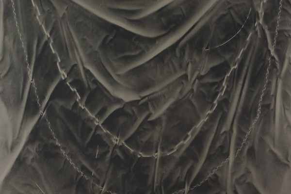 Hannah Knox, ‘Sport-Luxe’, 2013, Detail, Acrylic on pewter PVC.
As you talk about your work, I’m thinking about histories of painting and themes to do with mortality and transience, such as memento mori. It’s also interesting to think about the enormous attention given to clothing in paintings through history. There is so much emphasis on fabric, folds, creases, decorative elements. Clothing is so much part of the history of figurative painting.
I used to paint in a much more figurative way when I was at the Royal College of Art. I was working with more detail and tiny brushstrokes. I have always used a lot of fashion imagery in my work. I’ve always been especially fascinated by the idea of painting cloth. I’ve since been through a process of paring down, working out the essence of what it is I’m interested in. Hannah Knox, ‘Pliage’, 2013, Acrylic on purple wool.
It’s fascinating to think about how you’re honing in on a miniscule aspect of the history of painting, the painting of fabric.
Earlier you were asking about whether these works are actually paintings. I wanted with this show in particular, to explore the idea of paring painting right down. Painting is essentially cloth; a canvas with colour and either pigment or paint, or some form of colour, is put onto the cloth. And then there is the support which is the stretcher. Both ‘Pliage’ and ‘Fall13’ explore the idea of putting colour onto cloth. As a teenager I used to tie-dye my T-Shirts, and these works are tapping into this. I’m also referring to a process associated with Simon Hantaï, an artist working in the ‘60s. He became well-known for pliage, a method of painting where canvas is folded or tied before pigment is applied. He said some really interesting things about the process: ‘You could fill the folded canvas without knowing where the edge was and you don’t know where things stop’. There was something about this that I really tapped into because you’re working blind with these. I work with spray-paint, and the process makes me think about the removal of control. I was thinking about going to a Rave and about something being quite hedonistic. There’s something in the clash that I really like between the fluorescence and the traditional tweedy wool.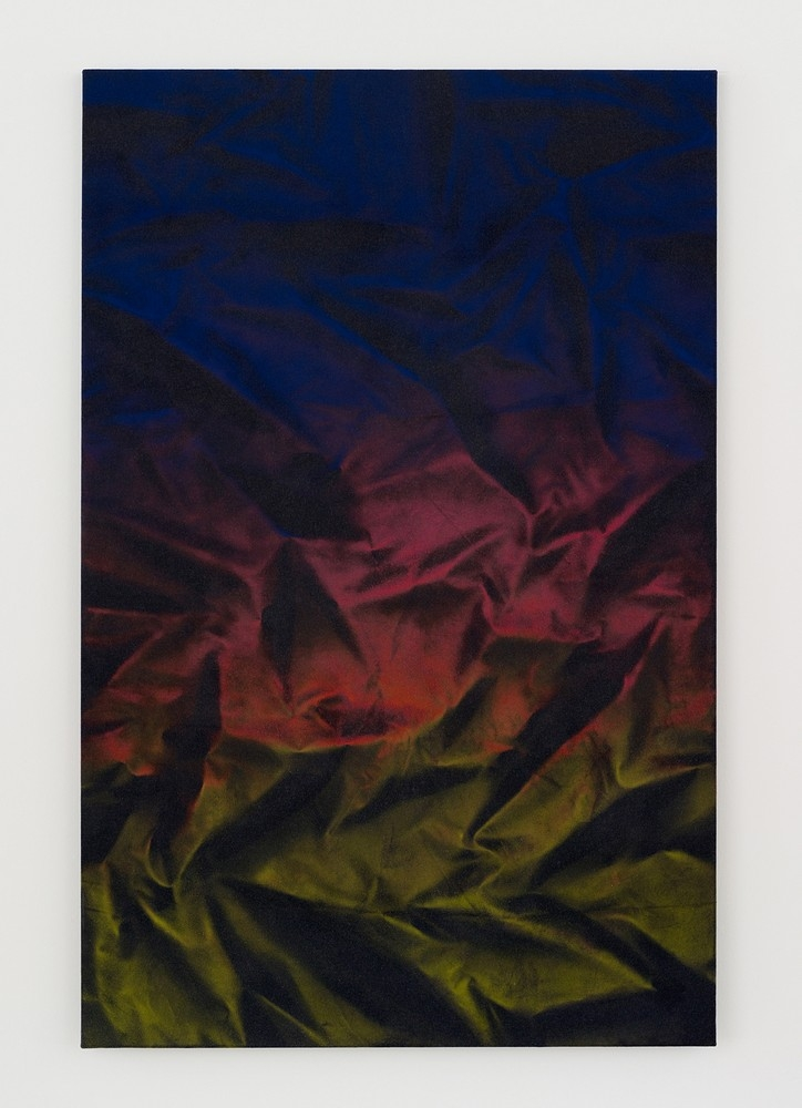 Hannah Knox, ‘Fall13’, 2013, Acrylic on wool and cashmere mix.
‘Fall 13’ refers directly to the idea of a fashion collection. It’s also very sumptuous and opulent.
Yes, I was thinking about the show in terms of making a fashion collection in some way (especially with using fabrics). As I made the work, it also reminded me of other things like falling leaves. As you step back it turns into a silky bed sheet. I wanted to make a painting which looks very silky but actually is a cashmere wool mix. So when you go right up close to it you notice that where the paint sits it gets claggy almost like fur, like a furry animal. There’s a contradiction there that I like. You also get slight creases and so on.
Are you interested in the body in art? Your works are quite abstracted but they invite you to think about the body. ‘Pneuma’, using the heat sensitive fabric, is just one example of this. ‘Buff’ is another, the idea of the absent body. The T-Shirt fabric you use in ‘Pneuma’ literally changes colour with body temperature. You’ve demonstrated how it changes colour if you breathe on it.
Yes, I left the text which is printed onto the fabric deliberately, its name. If somebody reads it and remembers the fabric they might want to go closer. I like the idea of it being slightly enticing. There’s always that thing of not being allowed to touch art, and I’m slightly encouraging rule-breaking or misbehaving which I’m quite interested in. It’s definitely quite playful in lots of ways. ‘Pneuma’ is a Greek word which means breath or spirit. It suggests the idea of breathing life into something. I’ve made works with this fabric before, and they had heated frames, so the works would gradually change colour. I like the idea that there is the possibility of change, and even if you didn’t ever breathe on the work the possibility is still there. It’s hidden in the work. Every fabric is selected for their possibilities. It’s not just about colour, or something like that, although colour is key to the works. It’s definitely about the possibilities within the fabrics.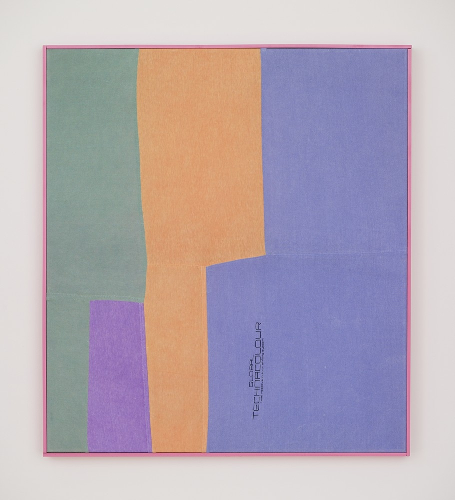 Hannah Knox, ‘Pneuma’, 2013, Heat sensitive Global Technacolour T-shirt in artists frame.
The way you work in and out of lines is interesting in ‘Third Wave Riot’, you have the straight lines of the fabric print but then you disrupt them, you play with smudging and asymmetry.
As a teenager I was very involved with going to see bands with friends. A lot of the bands we saw were Riot Grrrl bands. As part of that, we’d go out stencilling using spray paint. It was feminist stuff. It all probably lasted about a week! But we did carry on doing flyposting and things like that. With this work I was also thinking about fanzines, mis-print and the homemade side of printing. Also carbon copy paper, the idea of something that is smudged and inky. It has to do with rebellion and not staying in the lines.
Why did you decide on the Triptych with ‘Third Wave Riot’?
It’s also linking back to art history. There’s a slightly religious idea of it being an altarpiece.
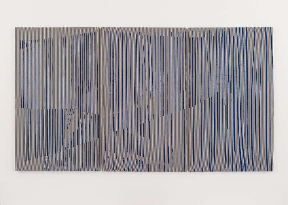 Hannah Knox, ‘Third Wave Riot’, 2013, Acrylic on cotton mix.
The history of art is such an important aspect of these works, and you often refer to it.
‘Still Life’ looks back at Barbara Hepworth. I was thinking about the solidity and mass of her sculpture and then the delicate line that would go with that. I wanted to make something that was solid but also delicate. I saw the patterning as a bouquet of flowers and so I called it ‘Still Life’. The process of threading felt like following in a female tradition in a lot of ways: my grandmother embroidered, and my mother was a fashion designer. As I was making it I felt very much part of a female history. But at the same time you can’t help but question so much of this history. ‘Still Life’ and ‘Third Wave Riot’ (with the whole Riot Grrrl thing) felt very much as though they were playing off each other.
I don’t want any of these works to mean something specific. All of them are definitely abstract paintings. I like that they can hover between different things; and that there’s the possibility of seeing different things within them.
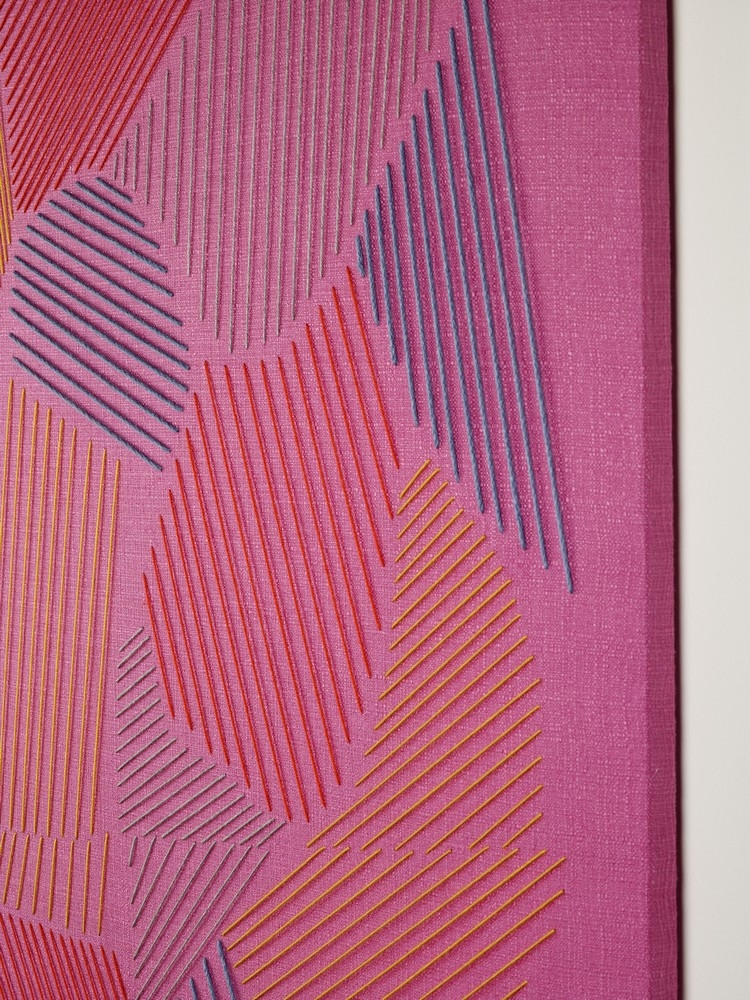 Hannah Knox, Still Life, 2013, Detail, Stitched wool on pink linen.
The idea of fabric is so rich, and speaks to so many histories; you’ve mentioned ideas about labour.
Labour is something that I was thinking about with this show. I was thinking about fabrics that are machine-produced and things that are hand-made and man-made. Both ‘Still Life’ and ‘Third Wave Riot’ register deliberate accidents, misregisters in the fabric. A few people thought it was an accident with the fabric and hadn’t realised that I’d put it in on purpose. I was thinking about traditions of weaving a mistake in a carpet because only God can create perfection. I quite like the idea of trying to produce a painting and it failing. I am interested in failure. With making any painting there’s always the unknown of ‘has it worked?’ Sometimes you don’t ever know. Sometimes you don’t know until you get feedback from other people, and this is the wonderful thing about showing the work. It’s quite insightful to see which works people pick up on. But at the same time you can’t let your work be made in that way; there has to be something that comes from within it.
BUFF closes 26 October 2013 www.cerihand.co.uk
All images courtesy of Ceri Hand Gallery, 2013. Hannah Knox, ‘The Molluscs’, 2013, Acrylic on linen with stitched wool.