IONE & MANN to present ADVANCED CONTEMPORARIES II, an exhibition curated in collaboration with Paul Carey-Kent. This year’s edition brings together six artists whose work challenges conventions of representation to reach meaningfully simple results – enriched by their conversations with art history as well as life experience.
ADVANCED CONTEMPORARIES was conceived by Paul Carey-Kent to highlight and celebrate artists whose practices, spanning decades, are deserving of attention now, making this a counterpoint to all the prizes / shows / lists that are fixated on youth and/or the simple fact of having recently graduated from an art school. What, after all, does it mean to be ‘contemporary’? Is it linked to youth? ‘Contemporary’ is defined as ‘living’ or ‘occurring in the present’. John Peter Askew, Phil Illingworth, Maria Lalic, Jonathan Parsons, Michael Samuels and Michael Stubbs have been occurring in the present for over forty years, making relevant, materially fresh and visually exciting works – all with formal beauty, typically of some rigour, but also plenty of ideas. A rare achievement of long-term commitment, belief and quiet dedication, marks them as Advanced Contemporaries.
Exhibiting artists:
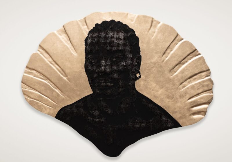
John Peter Askew pulls his photographic projects together from a vast archive. For example, his two photo books, We and We II, contain 320 images culled from 20,000 negatives taken since 1996 on his regular stays in the Russian city of Perm, 1,500 kilometres east of Moscow. Here we see two images printed large from the five-pair series Flower, taken when Askew started recording the campanulas which his father grew in his garden as a reassurance at a time of serious illness for his mother. Their delicate white-on-white, non-frontal depiction almost denies them presence. This mirrored pair seem to be ignoring each other, but perhaps they are engaged with the adjoining works. Askew also presents small prints from his series Circles. All have their attractions independent of their inter-connection, which acts as the rationale – or excuse – for all sorts of unexpected encounters and conjunctions that yet retain a small shock of arbitrariness. You are soon drawn in the seductive search for commonality, and to the surprising range of circular forms to be found when one might have thought they would be pretty-much the same. The series suggesting a quotidian, yet sacred, geometry – as if a creator has based the world’s design on the circle.
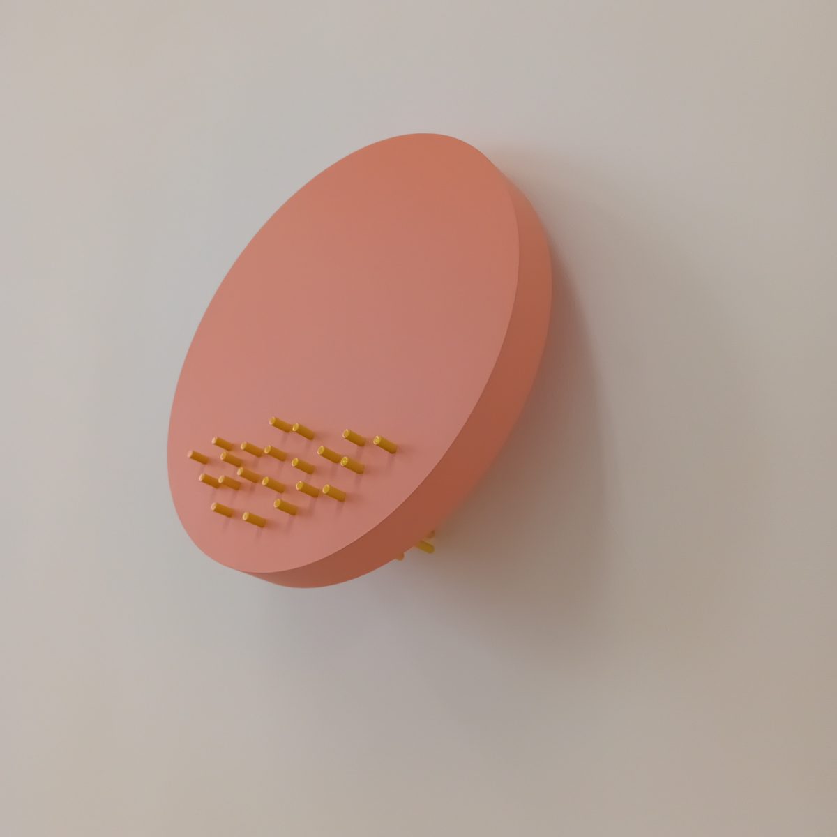
Does Phil Illingworth make paintings? True, there’s no canvas involved, and not necessarily much paint, and usually three dimensions – yet he wittily explores the language of painting. The three chosen here imply various aspects of movement. Triptych nods to religious iconography while drawing on a wish to avoid the sense that a painting, when finished, transitions from creation to object. Illingworth makes it moveable, allowing for ongoing changes. The title Carry Moonbeams Home in a Jar refers to autokinesis – how our own eye movements can make us see still objects, especially in the night sky, as moving. Now the angled bamboo spikes might intrude on the viewer’s space in a potentially extreme way: the pretty pink tips, he says, are at odds with real danger if they are at eye level. Portrait of a king in several different positions refers to van Dyck’s Charles I in Three Positions, which Illingworth thinks of as a precursor of Cubism. So the movement implied here is of the spectator, through the incorporation of different viewpoints. There is, then, no shortage of content, assisted by Illingworth’s cunning titling – yet these works are essentially abstract, as well as essentially paintings.
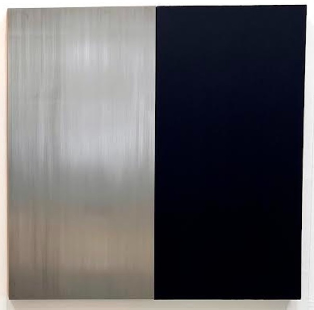
Maria Lali? exhibits examples from two of her long-running series of works concerned with the material and historical bases of painting. They each follow a rigorous conceptual procedure, working with the past, present and future of their materials in relation to the culture of painting – and find painterly allure within these constraints. The Colour and Metal series exposes the chemical make-up and properties over time of certain colours by pairing a metal with a pigment derived from it: here she contrasts the metal (iron), which will oxidise and change over time, with a colour derived from it (the iron-based pigment Mars Black). The History Paintings deal with how colours are a product of a particular time and place, meaning that the history of painting is partly determined by the developments of each age. They utilise a Winsor & Newton chart which sets out the colours as they were introduced over six periods: cave; Egyptian; Greek; Italian; 18th and 19th centuries; and 20th century. Each painting is made from semi-transparent layers of all the pigments that were developed in the period referred to in the painting’s title: in this case 18th-19th century, the top layer being Emerald Green.
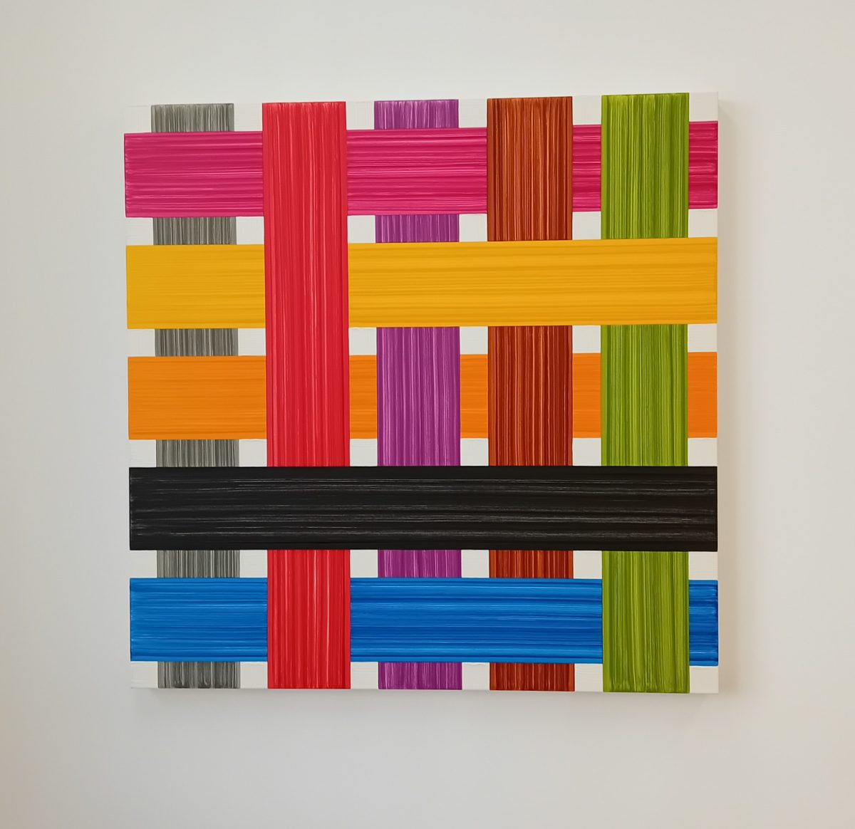
Jonathan Parsons shows two from the various strands of his work that deconstruct the conventions of representation – an approach which can be traced back to the hanging map piece Carcass, as displayed in Saatchi’s Sensation exhibition in 1997. His long-running series of grid paintings deal with the brushstroke and also the impossibility of something that appears to be 3-D being flat at the same time. ‘There are no layers whatever’, he explains, ‘just abutting colours which create a succession of apparent levels which are actually flat’. Parsons also shows a multi-panel painting exploring the optical and verbal properties of the roundels in tincture. That stems from his study of heraldry, in which ‘roundels’ are the circular charges (symbols) placed on a shield, and tinctures are the colours and metals used – and they have a specific vocabulary. For example a roundel vert (green) is known as a ‘pomme’, the French word for apple. Singular discs of impasto paint were applied onto the picture surface using a single pressing action to create the roundels and the texts of their names – so that heraldic conventions meet a chance-driven process leading to a result that fits with another set of conventions – those of geometric abstraction.
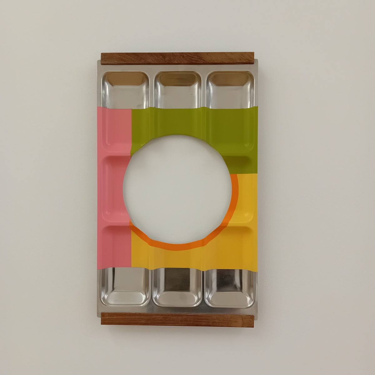
Functional objects become non-functional in the work of Michael Samuels: he deconstructs and reconstructs them to make a form of contemporary bricolage. He has often ‘liberated’ 1960’s and 70’s cabinets, tables, sideboards and (as here) Danish condiment trays – from their traditional roles, cutting and reconfiguring them to emphasise materials that act as strong visual markers of Modernism. The self-standing sculpture Everything Looks Perfect From Far Away sees him move to a non-domestic source with less evident design of its own: 1960s laboratory boxes, stool and clamps – Samuels likes clamps as a means of making his means of construction apparent, and bringing that into the aesthetic. A recent series continues in this less domestic direction, reconfiguring vintage letterpress boxes – printer’s trays – into works that act as paintings (albeit with only vestigial paint) rather than sculptures. Samuels finds the backs of these trays particularly interesting, carefully sourcing them for the paint marks and fingerprints that reflect their history. He explains that ‘as a rule, I don’t draw or plan my work; my practice is a performative and intuitive process of working straight with materials I accumulate in the studio. I avoid traditional art materials, preferring ready-made objects as I always look for a unique visual language and objects with a previous life’.
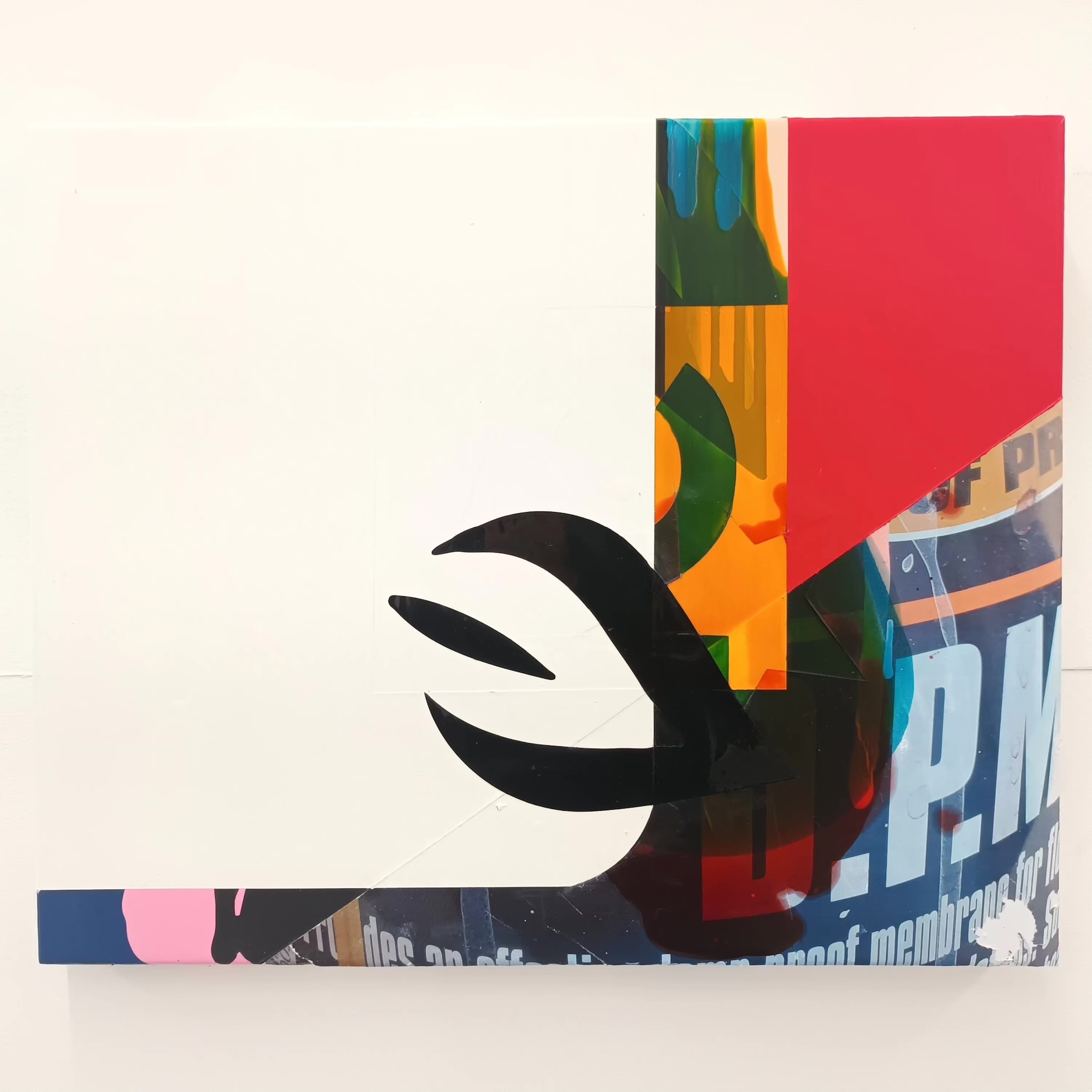
Michael Stubbs makes abstract paintings through a process akin to the collage more often associated with representation. He paints on the floor by pouring household paint and tinted varnishes, into which he inserts (and removes after drying) popular graphic signs and symbols, and also photos from his phone which depict his studio tools, paints and equipment. The resulting simultaneous optical effects incorporate the material conditions of production and suggest the layered screens of computing, while retaining hints of pop art and graphic design within an abstract expressionist language – pouring being a classic technique of Jackson Pollock, Morris Louis and Helen Frankenthaler. That brings various systems into a democratic post-modern collision: the utilitarian decoration of houses, the symbols and signs of advertising, the social realm of the online world and the history of painting. That can be taken as countering the view of abstraction as the independent expression of the artist’s emotional states. Equally, though, one can concentrate on the seductive formal qualities, be that colour, texture, crispness or multi-layered, process-based activity balanced by calmer zones – in which respect CE 0082 and DPM 45 are particularly dramatic. Those titles, incidentally, are fragmentary extracts from the labelling on the tools he uses.
ADVANCED CONTEMPORARIES II, 26th July – 13th September 2025 IONE & MANN
Private view Saturday 26th July from 1PM-5PM