Let’s begin rather grandly with the history of art since 1900. The liberation of painting from naturalistic depiction led to modernism. Abstraction became mainstream. Duchamp re-presented found objects in contexts that changed them. Surrealism made more of the sub-subconscious, often through collage. Pop found value in wider culture. The minimalists favoured the serial presentation of simple forms. Art expanded into photography, film, performance and installation.
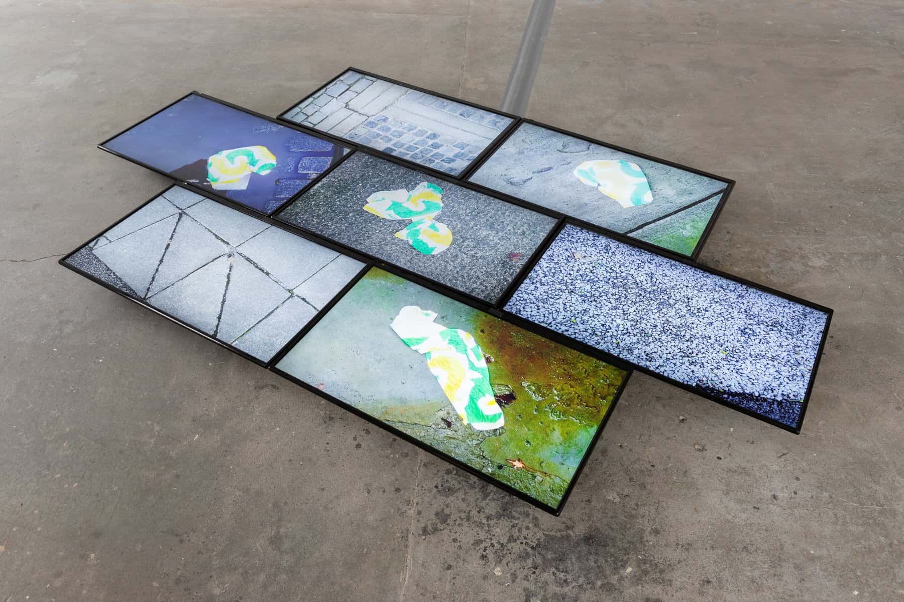
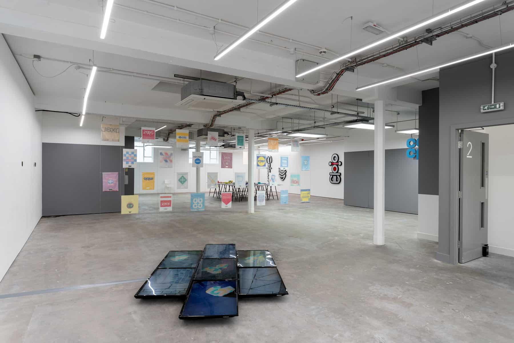
It might seem ludicrous to move from that overview to discarded wrappers from Subway’s meals. Yet we can actually read much of that history into Subv>ay (2020, as are all works in the show), in which Fitzmaurice’s collected photographs of such wrappers are presented as an out-of-sync slide show on seven floor-mounted monitors arranged like paving stones. The Subway logo carries the traces of how modernism has fed into advertising. The wrappers are found items given a new context. To do so values an item not merely overlooked but normally categorised as rubbish, and turns it into a pop icon of sorts. Fitzmaurice is interested in how the flattening of foot traffic and vehicles casts the original graphic design into new arrangements, producing a serial set of variations. It becomes tempting to read images into the resulting abstract distortions, a natural inclination which the surrealists exploited. The soundtrack samples – hip-hop style – a few seconds from a track by the American rock band Kansas, as music of the street. The sequenced images act as an animation suggesting movement, dance and music. That performative reading is emphasised by the striking installation. The history of art? It’s a wrap.
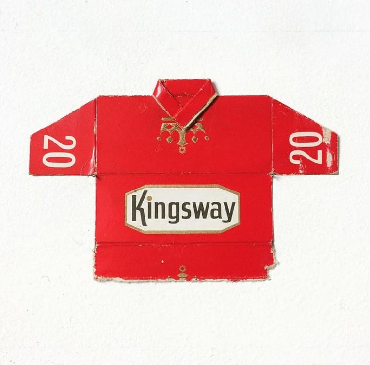
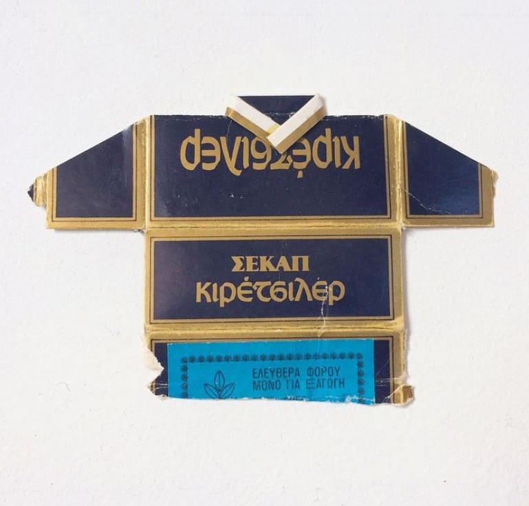
Just so, Fitzmaurice’s best-known work is probably Post Match, 1996-2017, a repurposing of cigarette packets as football shirts – he omits it here but you can visit its bespoke Instagram site @post.match. Fitzmaurice picked them up from the street, battered in the manner of the Subway wrappers, having noticed how – before such packaging of cigarettes was banned – ‘when designers tackled the packet top as a visual problem they resolved it in relation to previous solutions for clothing’. The conceit is a rich one, bringing in national identity, changing perceptions of class and the ironies of cigarette companies sponsoring the health benefit of sporting activity.
Yet, while it is possible to interpret Subv>ay in that broad context, it also illustrates what is most distinctive in Fitzmaurice’s approach. When I took my degree, back in the 1970’s, undergraduates thought that to go into advertising was to put one’s creative potential to a trivial use. Nowadays, not only does financial necessity focus students more realistically on their career options, but the true creativity in advertising is more widely acknowledged. And you could say it forms the basis for Fitzmaurice’s practice: he admires the means used to attract the attention of potential consumers, but then proceeds to disarm its function and put that energy to a new use as art.
Fitzmaurice has picked up on a local connection by responding to a collection within the Guildhall, where hundreds of plaques are mounted to commemorate each time a naval vessel has visited the port from a new destination. For Blazons Fitzmaurice has collaborated with their producer, Hull-based GK Beaulah & Co, to make versions of car plaques. These start from Fitzmaurice’s observation of the way we design things in our own image – typically symmetrically. Current car badges fit the mould, but that is less true of the more historic marques, which Fitzmaurice therefore back-adjusts to rather trippily symmetrical effect.
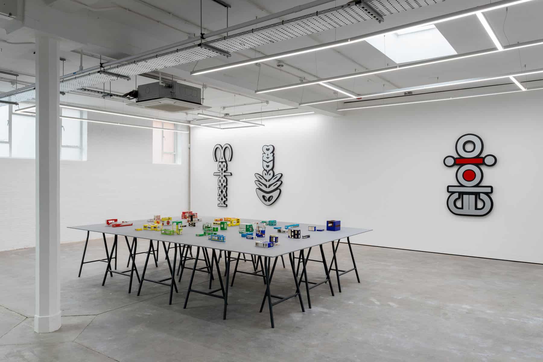
The related Intersignia series also starts from Fitzmaurice’s interest in symmetry and the human figure. These are mirrored signs blown up to the scale of the dealership signs typically seen at the back of garages – and focussing on the many positive words placed on the back of cars, sometimes part of the brand name (e.g. ‘Škoda Superb’), sometimes additional (that’s where Enjoy Civic Life comes from, originally referring to the Honda Civic rather than the merits of democracy). The original words, halved and reflected, are turned through 90 degrees. The imposingly-scaled results look rather like African tribal art, taking us back to the origins of Cubism. Fitzmaurice calls these plaque works ‘totems to growth’. The way he alters them is, he says, ‘designed to unmoor the original meaning’ so that there is less distraction from the underlying aesthetic and subconscious energy. There’s a certain irony, of course, in drawing attention to such affirmations at a time when the internal combustion engine is seen as a more of a problem than a source of pride.
Yellow and black recurs in the work in the café downstairs, which uses the Pay Point Company’s distinctive – though now historic – terminals for topping up credit. Fitzmaurice obtained these steel structures from EBay, attracted by them as objects that reference modernist or constructivist art. There’s something paradoxical in how physically they stand up in the world, when their function is the ethereal one of holding information. WayPoint, cuts up several of these to emphasise their shield-like aspect and create an ironic modernist totem to the circulation of cash.
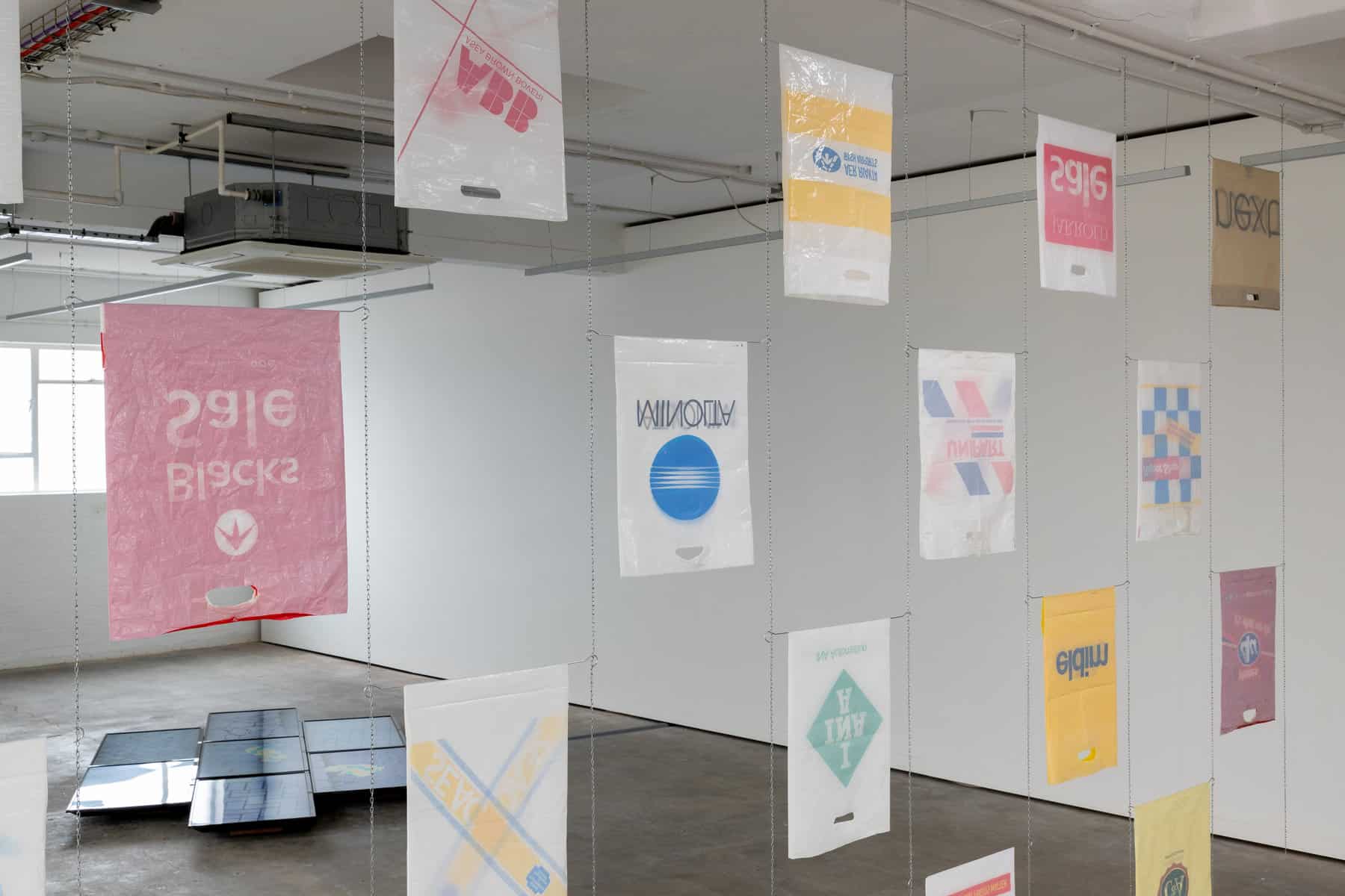
Even larger, yet also less substantial, is s6eq – a dividing wall made from plastic shopping bags, the title imitating ‘bags’, inverted. They are, says Fitzmaurice, ‘another form in which the brand or logo moves through the urban environment – bags most resembling, historical speaking, flags or banners – and this piece inverts and silences objects that are intended to shout’. Fitzmaurice achieves that by the simplest of means: the carrier bags are turned inside out and hung upside-down, so that what were brightly colourful in-you-face adverts become ghost messages, reversed into pastel paleness, their handles emerging as mouths in a crowd of faces.

Yet if s6eq is big, the building which houses it is bigger. And ‘many buildings’, says Fitzmaurice, ‘are designed to be iconic 3D logos’. He aims to reverse that process in his installation by using interior and graphic design to emphasise existing features – to make the building and its spaces ‘more-like-itself, if you like. To heighten its identity’. To achieve that, he paints some walls grey so that the irregularities of the room are emphasised, and calls that Appearances – a work you might easily miss, in the service of how the whole show fits together. That move can itself be compared with how Fitzmaurice treats supermarket packaging – which is no coincidence, as Humber Street Gallery was originally a fruit warehouse and Fitzmaurice wanted to highlight the space’s idiosyncratic and historically appropriate resemblance to boxes or packaging. He often finds – as in b[]x w[]rks – that if the text and logos are removed, packaging is returned towards a version of the constructivist art and modernist architecture from which the design may well have subconsciously emerged. The intervention exposes shared features: ‘The way blocks of texts are arranged on a page’, says Fitzmaurice, ’is the way buildings are resolved. And once you have the connection you can go both ways. It would be really nice to have a left-justified building so that all the windows and apertures were on one side!’ That would take us from architecture to design and back to architecture. Spread out on a table top, this particular arrangement of Fitzmaurice’s collection of ‘value range’ packaging acts as a cityscape. Yet he has previously arranged them to suggest vehicles, emphasising the commonality of design solutions. The removal of text also highlights how similarly the various supermarkets tackled the presentation of their ‘value ranges’ – another component of the show which has now passed into history.
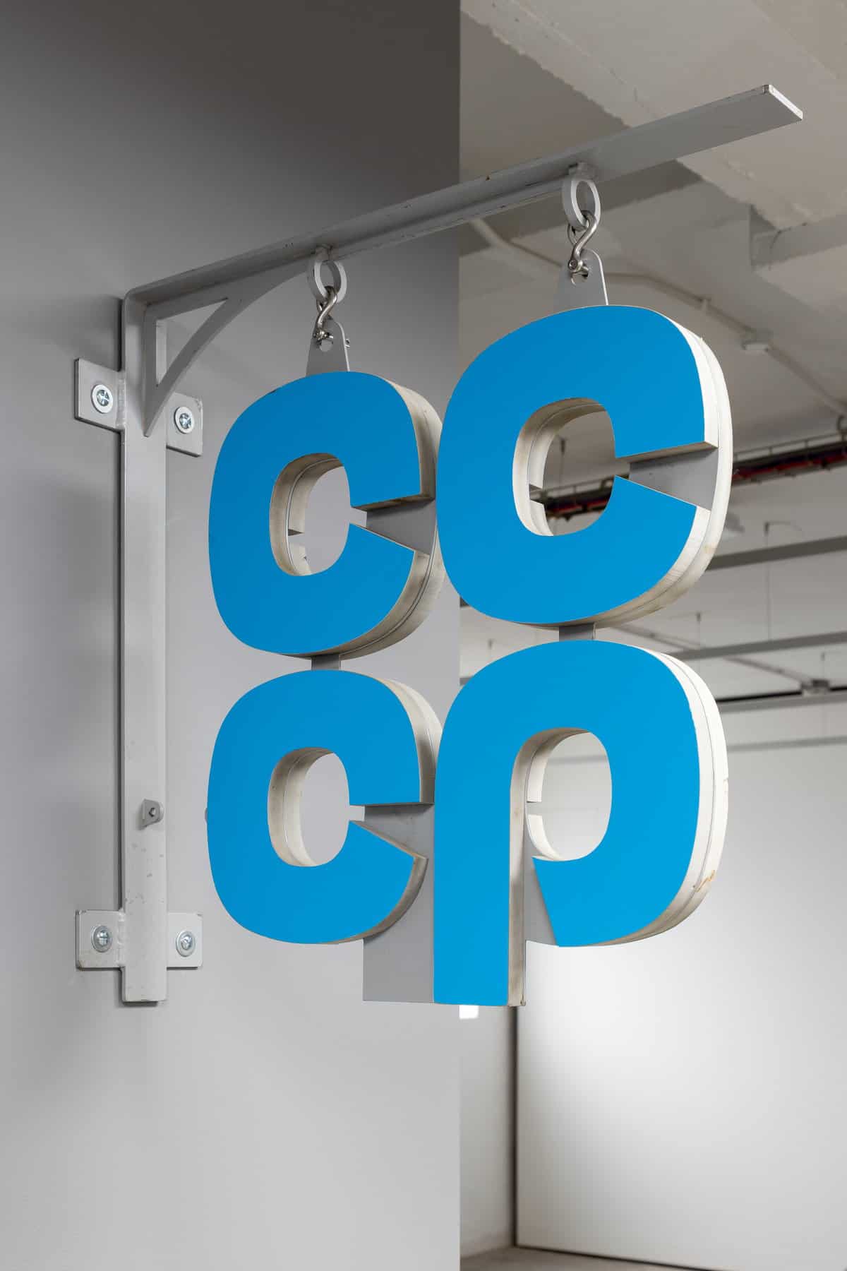
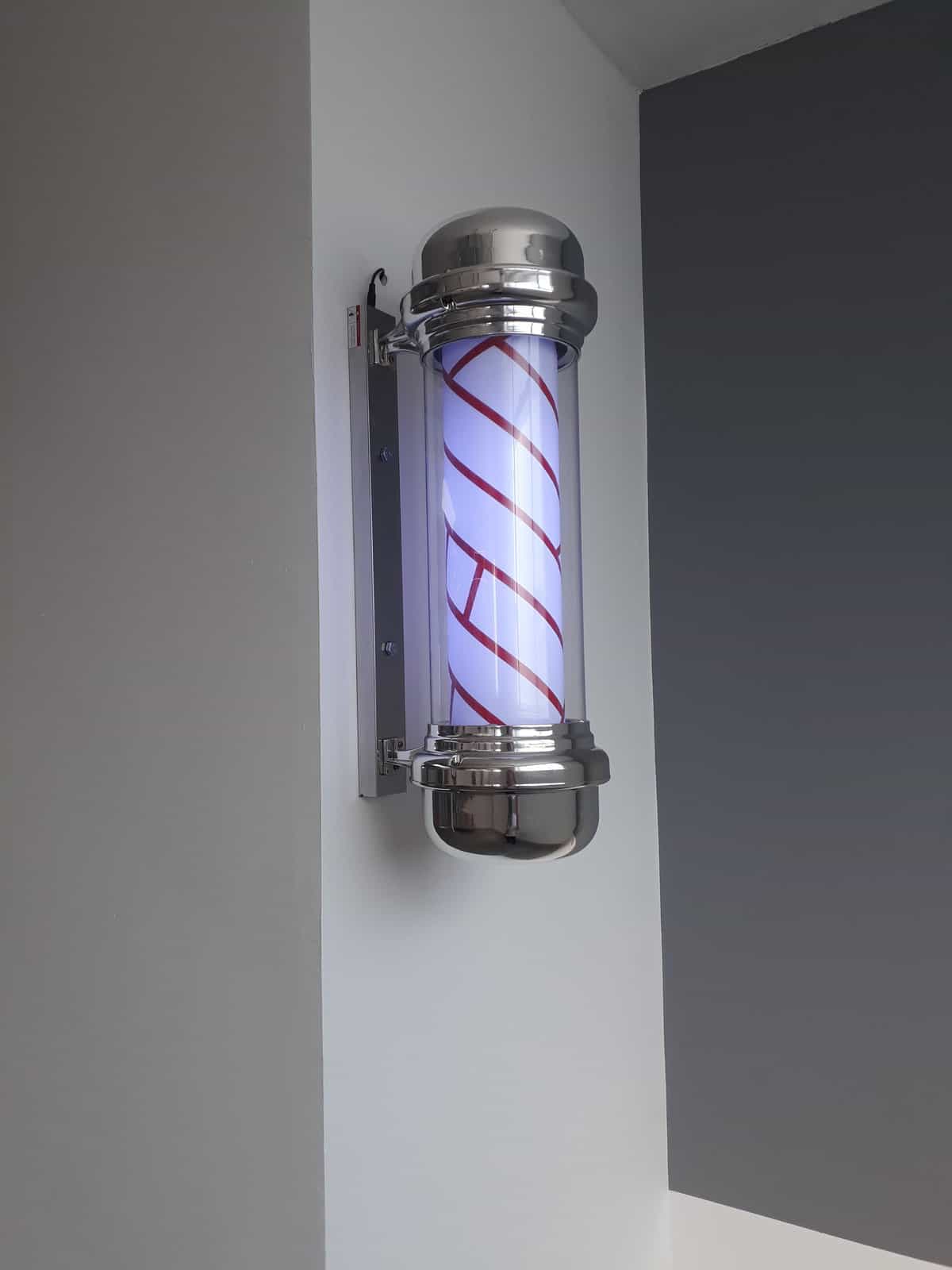
There is more history to explore in this prolific gathering. CC-CP adjusts a Co-Op sign to read CCCP, drawing attention to how the Co-operative movement and modern Communism developed contrasting visions of collectivism in parallel – in 1844, for example, the Communist Manifesto was published and the Rochdale Society of Equitable Pioneer Cooperative – often seen as the movement’s prototype – was formed. The revolving pole sign of Ba-Ba-Ba returns the stripes of a barber’s sign to their battlefield origins as bloodied bandages when hair and bodies were cut by the same profession – but in a cartoon version suited to our times. The cycle of its turning picks up on the rhythm of the soundtrack to Subv>ay. A Hoard of Benson & Hedges’ cigarette packs is surely fool’s gold, yet nostalgic too.
The journey through Fitzmaurice’s art, then, starts from the most common of places, but turns out to incorporate much of the history of modern art, of design, of marketing psychology, and broader connections to the past. After all of which we remain grounded in the everyday, with its immediate connection to our lives, but seeing it afresh. As TS Eliot put it in ‘Little Gidding’: ‘the end of all our exploring / Will be to arrive where we started / And know the place for the first time.’
Enjoy Civic Life’ at Humber Street Gallery to 5th Sept absolutelycultured.co.uk/humberstreetgallery
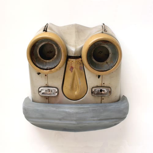
Note: For the first month of Enjoy Civic Life, the motoring heraldry of Blazons pointed towards a companion exhibition downstairs – Autosuggestions – of cars that Fitzmaurice has sourced by scouring scrapyards in Liverpool. The bonnet, headlights and bumper are removed; then the mid-section of the bonnet excised, bringing the headlights together. That transformation leads to mask-like results running the gamut of apparent emotions, so exposing the anthropomorphic tendencies which underlie car design. The middle of the car’s name is also excised – like the middle of the bonnet – to yield each work’s title. For example, Chevalir, 2018, is a Chevrolet Bel Air from 1956 which looks its age to characterful effect; Ciasso, 2018, a Citroen Picasso from 2001 with just a little of Pablo’s intense stare; and Mercurior, 2020, a Mercury Meteor from 1962 – and the first case of Fitzmaurice working with the boot rather than the bonnet, with somewhat diabolical results. Auto Showroom, 2015-20, carries forward the approaches which recur in Enjoy Civic Life: we see objects which have a history of personal use – ‘it’s about the lives that they have, alongside us’, says Fitzmaurice; the basis of commercial design is freshly presented as it is put to new ends; our own relationship with consumer products is altered; and the environmental negatives of a disposable consumer culture are foregrounded – a showroom for cars becomes a showroom for the junk which disfigures landscapes.