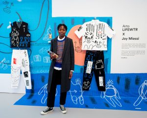
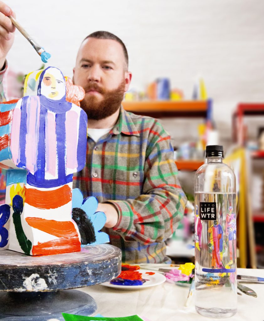
Arto LIFEWTR®, a premium water brand committed to advancing and showcasing emerging artists on a global stage exhibited it’s upcoming design series (launching Spring 2020) Unconventional Canvas, at this year’s Frieze London. Art by John Booth, Rose Pilkington and Joy Miessi was on display in the Arto LIFEWTR lounge.
FAD managed to have a chat with all three artists at Frieze about their art practice, working with Arto LIFEWTR and more, below is the first with artist John Booth.
John: .. Digital art and now it’s almost gone back to applied arts and stuff again, which maybe is where I fit in because mine’s definitely applied.
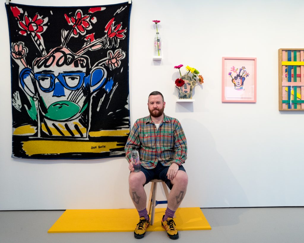
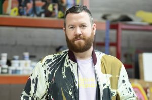
John Booth at the Arto LIFEWTR lounge Frieze London 2019
Mark: Is that you? (pointing to John’s display the Arto LIFEWTR lounge)
John: Yes, that’s my little bit. There’s not much there because I never have– They’re like, “Can I get ten vases off you?” I was like, “I don’t even own ten.” I make them but they go quickly, because I do stuff through Studio Voltaire. I’ve got an edition with them in the Fair now. Me and my studio mate, we’ve made a giant flower edition. I can show you a picture actually.
Mark: You’re in the shop? They’ve got a shop as well?
John: Yes, in Allied Editions and in the one in Mayfair. I just dropped the edition off there.
Mark: I think that’s a great idea that they’ve been doing that. They started that a couple of years ago. Also didn’t they just raise a lot of money?
John: Yes, they’re really good at supporting– They supported me from the start, in terms of just setting a really good precedent for prices and things. I can show you the–
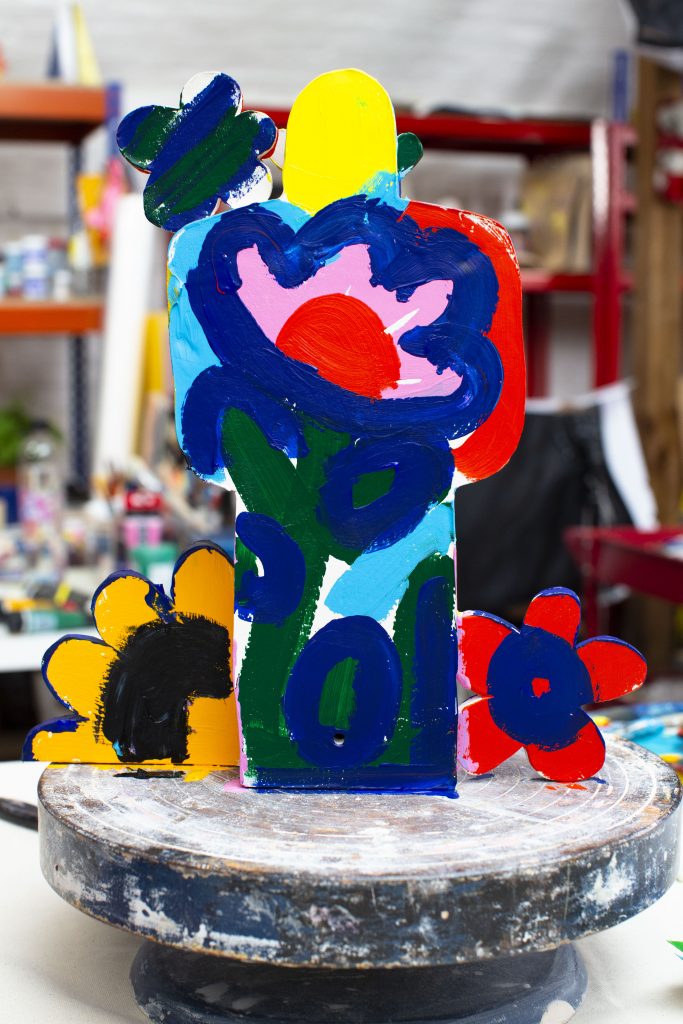
John: They’re the giant flowers. You can see they almost camouflage against the studio
Mark: Your practice, how long have you been doing it? What do you do?
John: I do a mixture of stuff. I reckon I started taking my work more seriously when I was 30. I’ve just turned 35. I’ve been operating a bit more professionally for the past four years. I studied Fashion Design at St. Martin’s. Fashion Design with Print, so it was all about drawing, drawing patterns, and textures. Being quite surface.
Mark: Did you work in fashion?
John: I did, yes, and I still do. I think quite a lot of people from fashion end up doing art as well. Somehow a lot of fashion-related stuff just isn’t as– It’s not as satisfying in a way. It’s so transitory and it moves really quickly. You could spend time doing something but it’s over very quickly.
John: Also fashion people always rip– Not rip, they’re quite bad at– They do rip people off. They’re just really blatant ripoffs all the time.
Mark: Sometimes I don’t think you can help it. If you walk around and you see things-
John: Yes, it could be quite subconscious. Just say there’s a particular exhibition on at a major gallery, you can see how it might have affected three or four of the major fashion labels, and I get that, but surely they need to be a bit more savvy about their references. It’s a funny one.
Mark: I think ad agencies definitely steal. [laughs]
John: My God, yes.
Mark: Okay. Five years ago, you got a bit more serious. You make stuff?
John: Yes, basically. I work freelance and like I said, I guess one of my bigger jobs,I did three seasons with Fendi Menswear designing prints for them. That was a good trajectory. Before that, that vase there that you see with the geraniums in, that was the first edition. I sold that edition nearly three years ago at Frieze. Every year I have an edition with Voltaire, and I do other projects with Voltaire. That was the first time I had a presence at an art fair and it really started from that.
Then the precedent was set for the ceramics. I feel like I put a lot of work into the pieces. I see them as art pieces. It’s a functional art piece. Somewhere between art and design, which is where I want to sit anyway.
Mark: This is it. (pointing)
John: Exactly, right. I love a good vase.
Mark: I think a lot of people do. It came in about two years, two or three years ago. Again, it’s also back to this– I think people are searching for reality, what is real.
John: It’s true. It is true, and that’s when it comes back to the physical object. Before doing the ceramics, I did a lot of work on paper. I was drawing a lot. I did have a steady flow of sales of my drawings but nowhere near as much as the ceramics. I think people responded really well to them.
Mark: What’s that? (pointing)
John: That’s a blanket. It was done with a Scottish textile mill. The pink thing on the wall is an edition from Voltaire, and the wooden thing is this structure that I made. It’s a framed edition with the Wrong Shop. I don’t know if you’ve heard of Sebastian Wrong. He’s quite well known in the design world, so again, it’s being involved with art stuff but also definitely design stuff as well.
Mark: How did you come to work with Arto LIFEWTR?
John: Somebody from Frieze approached me because I had presence here and they knew the nature of the project was quite– That there was something pop related about it, the fact that it’s on a bottle. It’s not trying to be high end. I don’t know how to word that. Obviously, they’ve put thought into the design of the bottle, but it’s acknowledging the fact that it’s got a wide reach and it’s packaging at the end of the day. It has to be universal. It’s quite a fun, quick message to send out, isn’t it? I was quite up for it.
Mark: How long did it take?
John: There was lots of different ideas to put onto the bottle, but in the end they used a nice collection of archive drawings. It was quite cool. I sent them lots of stuff that I thought would look quite cool on the bottle and they mix and matched, they collaged different drawings together. I reckon the drawings spanned over the space of three or four years worth of drawings done in different points. It was nice, because the minute somebody says to you, “Okay, design a package or a label,” you can be like, “Okay, what am I going to do?” It was quite cool that we came to the conclusion to use already existing–
Mark: Where do you find inspiration for your creativity?
John: It’s material-led. A lot of the time I have an aesthetic that I like to apply to stuff, but it’s more about what I can apply it to, if you see what I mean. It’s like I said, material-led. That thing that you see on the wall, that’s like the wood behind the glass, the colorful wooden slats, that was because I wanted to use this particular wood stain on wood, and then it’s knocked together with brass tacks. It was just more about the combination, and this idea of having– That was a piece based on almost showing material for what it is. That’s actually just painted strips of wood behind glass.
I like the simplicity of it. Tacked onto MDF. I liked it as well, having the MDF as the actual frame is oak. It’s kind of playing around with something being– MDF is really low-brow, but the oak frame is pretty nice, I think. A lot of the work is material-led. Again, the ceramics came about from me wanting to translate my drawings from a 2D drawing into an actual object. It’s just fun.
Mark: In a way your drawings becoming a label for a bottle isn’t that unusual for you?
John: No, it’s not in a way. Because I think it actually suits the nature of it and even if they’re talking about this– The term that they keep saying, A canvas for artists, that actually resonates with me in terms of–
Mark: Because you don’t use a canvas?
John: Because I like to work on stuff. For me, the bottle just feels another– It’s just another way of showing your work, isn’t it?
Mark: You go to Arto LIFEWTR they pick some, then they showed you what it looked like. Was it a joint approval thing?
John: Yes, it was, definitely. We did loads of mockups and I said yes and no and I like this and I don’t like that. There were lots of mockups. There was even an idea of having a picture of one of the vases on the front of the bottle, which would have been okay, but I just don’t feel it translated that well, because I think the vase from face on, especially on a packaging you couldn’t see that it was a 3D object. It is almost better to almost acknowledge the drawn characters something that has almost more presence than the ceramic did on the bottle. I think it fits the nature of the packaging better.
Mark: You like colour?
John: Yes, definitely. [laughter]
John: The reason I’m laughing, it’s just funny because that is such a big thing. It’s funny, because sometimes people send me a reference image or they’ll say something– I think people just think I like any colour combination, but actually when it comes down to it I’ve got quite specific combinations and shades I like, and that I think you can see continuity with that across the work. I like bright stuff, but not all bright stuff. Do you know what I mean?
Mark: That’s interesting. Yes, you can see that with the carpet and the wood, that it almost is the same colour.
John: Yes, that’s a good point. I don’t even think about it. Yes, it is. It’s funny because I think I inadvertently do end up repeating colours just because I like them.
Mark: Green, blue.
John: Yes. I’m definitely interested in colour.
Mark: I always find it fascinating because I used to do a print magazine a long time ago, but I got to learn RGB and CYMK, all that. CYMK is weird. It is cyan, yellow, magenta and K for black.
John: Yes. It’s true, isn’t it? I’ve been doing a lot of risograph printing. It’s really nice, isn’t it? That print was done with Hato Press. I don’t know if you know them, they’re just off Hackney Road in East London. Hato, I’m doing a book with them coming out soon. I love the risograph technique, it’s amazing. That to me almost– I loved that backward screen printing that I did in university because a riso print is halfway between a colour photograph and screen printing.
Mark: Yes, and what’s lovely about it is it’s so cheap, and it’s so accessible for lots of people. The idea is far more important than– Because screen prints depend on the paper you use, the screens you use, the paint you use, the techniques you use. You can make something that’s not that good look amazing.
John: It’s true. I really love it. Do you know why, I think it’s the presence of the technique, that you can see that there are physical elements rather than everything being so digital. That’s why I love risograph because it’s sort of–
Mark: The last one. Plans for 2020?
John: Right. I have some time for myself. I need to work on my actual studio practice because as much as I love commercial projects I need some time to do non-commercially related objects, I think. This is what pays the bills, but then I need some time to focus on my own studio.
More Info on John: @supergroupprojects
About The Artist
London-based illustrator, ceramicist and textile designer, John Booth is renowned for his graphic aesthetic featuring multi-layered collages of textures and colours. Born in Scotland in 1984 and raised in Cumbria, he enjoyed art from a very young age. He moved to London in 2004, where he graduated with a BA in fashion print design at Central Saint Martins in 2009. He has since then taught as a lecturer both at Central Saint Martins as well as at the University of Westminster. During his studies, he realized that he could channel his interest in fashion and textiles through his passion for drawing.
His works are distinct and identifiable, characterized by vibrant and youthful multi-layered collages bursting with colour and texture. His instinctive, un-laboured collage techniques combined with painted and drawn elements bring together rough-and-ready textures with luminous colours for a touching sensitivity. More recently, Booth has been focusing on making ceramic ornaments, prints and vases with Studio Voltaire and interior and art based objects with Ian McIntyre under their collaborative platform Supergroup. His diverse works seem to feature as often in the fashion world as they do on magazine covers, restaurant walls and in museum collections.
John is currently focussing on his studio work – exploring ceramic objects and furniture as well as his textile print designs for luxury fashion and interior labels.
Unconventional Canvas from Arto LIFEWTR launches Spring 2020 @artolifewtr