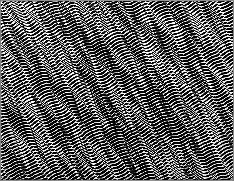
Franco Grignani: Combinatoria di Strutture Ondulate Interferenti, 1956
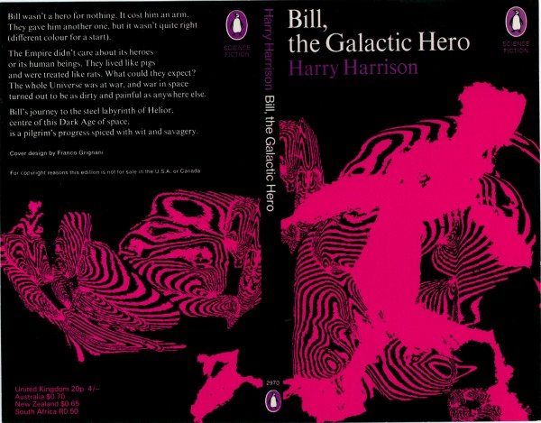
Prior to recent shows at M & L Fine Art (June-July) and now at the Estorick Collection (to 10 Sept), Franco Grignani probably belonged in the category of artists you’ve never heard of yet whose work you turn out to have seen. The Italian (1908-99) explored the optical effect of structured black and white repetitions in the late fifties in a manner which can be related to Bridget Riley’s subsequent work. When you see his paintings alongside the famous Woolmark introduced in 1964, it is no surprise that Grignani was responsible for that – having made an awkward ethical decision, as a judge for the competition. Concluding that the entries were not up to standard, he entered himself under a pseudonym! In fact, Grignani worked consistently across art and design, and his book cover for late sixties sci-fi books from Penguin are also striking – and a rare indulgence in colour, which he considered for the most part too subjective for art, though I found that the perspectival effect of some black and white works can introduce an illusion of chromatic gradation . And if it’s a test of art that other things remind you of it, then at nearby Highbury & Islington underground station on the way back from the Estorick, the setting of one of Mark Wallinger’s 270 mazes from his Labyrinth project (2013) seemed set to echo Grignani…
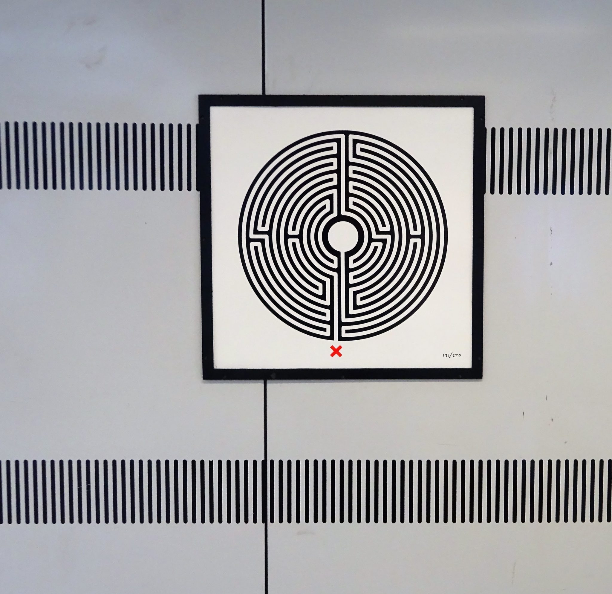
Wallinger placed a la Grignani?
Most days art Critic Paul Carey-Kent spends hours on the train, traveling between his home in Southampton and his day job in London. Could he, we asked, jot down whatever came into his head?

