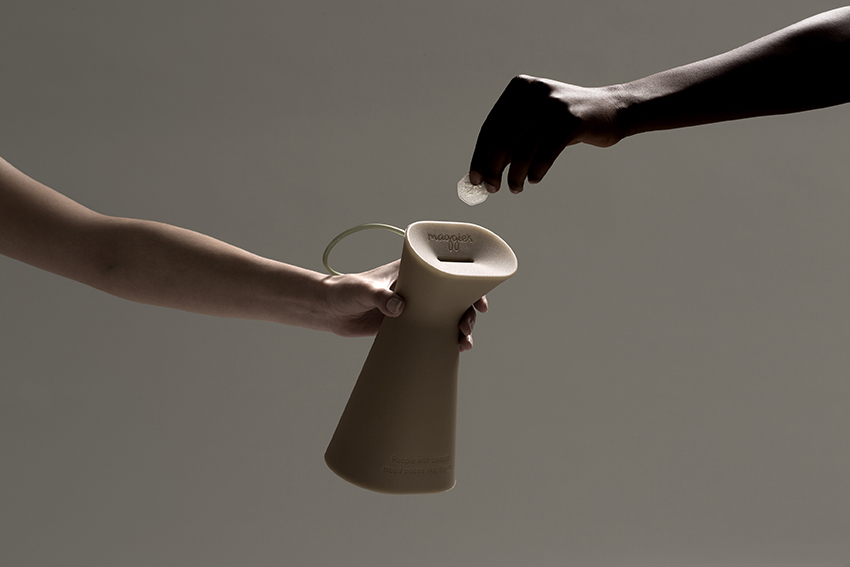
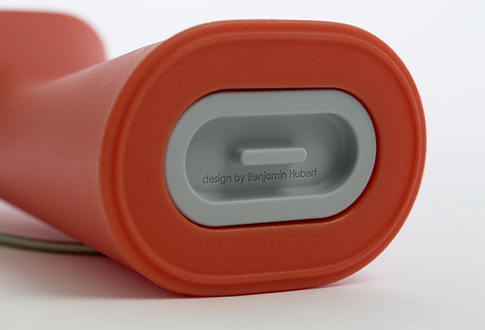
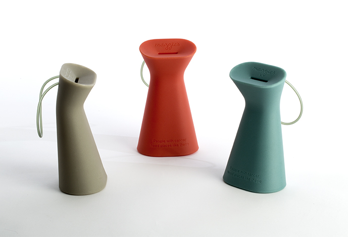
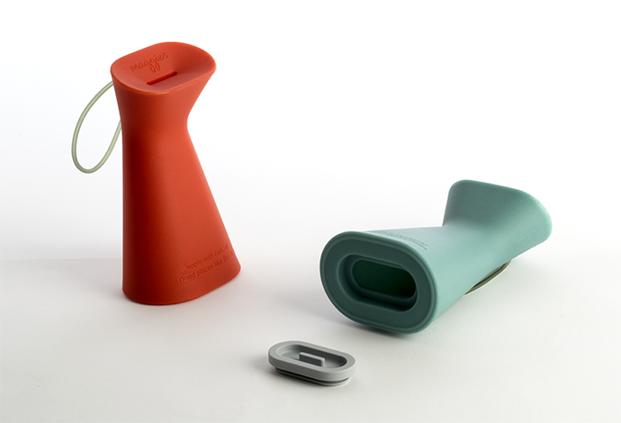
Benjamin Hubert of experience design agency Layer has designed a new mass-produced charity collection box for Maggie’s, a UK-based charity organisation that provides free practical, emotional and social support to people with cancer and their family and friends.
LAYER is the first agency to re-think the much maligned charity box, normally a generic OEM product, sourced and re-branded by various charities. The new collection box for Maggie’s is a valuable tool to increase fundraising capability through a strong format that can be readily identified as belonging to the charity and stand out in any context. This approach is sympathetic to the design-led values Maggie’s expresses through their high-profile architectural collaborations for the Maggie’s Centres with renowned architects, including Frank Gehry, Zaha Hadid, and Richard Rogers.
The concept behind the new charity collection box is:
“Small change can make a big difference”
and it has been designed to encourage giving. The body of the collection box leans forward to present an open face with a clearly demarcated money slot that can accommodate coins of all sizes and denominations as well as notes. The easy-grip form has ergonomic benefits for Maggie’s volunteers carrying heavy, coin-filled collection boxes.
“We saw a big opportunity to evolve the charity collection box into a device that more readily represents the values of a great organisation like Maggie’s, and through its design raise increased funds to help support people living with cancer.”
Benjamin Hubert, Founder Layer
layerdesign.com Instagram/Twitter:@layer_design
