The Financial Crisis Show – Art as a Derivative
It could hardly be more timely. Just days after HSBC have agreed to pay a $1.9 billion dollars in a record settlement with US regulators over money laundering allegations, a new exhibition opened yesterday at the Hay Hill Gallery on Baker Street that brings to life some of the myriad voices involved in the financial crisis.
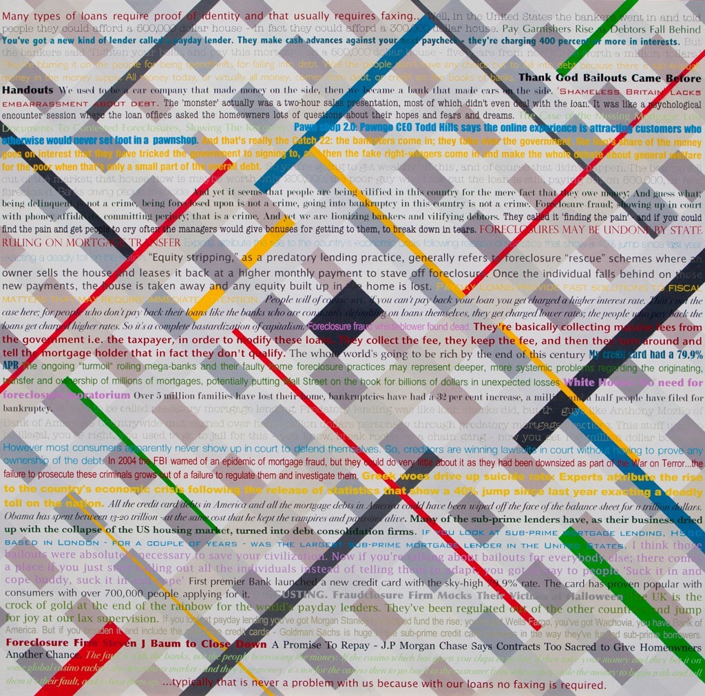
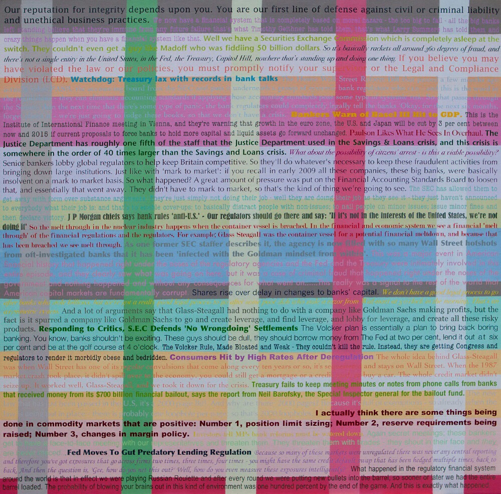
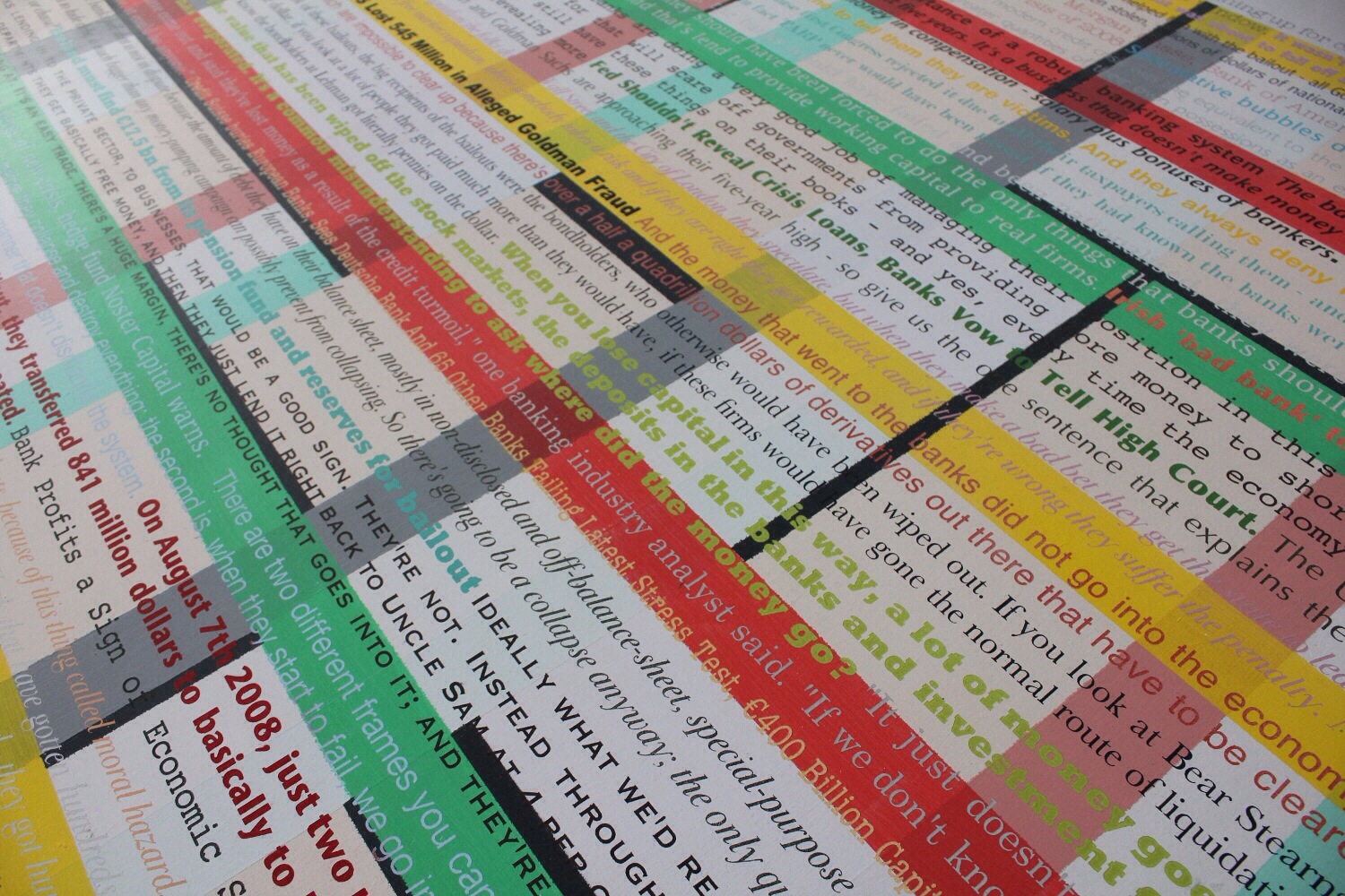
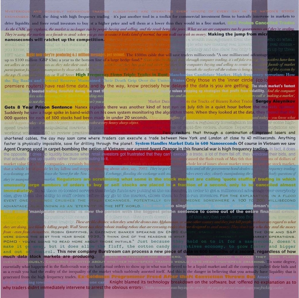
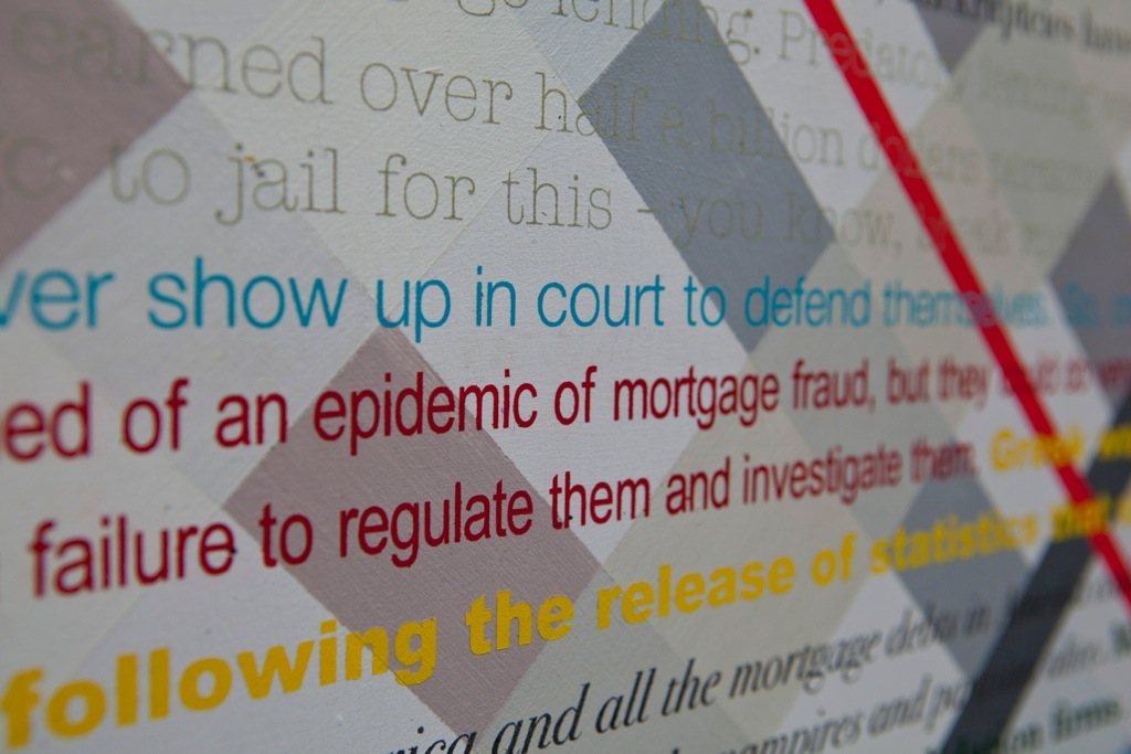
The Financial Crisis Show – Art as a Derivative is a series of fourteen thematic paintings by artist and art historian Larry McGinity. Produced out of a period of extensive research, each work includes around 1,500 words of verbatim text that explores a different aspect of the occasionally impenetrable goings-on of financial markets.
How did the idea for the series first originate?
At the time that banks were collapsing and countries going bankrupt, I was working on a book about Modern art movements for Thames and Hudson. I realised that I hadn’t really paid as much attention as I should have to what was going on. There were so many words and phrases that I didn’t understand. I mean, what is high-frequency trading? What’s the difference between CDOs and CDSs?
So I decided to turn my studio into an office and research centre. I would get up every day at 6am to listen to Bloomberg Trading. I worked the same hours as financial sector workers, listening to Max Keiser and American financial TV. I wangled my way into conferences on foreign exchange, and assembled an enormous body of verbatim text from the likes of Paul Wilmott, a specialist in algorithmic trading, Scott Patterson, author of Dark Pools, and Michael Lewis, who wrote The Big Short.
By the end, I had about half a million words in piles of differently coloured notebooks. These were then typed up and grouped thematically. There were fourteen key themes that kept cropping up, and each one formed the basis for a painting. Each finished work contains approximately 1,500 words of verbatim text, including quotes, comments and headlines.
Your approach is quite unusual in that it’s so rooted in language. I can only really think of Fiona Banner among current artists to have featured so much text in their work. What led you towards this particular approach?
Text is not a new thing in my work, but I wanted to get away from using text as a slogan, and examine how it functions as hard data, as information. I was especially interested in trying to play with language, to create dialogue and interruption through the coming together of different voices. I realised that in the world of finance, there were many voices, something seemingly not understood by conventional media. I met many people in finance who were incredibly angry, who warned about what was about to happen. There’s people with that Brooklyn twang, pukka bullion chaps, four Nobel Laureates, the hopefuls at the ratings agencies…It’s a very human story – full of drama, and full of humour too.
But you’re also clearly interested in the visual aspects of language.
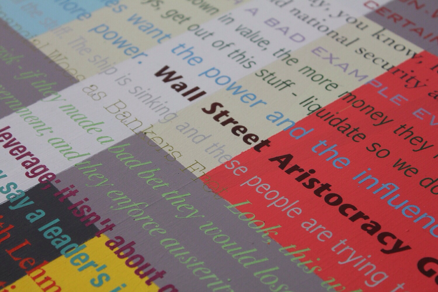
Well I also wanted it to look beautiful! I wanted every word to be leveraged, amped up, in the same way that banks had over-leveraged, borrowed too much. So different quotations are in different fonts to identify the different voices. I was using typology as a dynamic force to accentuate language, and have some fun with it as well. So something like Benjamin Gothic has an air of ambiguity or duplicity. Plus all the fonts have their own names and that becomes part of it too. I used Rockwell for heavy, pithy statements.
How did you approach the composition of each work?
I wanted to recreate the architecture of finance. So The City of London is based on diagonal stripes that echo The Gherkin, and Wall Street Aristocracy has a white line running down the middle.
I also wanted to pay tribute to the Modern art movements that I had been researching at the time. You can see nods to Malevich’s squares in works like Bad Loans, and elsewhere touches of De Stijl and Constructivism.
Once you had whittled down the text you wanted to use and worked out the composition, what was the process of actually making the paintings?
Each board is 100cm x 100cm. I primed them with gesso, then painted the grounding to map out the design and composition to correlate to the subject. Then I used laser-cut stencils and spray paint to apply the text. I wanted it to be as clean as could be, so that whatever was being said was accorded equal concentration and reverence, whether I liked it or not. So many decisions are made by machine without human interference – especially in the world of finance where all information, ultimately, is expendable. So as opposed to algorithms, I wanted to create a chiselled, hieroglyphic object – something that could make a physical, slow, concrete reference to these things.
“Art as a Derivative” is quite a provocative subtitle. What was the thinking behind that?
In addition to the economic crisis, I also wanted to make a comment about the art world – in particular the secondary market – and its close ties to the world of high finance. For a long time, for example, it’s been considered acceptable for major events to be sponsored by banks. In addition, the works themselves are derivative in that I’m deliberately taking the words of other people and making art from them: I’m overtly making use of other people’s labour. I wanted to be derivative, but also to bring something alive in a way that transforms the original.
Have things improved since you started work on the project?
I don’t think it’s a case of better or worse. Fundamentally, it’s a case of applying the law even-handedly, which has not happened. If this thing blows again, then there’s no money to bail the banks out a second time. And all the same signs are there…
Words : Tom Jeffreys
The Financial Crisis Show – Art as a Derivative is at the Hay Hill Gallery from 6th January to 1st February 2014.
