
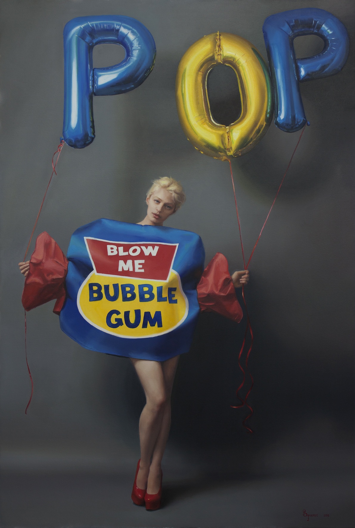
Sally Fuerst – Pop – 2013 Oil on canvas 137 x 91.4 cm
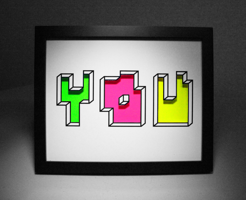
Aakash Nihalani – You 2013 Paper and layered glass 60 x 76.2 cm
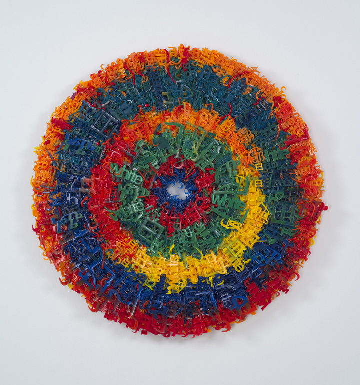
Yael Kanarek – Deeply Concentric 2013 Wood, silicone words in 9 languages 106.7 x 5.1 cm
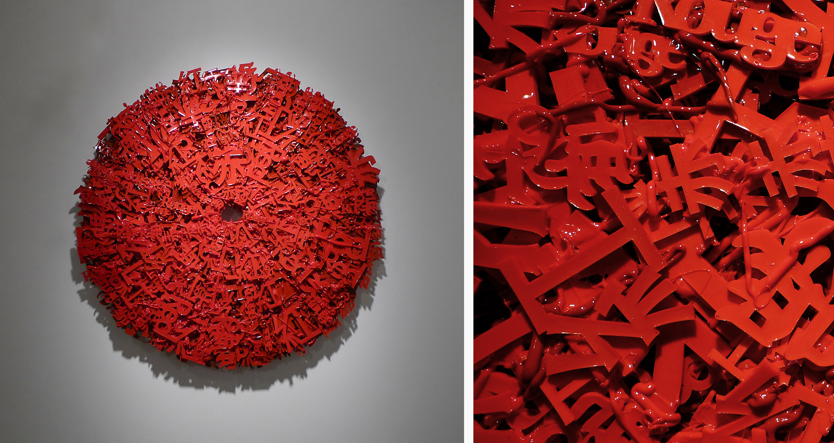
Yael Kanarek – Wavelength Range of Roughly 630-740 nm, No. 6 2011 Wood, silicone words in 5 languages 106.7 x 5.1 cm
13th December – 8th February 2014 Scream 27-28 Eastcastle Street London, W1W 8DH www.screamlondon.com
Artists:
Chris Bracey (UK), David Buckingham (USA), Sally Fuerst (USA), Meg Hitchcock (USA), James Hopkins (UK), Yael Kanarek (Israel), Greg Lamarche (USA), Morag Myerscough (UK), Aakash Nihalani (India/USA), Pakpoom Silaphan (Thailand).
“How words are understood is not told by words alone.”
Joseph Kosuth
Scream is to present Telling Tales, a group exhibition bringing together both UK and international artists whose practice incorporates words and language. As the exhibition title suggests each artist in the exhibition employs text to convey personal or discursive narratives through disparate materials including neon, found metal, collage, silicone, foam and the pages of religious texts. The act of storytelling has been an inherent part of every culture, both in oral and pictorial form, originating from Eygyptian hieroglyphs or Aboriginal cave art where symbols and pictures were painted on cave walls in order to illustrate and preserve stories for future generations. In an art historial context, with the advancements of the Industrial Revolution and the introduction of advertising, newspapers and printed material the printed word became part of the urban landscape.
In the early twentieth century artists such as Picasso, Braque and Kurt Schwitters incorporated graphics and experimented with typography, or they appropriated text from newspapers and posters. Since the evolution of Conceptual art in the 1960s, many artists turned away from the materiality and aesthetics of art-making and used text as a way of reinforcing the concept of art as idea. Artists such as Joseph Kosuth, Lawrence Weiner and the collective Art & Language utilised text in their work and it became a key component in their artistic practice. This was not an attempt to move completely away from the pictorial but it was a radical departure from the conventions of painting and what constituted a work of art. This exhibition aims to highlight the power of communication when words and image are combined and “how words are understood is not told by words alone”.
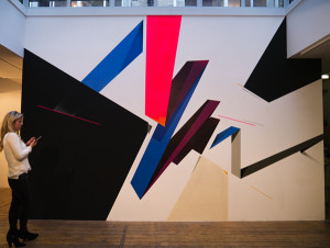
Chris Bracey has worked with neon and lights for over thirty years. He designs and fabricates ambitious free-standing and wall mounted neon works, incorporating Murano glass from Venice, and salvages old lights from fairgrounds, vintage signs and film props that transcend what is possible with light. Bracey’s father (originally a miner from Wales) came to London and became a neon sign-maker, predominantly for fairgrounds and amusement arcades. Chris learnt how to manufacture and design the neon signs at an early age. Inspired by the vibrancy and kitsch character of the Soho area during the 1970s, Bracey was confident that his designs for the signs would bring a fresh sense of glamour and intrigue to the area. Bracey had the autonomy to explore the possibilities of what could be done with neon and this has led to installations for films, commercial projects and his first UK gallery exhibition. Bracey’s works are imbued with strong biographical references and he quotes Welsh poet Dylan Thomas in his new work “Light Breaks Where No Sun Shines” which has a particular resonance with his upbringing in Wales and his father’s journey out of the dark of the mines and into the neon light.
David Buckingham uses found metal as his artistic medium. The making of his sculptures and wall reliefs are a profound journey of discovery and adventure. Sheet metal is scavenged from abandoned cars and trucks and other machinery that Buckingham finds in the Californian desert. Buckingham’s artistic philosophy is to challenge, humour and create work that has a universal appeal. Buckingham welds the colourful panels of metal into text quoting recognisable lines from popular culture. Buckingham’s previous career as a professional writer infiltrates his work with the use of text and language as a powerful mode of communication. Buckingham wants the viewer to react and interact with his work. Imbued with irony, humour, political angst and the physical signs of wear and tear, Buckingham’s work “absorbs, muses upon, mirrors, and upends the public language of his country, chewing on the word-image of Pop art and the imaged words of the Internet and spitting them out as profane illuminations, banners of defiance and provocation, calls to arms and calls to a peaceable future.”
Sally Fuerst’s paintings skillfully combine the contemporary with the classical, having trained at the Florence Academy of Art in Italy studying the figure and acquiring the traditional techniques of drawing and painting the human form. Inspired by popular culture and appropriating the style of fashion photography, Fuerst meticulously paints images of beautiful and confident women and provides a fresh interpretation of contemporary portraiture. These empowered women are often dressed in playful fancy-dress costumes such as a bubblegum wrapper as seen in the work ‘POP’, or posing with props such as balloons, seen in the two new works Fuerst has produced for this exhibition. These works clearly demonstrate her photo-realist talent in oil painting and incorporate text balloons which add humour and elevate the lexicon of mobile phone ‘text speak’, evident in the work ‘YOLO’ (You Only Live Once), to the high realms of fine art painting which capture a defining aspect of contemporary culture.
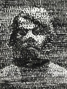
Meg Hitchcock’s practice is concerned with sacred texts and the idea that all spiritual traditions and values derive from the same source. Working in a range of scales Hitchcock meticulously hand-cuts the letters from one religious text, such as the Bible, and combines this with letters from another, such as the Quran, and painstakingly reconfigures these letters into Mandala-like configurations, or branches or maze-like compositions. The words recreate popular hymns, prayers or exerts from a variety of sacred texts but the emphasis is not to represent or focus on a particular faith. In these works Hitchcock’s labour-intensive process is almost an act of meditation and self-discipline itself but in these works she suggests that all faiths are connected and the human condition is one that is shared and understood universally.
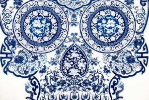
Yael Kanarek’s creative practice investigates language and numerals and how these define our reality. She is interested in the shift from analog to digital and in the works presented in the exhibition, this idea of sound-bites and information overload is clearly demonstrated. Using words hand-cast in silicone Kanarek builds these up layer upon layer to create a densely worked wall relief which consists of a particular word, such as ‘white’ seen in the work ‘Deeply Concentric’. The word ‘white’ has been translated into nine different languages and layered and arranged in multi-coloured concentric circles, influenced by a small work on paper by Kandinksky which was used as an advertisment for New York’s Museum of Modern Art in 1913. Kanarek explores the dichotomy of the hand-made versus the industrial, art versus advertising and she addresses notions of multilingualism, authorship and the global reach of language and symbols in our digital age.
Inspired by the dynamism of his native New York City and its role as an incubator of the outlaw art of graffiti, Greg Lamarche’s collages combine the city’s relentless rhythm and graffiti’s aggressive presence to express the power, elegance and rebelliousness of urban creativity. Using found materials and commercially printed papers from his vast collection of vintage printed matter, Lamarche abstracts graffiti’s visual language, playing with a profusion of font styles, word fragments, multiple layers, bold colors, rhythmic repetition, multiple perspective and movement. Each unique work of precisely hand-cut paper thus becomes an inter-play of the directness of graphic design and the aesthetics of fine art.
Aakash Nihalani is a multi-disciplinary artist working with tape, plastic, steel and wood to present geometric symbols and text that re-define and highlight the environment we inhabit. Nihalani’s practice originated on the streets of New York where he created isometric rectangles and squares made of tape which animated the familiar surroundings. Nihalani’s approach is playful and democratic – using identifiable words, shapes and symbols he alters the viewer’s perception of space and offers a momentary escape from the conventional urban landscape and gallery surroundings. Nihalani comments “My work is created in reaction to what we readily encounter in our lives…I’m just connecting the dots differently to make my own picture. Others need to see that they can create too, connecting their own dots”.
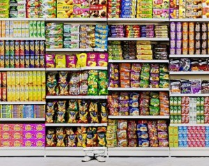
Pakpoom Silaphan’s (Thailand) practice examines notions of globalisation and the universal reach of cultural icons and symbols. Silaphan collected old metal Coca-Cola and Pepsi advertising signs during his time in Thailand and he uses these as his canvas. These trademark logos are recognized all over the world, irrespective of the Thai text, and demonstrates the power and global reach of these superbrands, even when translated into another language. Silaphan re-works these signs to open a discourse on the effects of advertising and mass consumerism and creates an engaging dialogue between the relationship between East and West, and the universal language and reach of signs and symbols. Using his favoured artistic and cultural icons he collages and paints over these advertising signs, implying the artists’ identity as a recognised global brand itself. The iconic graphics of these soda brands embody the consumerist, mass-market, brand-driven culture that Warhol was preoccupied with in the 1960s. These signs are fraught with marks of wear and tear, with textured rust and holes. The evidence of decay questions the success and legacy of the Capitalist dream.
The philosopher Ludwig Wittgenstein stated that “to understand a language is to understand a way of life”. Whether single words, phrases or specific vernaculars are used each artist uses this linguistic imagery to convey a multitude of ideas and interpretations that communicate directly about contemporary culture and the world we live in.