With the morning’s hot sun scheduled to give way to heavy rains in the afternoon, the wellies get their first airing of the vernissage, as we make our way back to the Giardini for some unfinished business. But on the way, we got a little side-tracked by some of the collateral exhibitions, with mixed results…
Crystal Bennes and Tom Jeffreys
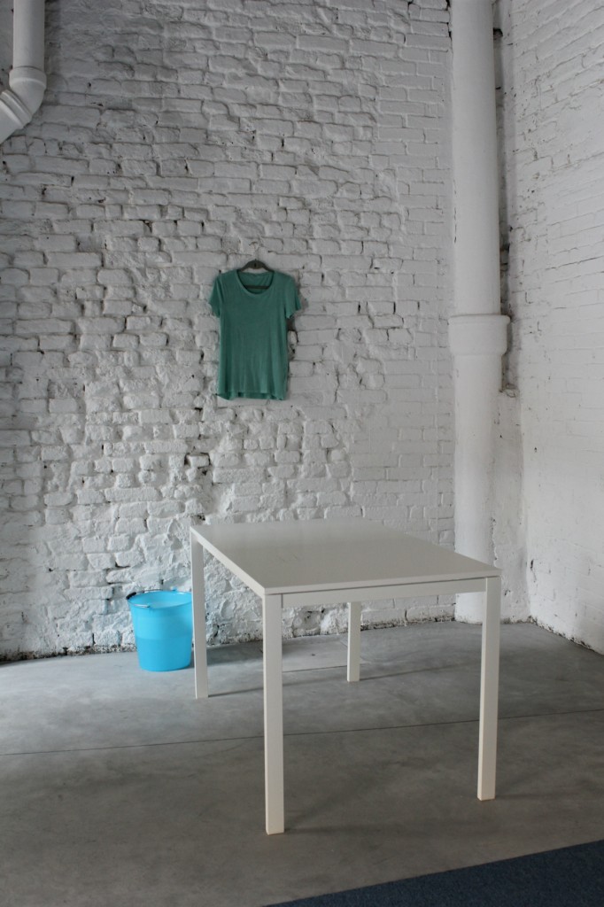
Tom: First up is Lee Kit’s work in the Hong Kong pavilion, situated just outside the entrance to the Giardini. I loved this! Towels, wash-basins, ironing and a scrupulously hoovered carpet: all exhibited in a precise palette of calming blues and greys, with a clinical sense of order and OCD levels of cleanliness. One video in particular stands out, with the artist pointlessly maneuvering little paper pellets around on a white table cloth (five white, one dark blue) – pointless, but pointless with precision and purpose.
Crystal: I wasn’t as crazy about the HK exhibition as you were, but I did love the catalogue they produced. What a stunner! I want to rip all the pages out and hang them on my wall. Where’d we go after that? I can’t remember.
Tom: Wales.
Crystal: Wales, of course. Well, I was super looking forward to this one, partly because they haven’t had a pavilion at the VB in 10 years, and because, well, I rather like Wales. Also, astronomy is rad and I was looking forward to seeing what Bedwyr Williams made of his chosen subject. Sadly, though the show was ambitious in size and sale, I didn’t really feel that Williams had anything interesting to say about his subject.
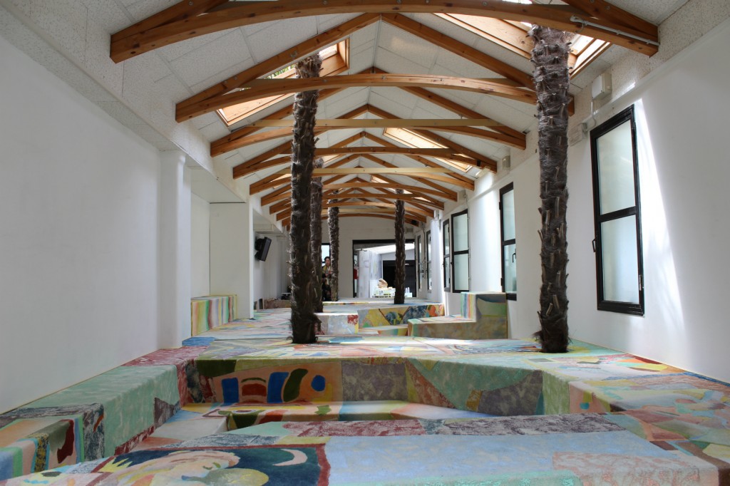
Tom: I know, right. What the sound of a man crying in a large model of an observatory actually has to do with astronomy, I know not. On the way out though, we spotted just across the canal a small exhibition with an unconvincing name. IF A DandeLION COULD TALK features work by a group of 1970s Italian artists who worked together under the collective name Sigma 1, and the exhibition – curated by Adina Drinceanu – looks at the relationship between systems of meaning and the natural world; whether or not, say, geometry is ingrained in nature or imposed upon it. I thought this was super interesting, although I would have liked to see some contemporary work in there too. Just yards away were the Maldives pavilion (which reminded me of a Geography GCSE project, and not in a good way); Whitney McVeigh’s installation of study clutter, curated by James Putnam (one of the driving forces in the current Victoriana/anthropology/artefacts/dusty museum aesthetic); and, of course, Palazzo Peckham, jointly conceived by Hannah Barry and Ollie Hogan, a member of LuckyPDF.
Crystal: Oh yes, the Peckham Palazzo. Where do I even begin with this one? It’s quite tricky to unpack because on the one hand, I actually like the attitude of so many of the Peckham spaces even though I don’t always like the actual work they’re showing. On the other hand, there’s Hannah Barry. Obviously, so much of what’s happened in Peckham has happened because of Barry, but there’s something really jarring about the hyper-commercial energies of what she’s doing (a second gallery on Bond St; Bloomberg as sponsors) and the slightly anarchic edge of the work of most of the other Peckham spaces (who, strangely, seem more than happy to ride on Barry’s coat tails). Leaving the socio-politics aside for the moment, as far as I can tell, Palazzo Peckham is just a place for the Peckham crew to hang out in Venice. And you know, what Venice really needs, is another place for people to sit and hang out and get boozy – I mean, the entire city is one enormous living room! What gives? As for the work, well, what work, really? It’s essentially artists doing variations on wallpaper. Needless to say, I didn’t love it.
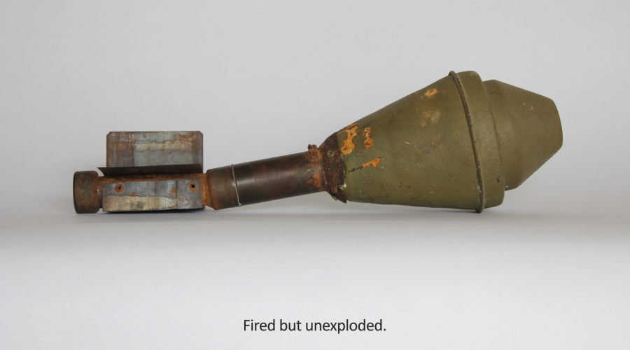
Tom: Yeah I found it all mildly irritating too, but then maybe it’s because we only had five minutes to whizz round before they held some big private lunch for the more important people. Oh well… Once back inside the Giardini, there were some great things to be seen in the Pavilions. We both liked Zsolt Asztalos’ Fired But Not Exploded works for the Hungary pavilion.
Crystal: Yeah, they looked great, I thought. Essentially a series of TVs set on the ground showing films of different bombs which were dropped but didn’t explode. It was all nicely framed around the tension created by these weapons which hadn’t worked but which still resonated with the latent power of their potentially destructive force. I heard that the artist had originally wanted to exhibit the bombs themselves, but that he – quite understandably – couldn’t get permission.
Tom: Quite right, too! After that, I think we were both completely baffled by Mathias Poledna’s retro Disney short film in the Austrian pavilion. I mean, what was the point? But I liked Odires Mlászho’s manipulated books in the Brazil pavilion, and Khaled Zaki’s sculptural pieces for Egypt were kind of cool in the dimmed light, but predictable in an Henry-Moore-does-the-Pharaohs kind of way.
Crystal: I hated those books! Boooooooring. But dictionaries were definitely the inspiration-du-jour; I saw them in at least three different pavilions.
Tom: Not as much as pigeons. Pigeons were everywhere! In that DandeLION show, in the Czech pavilion, in Bosnia and Herzegovina… Clearly artists love them some pigeons.
Crystal: Ha! Strange that I didn’t clock the pigeons. Definitely in agreement with you on Austria though. I watched all 3 minutes of the damn thing, which I found completely baffling. A pastiche copy of Disney-style film animation. I haven’t the slightest idea what this was about, or even why it was made. Really, truly incomprehensible.
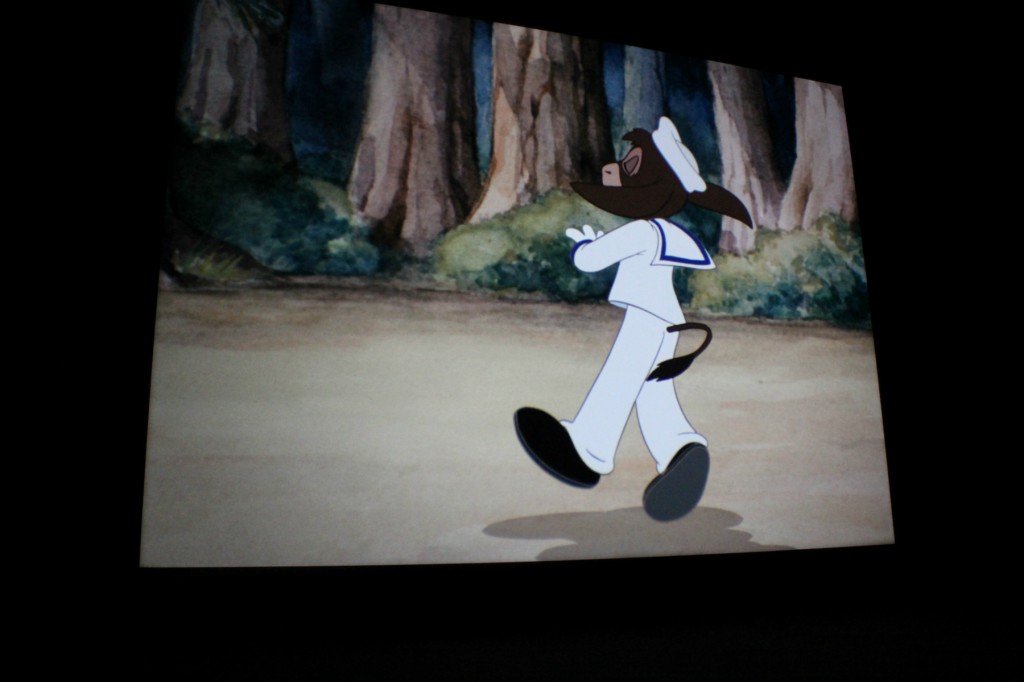
Austria still from Mathias Poledna film
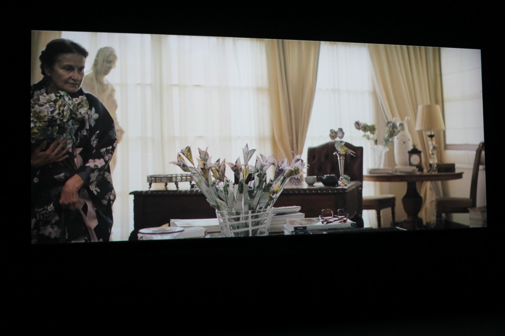
Tom: But I think we agreed that it was Greece who really stole the show in the Giardini, with a three-part series of short films exploring economies of exchange. Each film centred on a separate character – a bin-diver, a black-clad contemporary artist, and a senile old collector – and the three intertwined with wit, intelligence and a rare knack for the surprising.
Crystal: Seriously, I loved this. Huge props to Stefanos Tsivopoulos for this project. I thought it was so elegantly done – so many conceptual artists have failed to realise that subtlety can often be far more convincing and powerful in making a point than shock value. The three films were beautifully constructed, moving and funny and so satisfyingly woven together. It was great to see an artist with a serious point to make – about the role of money in how we value and construct relationships, to each other and to society – come at it in such a unique fashion. This was one of my faves across the whole Biennale.
Tom: From here it was into Part II of The Encyclopaedic Palace, in which the exhibition’s concept begins to try my patience. There was lots to like – namely Achilles Rizzoli’s 1930s tower designs; Uri Aran’s “bureaucratic formalism”; Marisa Mertz’ rust-hued mixed media drawings; a cruciform display of semi-precious stones; and Thierry De Cordier’s sea paintings – but in the end, it becomes tiresome. An entire room of crude clay figures on plinths, Levi Fisher Ames’ animal models, shamanic drawings collected by anthropologist Hugo A Bernatzik: it simply becomes too much, and the exhibition’s apparently broad theme – encyclopaedic, no less – begins to seem very narrow indeed.

Levi Fisher Ames’ animal models
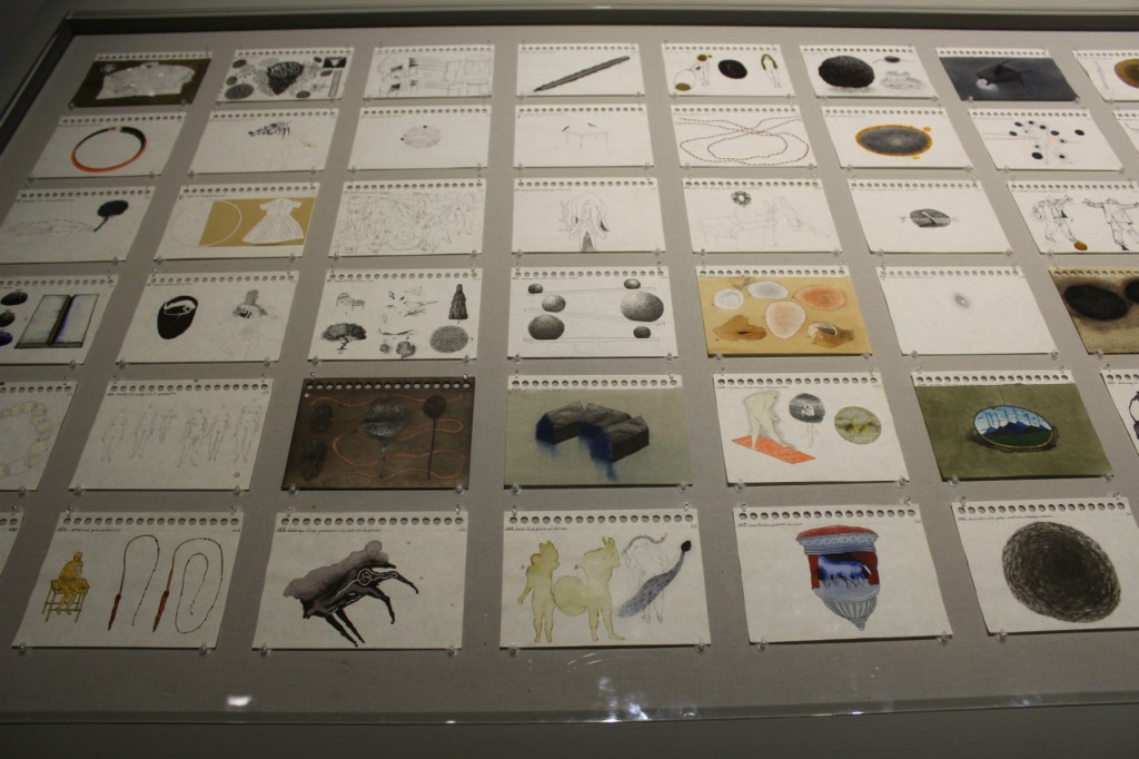
Crystal: Amen! I was already bored of the anthropological approach after the first part of Gonti’s exhibition yesterday in the Arsenale, so I wasn’t thrilled to see more of the same in the Giardini. I really didn’t get on with much in here – looking through my many photos of the Biennale, there are only three from inside the Giardini main pavilion, a damming indictment if any! Those pictures are of work by Colombian artist, José Antonia Suárez Londoño, long vitrines filled with pages torn from sketchbooks. The drawings on each page were inspired by the artist’s close engagement with numerous texts, from Ovid’s Metamorphoses to the diaries of Eugene Delacroix.
Tom: Trust you to pick those out…
Crystal: Well they are two of my favourite books! And the works actually provided engaging little insights into the mind of a prolific and intelligent artist. Even though they were only sketches, for me they stood out in room after room of a concept dragged out too long. The biggest problem with the anthropological approach is that, not only do we miss the sense of the contemporary, but also there’s no quality control – there’s only so many soft porn cartoons drawn by a 14-year old boy, or graphic, disturbed paintings by an abused woman one can look at before it all washes over you.
Tom: But the day finished on a high. After some typically sub-standard Venetian food with some entertaining antipodean chums, we strolled back along the Strada Nuova to our hotel, popping into a number of openings en route. It was an evening of paintings for me, as Guan Jingjing’s Remnant Mountain and Zhang Fan’s Xishan Forest Springwater stood out at Confronting Anitya in Palazzo Michiel; and then, a little later, Mao Zhi’s colossal abstract triptych, Lotus-20110801, was the highlight of the clumsily entitled Culture World Becoming.
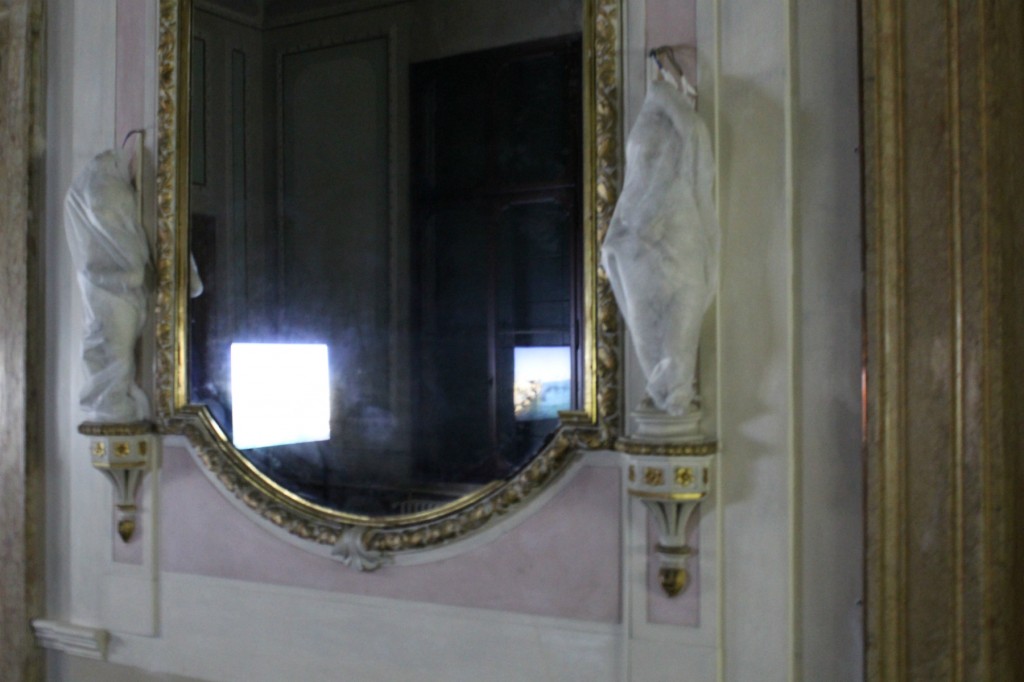
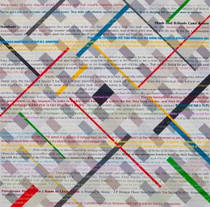
Crystal: Indeed, there were a few nice little surprises, even some laughs, in amongst the rubbish! I loved seeing the cupids in the palazzo hosting the Kuwaiti pavilion wrapped up to “preserve their modesty”, a woman told us in a conspiratorial whisper. In Confronting Anitya, You Liangcheng had a cracking painting called Mosaic Landscapes – a series of tiny green squares overlaid on a beautiful Chinese landscape scroll painting. I would have been quite happy to roll it up and put it in my suitcase. And that’s certainly not an experience I’ve ever had at the Venice Biennale before.
green squares by you liangcheng
Day 3 tomorrow!
Tom Jeffreys is an art critic and occasional curator. He is the Editor of the Journal of Wild Culture, an online magazine exploring the intersection between nature and culture.
Dr Crystal Bennes is a writer, curator, maker and cross-pollinator. She is the Co-Editor of Pages Of Magazine and a Contributing Editor at Icon Magazine and Domus.
