
I met Bisa Bulter at the 2019 Expo Art Fair in Chicago, IL. Her bright-toned quilts caught my eye from across the venue and I had so many questions, and emotions, but overall warmth. Speaking with Bisa felt similar to looking at her quilts, comforting and intuitive. The latest exhibition by Bisa Bulter, The Storm, the Whirlwind and the Earthquake at Claire Oliver Gallery until April 25th, 2020 presents large-scaled quilted portraits in which Bisa and I discuss in further detail from the color selection process to the history behind her figures.
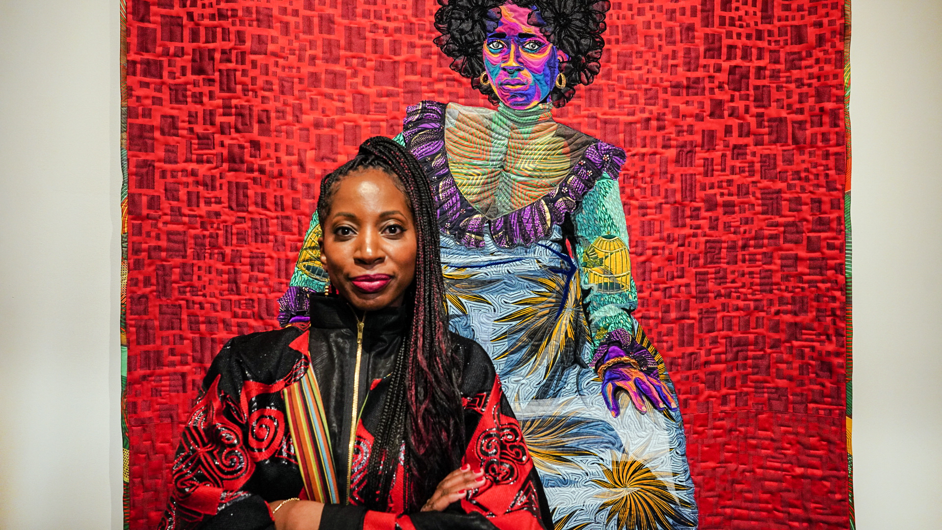
Bisa Bulter and Asantewa, Cotton, silk, wool and velvet quilted and appliqué | 52 x 88 x 2 in | 132.1 x 223.5 x 5.1 cm 2020 | Courtesy of Claire Oliver Gallery.
What is the color psychology behind your depictions of African-Americans figures in your latest show?
I studied color theory in undergrad and grad school so I am by no means the first person to associate color with emotion. I read about artists such as Picasso and how he used color to depict emotion in his blue and rose periods. Jazz artists like Miles Davis used color to create vivid musical compositions during his blue period. Colors like red and deep pink are associated with passion, love, power, and anger. When we are passionate our hearts beat faster, when angry it is said that they, we “ see red”. Indeed in times of high emotion, our faces flush. I use red and pink to communicate these passionate emotions.
Yellow and shades of orange represent the sun and happy feelings of warmth. Blue can be used for somber feelings, feeling blue, or even relaxed depending on the shade. Green is a color associated with vitality, life, and growth.
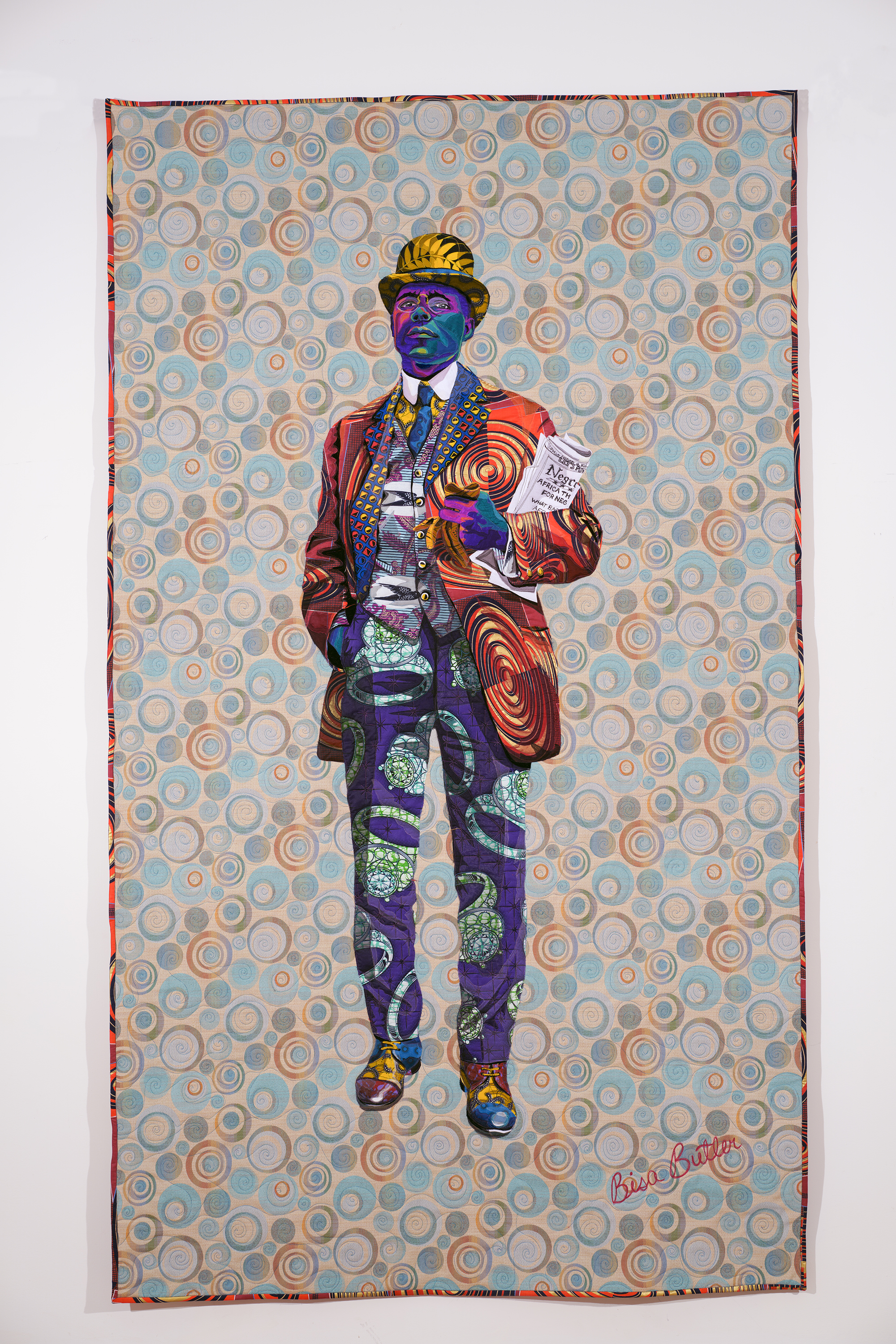
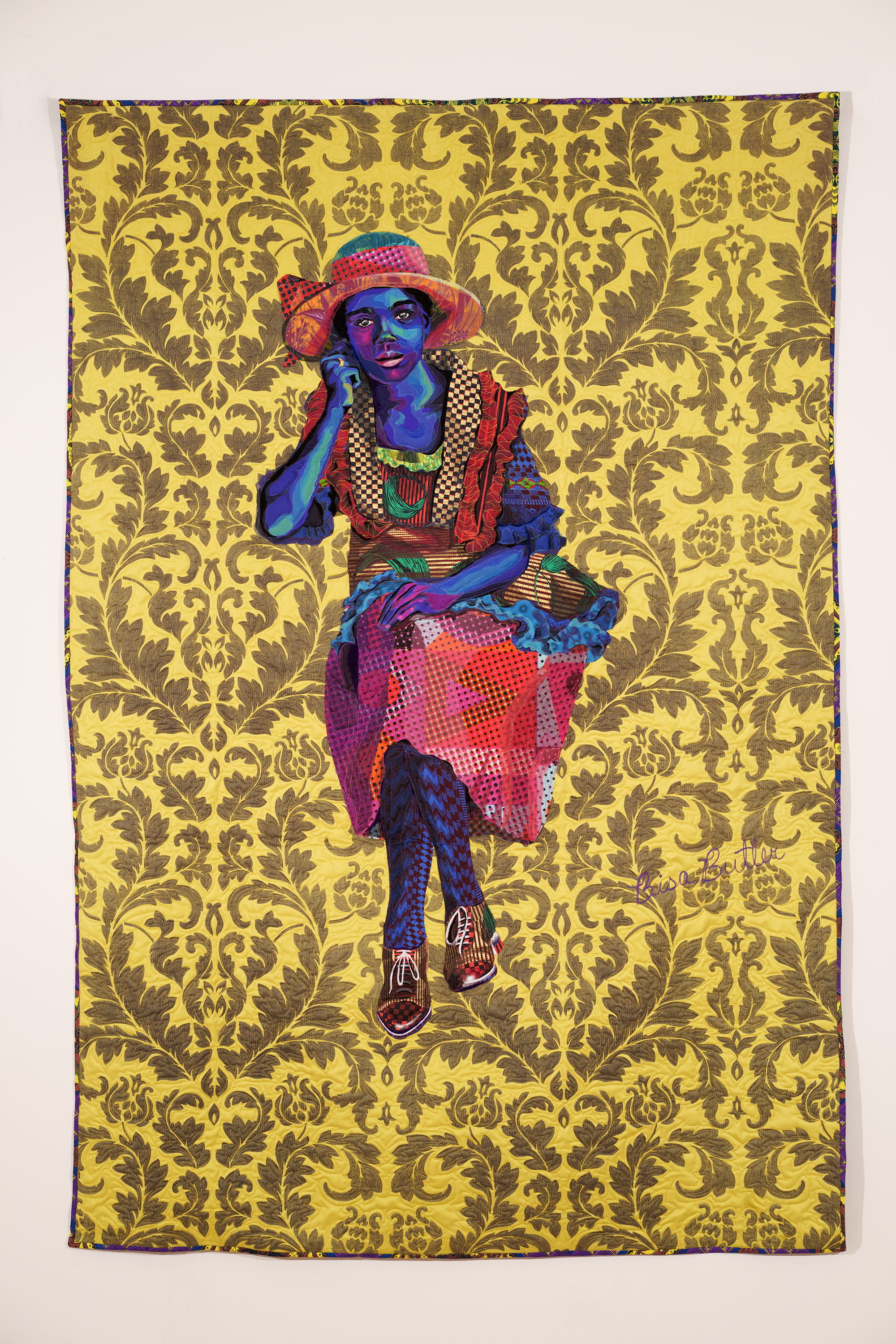
Africa The Land Of Hope and Promise For Negro People’s of the World , Cotton, silk, wool and velvet quilted and appliqué | 52 x 88 x 2 in | 132.1 x 223.5 x 5.1 cm |2020 Courtesy of Claire Oliver Gallery.
The African American community has always used colorful language to describe our complexions. A person with very light skin is called yellow, or red boned if they blush easily. A very dark-skinned person can be referred to as blue-black.
I use color to communicate emotion but also to speak to the African American tradition of using rainbow toned colors to describe complexions. Many of the names used to categorize African American complexions were used to determine a person’s lightness or darkness during the slave era. If an enslaved person was of a lighter complexion they were most likely a child or relative of the Masters and slavers— that person would be privy to an easier job and a more comfortable living condition. Light skin became a signifier of a less brutal existence although that many time wasn’t true. I create my figures in a myriad of tones to deliberately blur that line from light to dark. My figures must be understood on their own but not in terms of light or dark. The colorful tones I use to speak more about emotion than actual complexions. Unfortunately, some people still value light skin over dark skin and I refuse to play into that with my figures.
Your work heightens multiple sensory elements of the viewer in regards to texture, color, and space, what is your goal for people viewing your work to feel?
When I create an artwork and choose certain colors I want the viewer to be able to relate to the subject. I want them to be able to recognize the kinship of humanity and all of its facets; happiness, suffering, pride, joy, disappointment… We are all multi-layered and I want the viewer to be able to ascertain that just by observing one of my artworks. I chose to create a portrait of a young Frederick Douglass in my new series that is currently on display at the Claire Oliver Gallery in Harlem. Frederick Douglass was known as the most photographed man of his era- black or white. He chose to publicize his image to show people that African Americans could be educated, were humans and indeed had souls— unfortunately, this was not widely understood in the Antebellum era. In the many photos I saw of him he was dapper, wearing silk brocade vests and elaborately tied cravats. He was a man whose white mistress secretly began to teach him to read and after she refused to continue he taught himself. He escaped from slavery by forging free papers and riding a train right into New York City! I realized that this man had so much more depth than I had even previously realized and knew that I had to use multiple layers in order to capture his direct and challenging stare. I use layers of silk chiffon, dupioni, wool, lace and velvet to try and capture the minute expressions on his face.
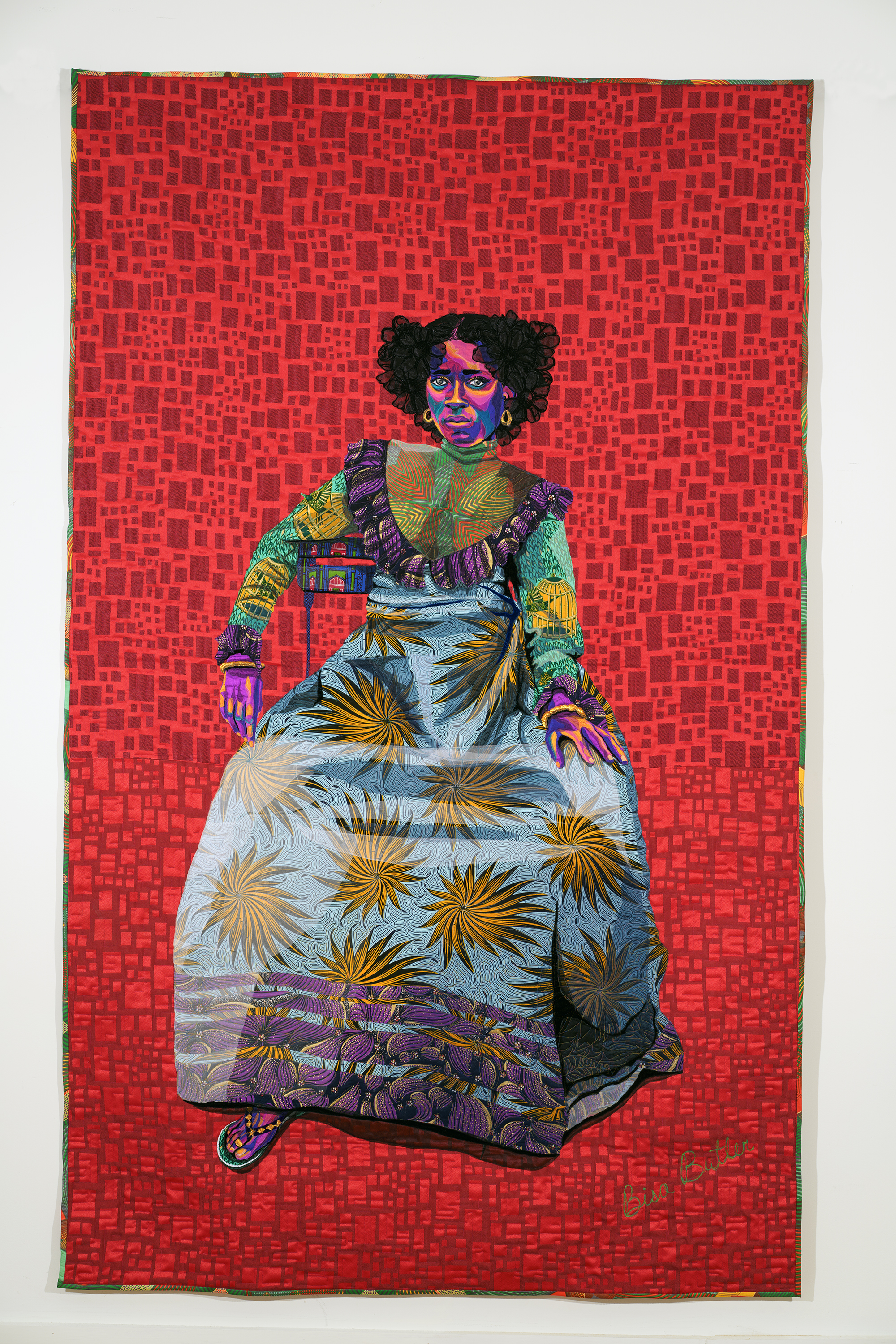
Asantewa, Cotton, silk, wool and velvet quilted and appliqué |52 x 88 x 2 in | 132.1 x 223.5 x 5.1 cm |2020 Courtesy of Claire Oliver Gallery.
All of my figures are life-sized because I want the viewer to look eye to eye with my subjects. I am trying to level the playing field between subject and viewer, past and present, black and white, living and deceased. I want my subjects to be acknowledged and respected as we all want to be. Most of my source images are taken from documentary photos from 1880-1940. The people are not identified nor did many of them ever see their photos in their lifetimes. I want them to get the respect they should’ve gotten in the first place.
You usually start your portraits with a black and white image, what is your color selection process?
My color selection process is organic and done in real-time. I sit with the image for a while when I’m creating my sketch. I am sketching while looking at a black and white photo so my mind is forced to come up with its own color scheme. The colors I choose to support the narrative I am trying to tell about the subject. The colors I choose support the emotion I observe and feel. I try to tap into the actual essence of the subject and try to listen to what my heart is telling me about them.
Your quilts often show an enlightened perspective of the figures you portray what images or artist do you look to for inspiration that helped you create this vision in your work?
I have been told that I have an enlightened perspective of my subjects—– some people even go so far as to say I elevate them but I don’t think this is quite true. I portray my subjects the way that I see them. I believe in humanity, in us. If you have a positive perspective of all people then there is good to be captured. I started making portraits of my loved ones and I extended that love to all of my respective subjects. I adopted this philosophy towards humanity when I was a high school art teacher. Teachers have to believe in all of their students, and the ones who present the most issues are usually the ones who have the most need for attention, direction, and understanding. I choose my portrait subjects because something about the source photo calls to me and I am compelled to create a quilted image. I see something in them that I find beautiful and I am just amplifying that for the world to see.
My professors at Howard University were mainly associated with the AfriCOBRA collective of artists. AfriCOBRA (African Commune of Bad and Relevant Artists) was formed in 1968 in the southside of Chicago. They had a specific manifesto that defined a Black aesthetic and wanted their art to be in service to the Black liberation movements. One of the founders, Barbara Jones Hogu states “ Our art must communicate to its viewer a statement of truth, of action, of education” (Wikipedia ). My professors impressed upon us that we should make art that made African American feels proud and uplifted. I still use that philosophy today but perhaps more broadly I want all people to feel elevated when they see my work.
Artists who I look to for inspiration are Faith Ringgold, Romare Bearden, Swoon, Elizabeth Catlett, Amy Sherald, and Kehinde Wiley.
Quilts have a long history in this country, how have you repurposed the usage of quilts and viewpoints of its associations with race, economics, and usage?
When African Americans first started making quilts they were made for the people who enslaved them. Enslaved people (mostly women) who were particularly skilled would make masterful and complicated quilts for their owners beds. The quilts these enslaved people could make for themselves were often done with the leftover fabrics, and scraps although a rare few were allowed to make beautiful quilts for themselves. The quilts the African Americans made for themselves could be used or sold but were thought of as utilitarian objects and not works of art all the way up to our present-day depending on who is asking. The work of women and particularly African American women were not thought of as fine art.
When I visited the touring exhibition of the Quilts of Gees Bend back in 2002 I had an epiphany. I saw these beautiful quilts large, colorful and commanding hanging on the walls of some of the finest museums in the country. At the time I had no idea that the women were not being equally compensated for their work. I saw my future. I thought to myself “ if these women can live their lives as professional quilters and fine artists, then so can I.” I remember walking around the exhibit reading and memorizing the names of the artists and committing to memory what they were quoted as saying about their quilts. After that, I set out doing my best to establish myself as a fine art quilter. I had no idea that there were some people who would try to limit the expansion of the artistic definition of African American quilters— or any quilters at all. I studied art and received a BFA and a BA and applied my artistic education to the medium of quilts.
You quilts often are complied with white thread, this allows the viewer to see the silhouette of each figure, what is your purpose behind these two elements?
I actually sew with all different colors of thread. It may appear white in some images but it rarely is. Sometimes I sew with a contrasting color of thread so that my stitches are more prominent and almost become like sketch lines. If I want to show a texture like the kinks and curls of African American hair I will use a thread that stands out prominently. If I am stitching a face I may use thread that blends in with the colors of the face in order to have it fade away more. If I am stitching the unlined forehead of a young boy I may not want prominent lines going across it so the thread should match and blend.
Daughter Of The Dust, Cotton, silk, wool and velvet quilted and appliqué|58 x 83 x 2 in | 147.3 x 210.8 x 5.1 cm |2020 Courtesy of Claire Oliver Gallery.
What is upcoming in 2020?
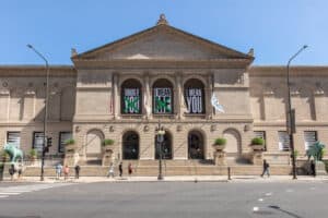
Currently, I have an exhibition called The Storm, The Whirlwind, and The Earthquake that features seven of my newest pieces. This exhibition will be up at the Claire Oliver Gallery in Harlem until April 25th. My first solo museum exhibition, Bisa Butler: Portraits opens at the Katonah Museum in Westchester, NY March 17th and will hang until June 14th. The museum exhibition will feature 25 of my quilted portraits from the first one I ever made into more recent works made last fall. Bisa Butler: Portraits will then travel to the Art Institute of Chicago on September 5th- January 2021.
The Storm, the Whirlwind and the Earthquake at Claire Oliver Gallery until April 25th, 2020, 2288 Adam Clayton Powell Jr. Boulevard, New York, NY 10030. @claireolivergallery