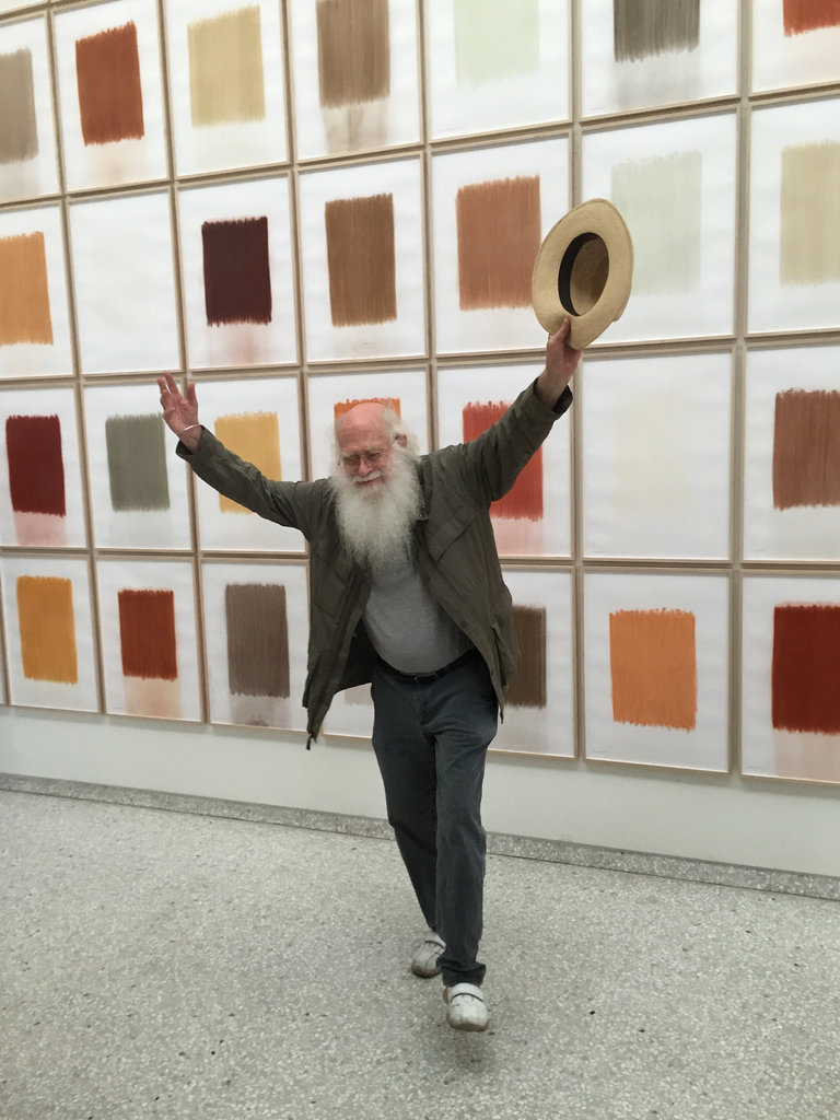
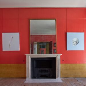
The determinedly lower case herman de vries takes the plaudits for his display of different soil types at the Netherlands Pavilion
Visiting Venice last week, I wondered: what’s the best way to make a bad pavilion at the Biennale? Enough nations succeed to make me feel they probably don’t need my advice, but there are several reliable tactics available. First, try too hard to say something important. That’s often flagged in the title: I feared the worst for ‘The Violent Necessity for the Embodied Presence of Hope’, and I was right. Second, stretch limited artistic resources too thinly, for example through a group show requiring more good artists than a small nation is likely to have without repeating former entries: Guatamala and the UAAE were among the strong performers here. Third, present shocking content without making the necessity apparent. Why did the main work at the Estonian Pavilion, which was taking a stand against the persecution of homosexuals, consist almost entirely of one man urinating into another man’s mouth? Fourth, bungle the information: you might make the press release long and indigestible, omit it all together, or – as in one case – claim there are five works even though, by October, you’ve known for five months that one work was withdrawn at the last minute. In conclusion, there’s no need to make bad art to make a bad pavilion, though it does of course help, and many of the above used that as a back-up method. As for Australia, Cyprus, the Netherlands, India-Pakistan (jointly) and the Czech Republic – perhaps they did need my advice, as they were among those who avoided all those mistakes and made excellent presentations, two of which I’ve chosen to illustrate..
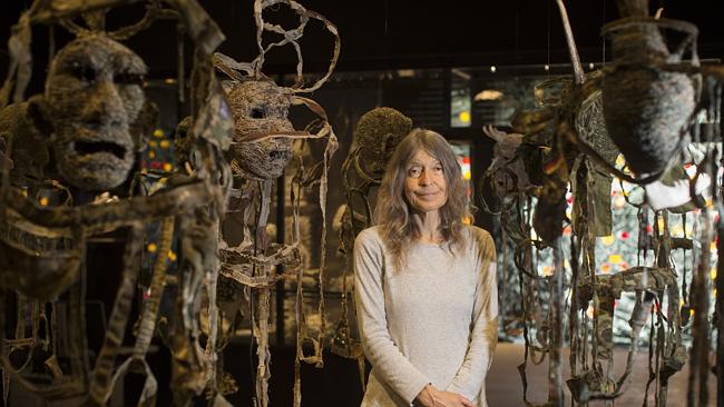
Fiona Hall in her exhibition Wrong Way Time for Australia
Most days art Critic Paul Carey-Kent spends hours on the train, traveling between his home in Southampton and his day job in London. Could he, we asked, jot down whatever came into his head?
