A folder sits on most small stores’ desktops that nobody looks at twice. 20–30 product photos, all shot clean, all approved, all doing nothing.
Meanwhile, the store’s social feed goes quiet for weeks, because the assumption is always the same: “ promo video means a reshoot”. And a reshoot means a crew, and nobody has time for either.
That assumption is wrong.
A catalog shot is already a locked-off frame, already lit the way it should be, already good enough to sell on a listing page. Motion is the only thing it’s missing.
The trickiest part usually isn’t the product itself; it’s whatever makes that product hard to photograph in the first place.
Glass, reflective packaging, anything with a curved label. The same qualities that make it look premium in a still shot are exactly what fight back once you try to move it.
Why your catalog already has what a promo reel needs
- Depth cues are already there. Shadow falloff and perspective convergence give a system something to read as “depth”. A three-quarter shot has both. A flat front-on shot has neither, so any push or parallax applied to it looks pasted on instead of dimensional.
- Edge separation makes isolation possible. Clean product-to-background contrast lets a system separate the subject from its background and move them independently. Catalog shots on white or a soft gradient clear this by default, since it’s already a listing requirement.
- None of it matters if the first frame doesn’t hook. A viewer decides whether to keep watching inside the first second and a half, before depth or edge quality even registers consciously. Everything technical in the first 2 points exists to make that opening frame look intentional instead of cheap, which is the actual thing deciding a scroll-past versus a watch-through.
The 4-shot spine: the order and pacing a promo reel actually runs on
A “spine” here just means the 4 shots every reel needs, and the order they need to appear in. Not every catalog shot earns a place in it.
For instance, a flat lay with no shadow or edge separation reads as flat once animated, because there was no depth there to begin with. A stretched-up low-resolution thumbnail shows its seams within a few seconds of movement.
Therefore, the shots that survive have some natural depth and a clean edge already built in.
A working reel runs 8 to 15 seconds, so every beat has to earn its place:
- Recognition, first, always. Even when the detail shot is the more striking image. Most small-store reels fail here, leading with a slick macro before the viewer knows what they’re looking at. Establish the object before you zoom into it.
- Detail, second. Once the viewer knows what the product is, give them a reason to look closer. Show the texture, the material, the finish, or whatever small detail makes the product worth a second glance.
- Context, third. The product alongside its packaging, on a shelf, or in use. This is where it earns believability, not just recognition.
- Action, last. Usually the CTA frame, held longer than instinct says, around two seconds. Middle beats move fast, 0.8 to 1.2 seconds each, but the opening hook and closing hold are what people remember.

A slow push into a static photo reads as intentional. A fast one reads cheap. Restraint reads as premium more often than movement does.
Before any of this gets generated, it gets sorted.
Hands-on Test: Running real product catalog images through it
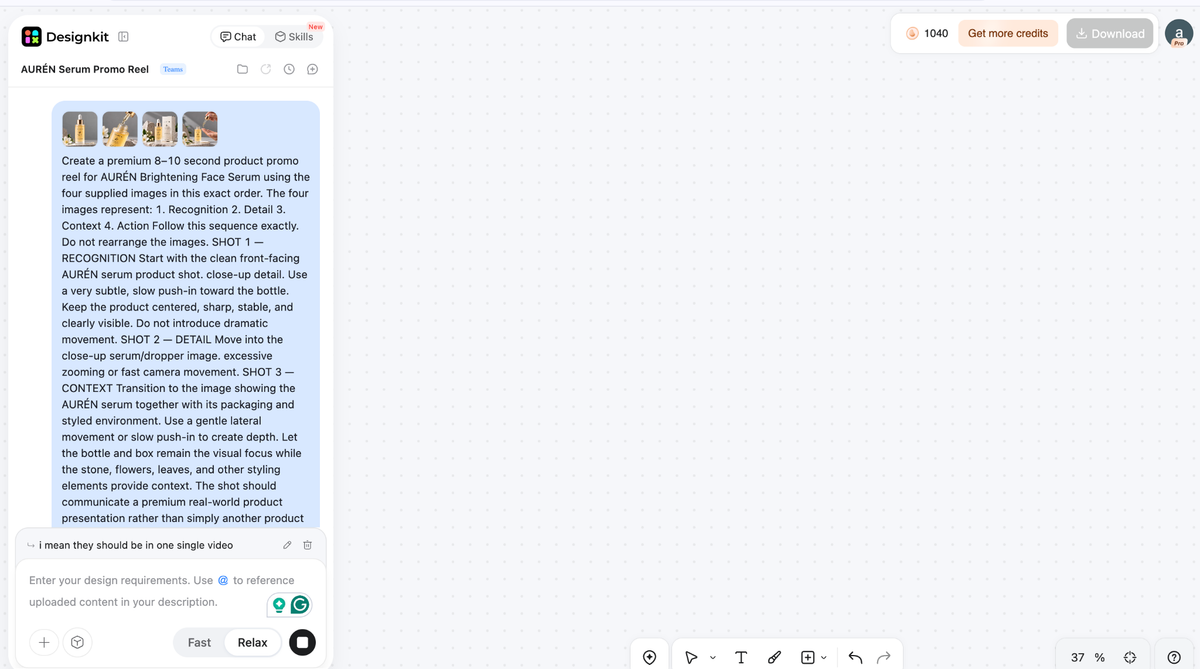
Pull the catalog photos into the 4 piles above, drop anything that fails the depth or edge test, and lock the order and rough timing first. Then run the selected set through Designkit:
Step 1: Upload the four shots and the information that sells them.
Begin with the most recognizable image, followed by the detail and context images, and finally end with the action/CTA image. Use high-resolution images instead of screenshots and compressed images.
Alongside the images, give the generator the product name and the few selling points the reel actually needs: the main benefit, an important ingredient or feature, and any genuine offer.
Don’t paste the whole product description in and hope the tool finds the message for you.
The point is to give it enough context to build around the product without handing it a paragraph of marketing copy.
Step 2: Generate the first draft.
Use the product video generator to turn those images and selling points into the initial sequence. The first pass should establish the product before moving into the detail and context shots, rather than treating every uploaded image as an equal beat.
Step 3: Watch the draft for the things a still image can’t hide.
Check whether the product remains recognizable as it moves, whether edges stay clean, and whether the pacing still follows recognition ? detail ? context ? action. A smooth animation can still be wrong if it spends too long on a secondary shot or reaches the CTA before the viewer understands the product.

Step 4: Fix the weak beats.
Tighten a hold that drags, replace an awkward caption, reduce movement that makes a flat image look artificial, or swap an image if the visual emphasis is wrong.

The goal is a light editing pass on a draft with the right bones. Not a rebuild from scratch.
That distinction matters. The tool is responsible for the production process, but the decisions that have been made earlier as to which picture should lead, which details deserve close-ups, and what message the frame should convey will decide whether it is a product reel or just a catalog slideshow.
One more decision sits right after that edit pass, and it’s easy to skip past: not every placement needs the same cut.
A version built for a site embed can hold a beat longer than one built for a paid ad slot, and a caption sized for a landscape frame won’t sit the same way once it’s reframed vertically.
Before you create product video exports for every channel, it’s worth deciding where each one actually lives first, since that decision changes the pacing more than people expect.
The CTA problem nobody solves
“Shop now” isn’t a CTA. It was only used as a filler, which made it past the editing stage because no one replaced it with the real thing.
A functional end card requires three elements: what it is, why to take action now, and where to go. The importance of each element varies according to its context.
| Placement | What the end card needs | Why |
| Site or listing page | Name and price, kept quiet | Surrounding page context already does half the work |
| Paid social | Real urgency | No surrounding page to lean on, easy to scroll past |
| Organic post | A quick close, nothing repeated | Caption already carries the message |
On-brand doesn’t mean adding a “swoosh” or a “stock transition”. It means the end card uses the same typography as the product page.
That’s the whole trick, and it’s the part most stores skip. For a serum reel headed to social, the strongest end card isn’t “Shop Now.”
The product is doing the talking here: the brand name, the single message that really counts, the component or the effect, but not both, and a brief push.
“Now Restocked” and “20% off today” trump generic CTAs since they offer the viewer a reason rather than simply instructing them.
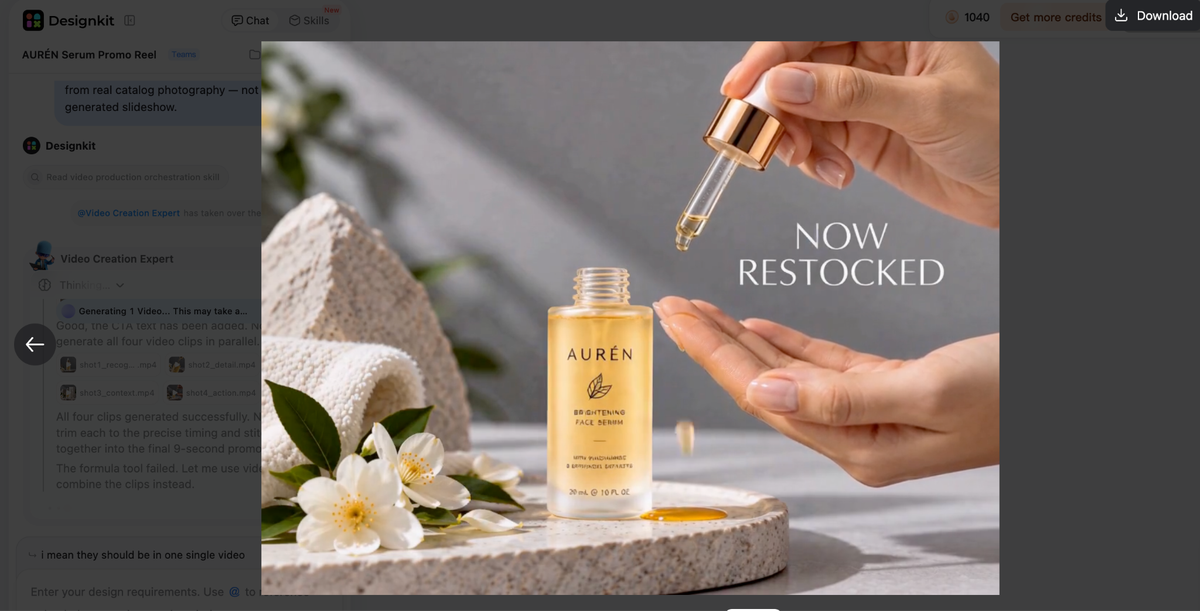
But where urgency is lacking, stating concretely what follows will work equally well: “See its effect on your skin” or “Try it risk-free.”
Give the viewer an answer to the hesitation instead of simply pointing at a link.
Parting Comments
The folder’s still sitting there with the same photos it started with. Nothing about the catalog changed.
What changed is four small decisions: which shot leads, how long the last one holds, what the end card says, and where each cut lives.
That’s the part most stores get backwards. They treat this as a production problem and wait for more time, more budget, another shoot day. It was never that. It’s a decision problem, and the assets were sitting there the whole time.
The stores still making reels a year from now aren’t the ones with better cameras. They’re the ones who turned those four decisions into a habit instead of a one-off.