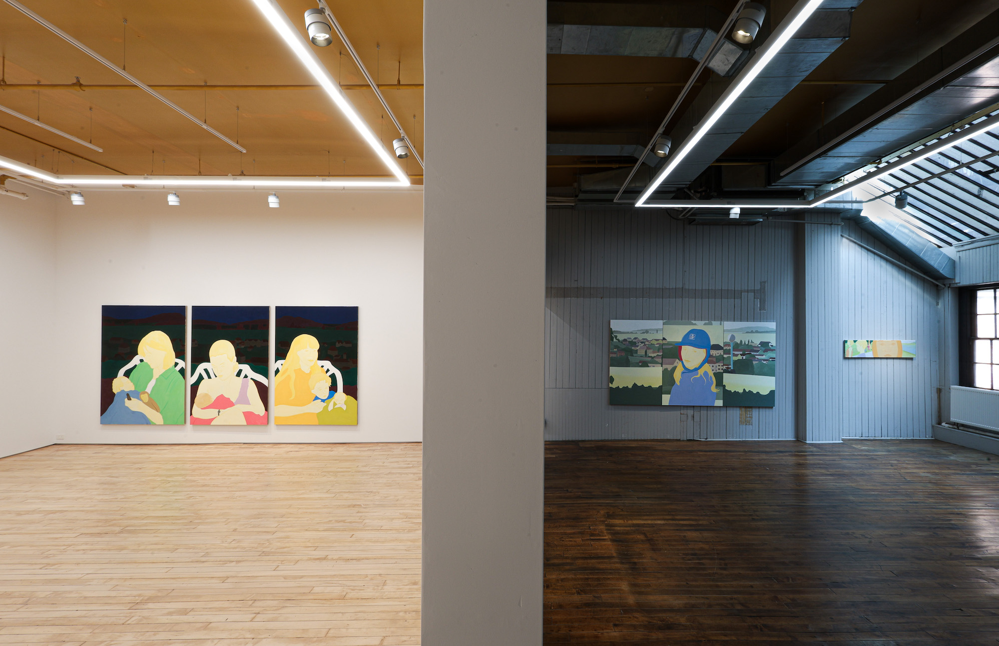
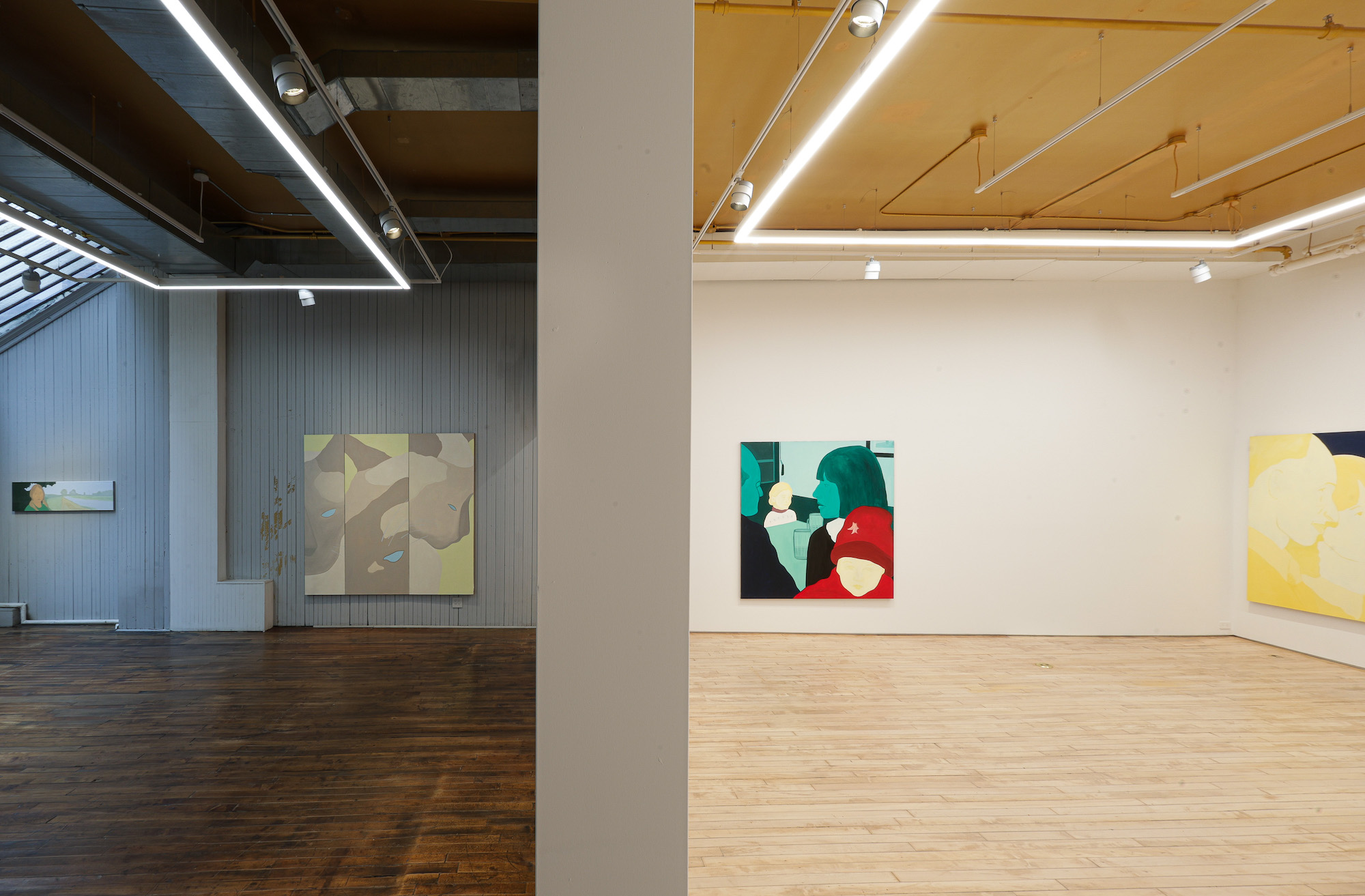
It’s hard to miss Anastazie Anderson, the spirited girl who welcomed me downstairs at her East London studio amidst the dust and noises from nearby construction sites. Finding a partially empty wall in the studio is equally challenging, even after the first batch of works have been shipped off to Soho, New York for her solo debut. Piles of canvases, tapes, and a few remaining triptychs and diptychs awaited. The sheer size of the paintings, their flatness, and fields of colours would envelop anyone standing in front of them. Quite contrary, the emotionless figures, looking straight into my eyes, are telling me to halt right where I stand.
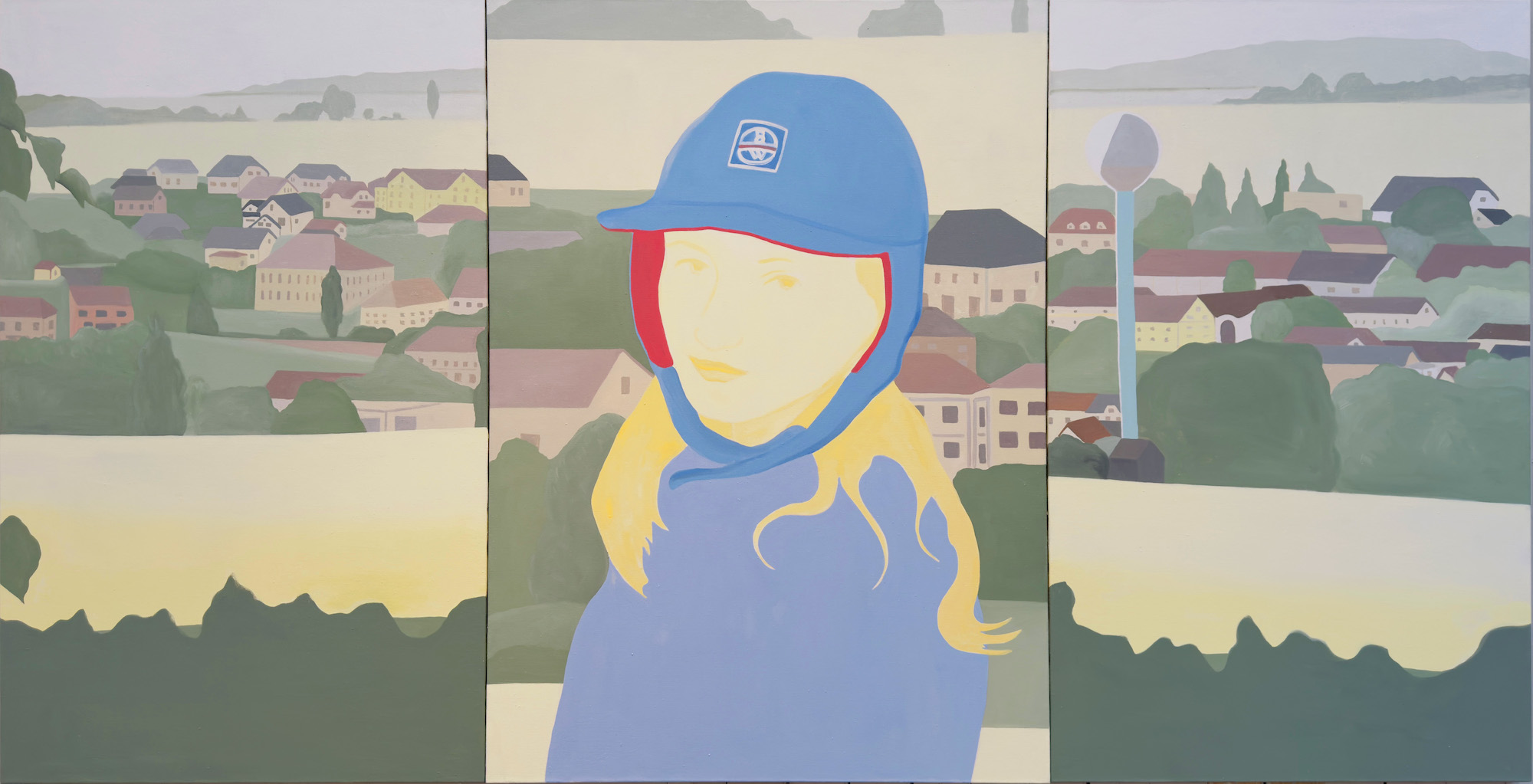
I was struck by this dichotomy of the embraced and the uninvited until I noticed the painterly brushstrokes hidden between clinical surfaces, the dollhouse in pale pink that turns out to be the artist’s childhood home, and the lollipop-shaped water tower—an out-of-action building left behind by the communist regime—hovering in the background. There is a feeling of unrest and ambiguity, as well as a dreamy quality prevailing in the space if one stood long enough. This reminded me of Chris Ofili’s exhibition “Night and Day” at the New Museum, where the artist designed a gallery to host nine monumental works in dark hues of blue: one’s eyes need to adjust to the darkness and take time to really understand what’s going on.
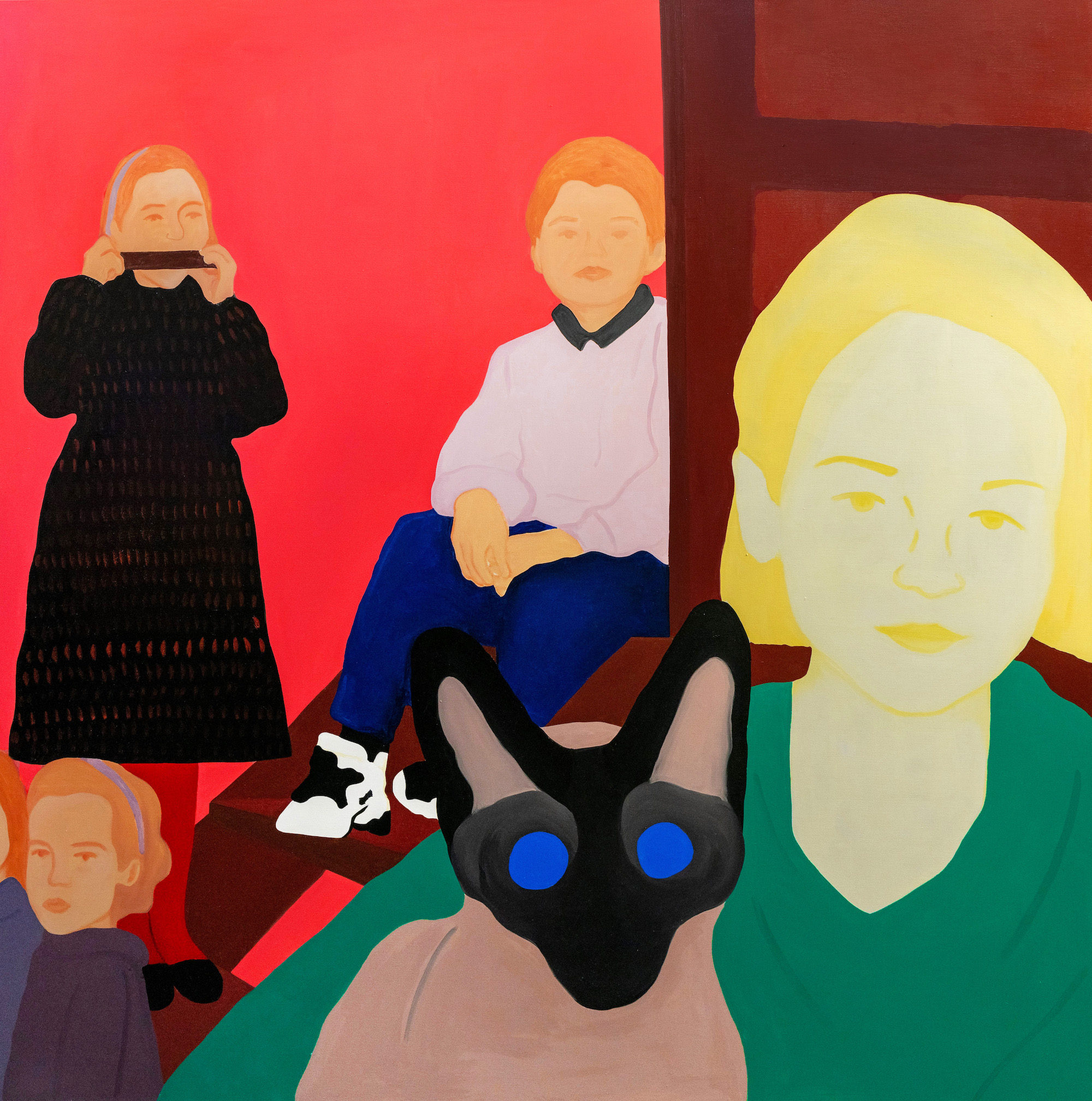
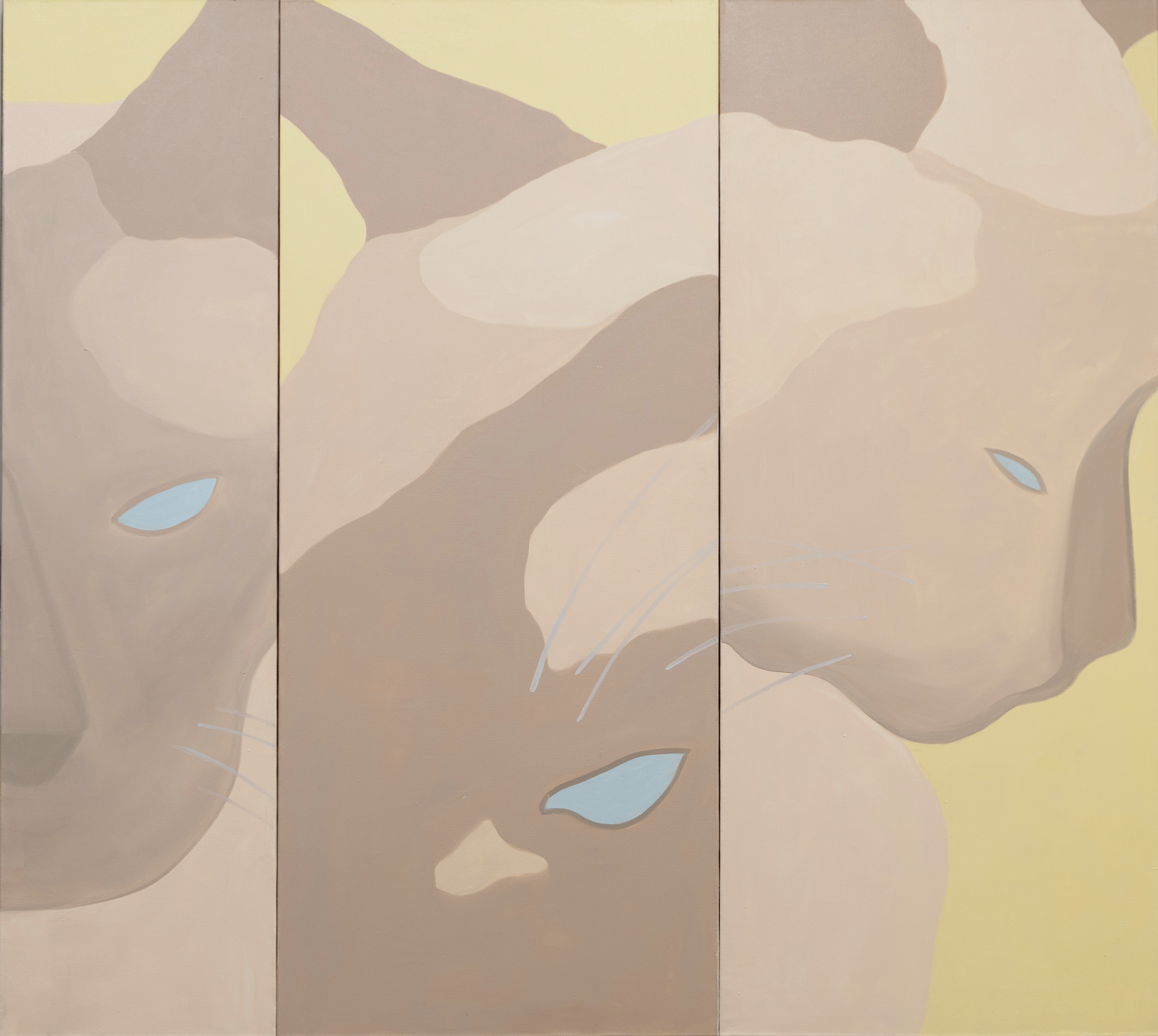
So, what am I looking at? In carefully cropped frames, recurring motifs such as the artist’s parents, sister, and cat—who lived with her for over twenty years—share a photographic light effect, almost like the flash one would find in a polaroid, giving them a luminous tint as if they are emanating lights. In the background, Anastazie’s family house, neighbourhood water tower, and the panorama of the village she grew up in find their own place. Although the subject matter and the formal qualities of the paintings would easily remind one of the works by Alex Katz, who aspires to paint ‘in the present tense,’ referring to the immediacy of his approach and his attempt to capture a transient moment, the younger artist forms nostalgic dreamscapes of her childhood by piecing together asynchronous elements. She uses colours and compositions to connect people or things that are not meant to be together, in an almost childish, stubborn way. As Anastazie introduces elements of significance in her life into the works, I started to wonder, how do we experience our distant, washed off memories at present, in this fragmented world?
Just before Anastazie left for New York for her exhibition “Imitation of Life” at YveYANG Gallery, I spoke with the artist about her inspirations and the theme of mediated fantasy and universal childhood.
Yiren: Let’s start from the basic. Why art and why painting?
Anastazie: I think, naturally, if you love art, you want to participate. My dad took me to galleries since I was a child, and I just want to be part of it, and keep art closer. By studying art, you can read any book, watch any film, see any painting, and it gives you so much perspective on things. For example, there’s a painting by Alex Katz of a seagull. Every time I see a seagull up in the sky, I think of Alex Katz; his paintings changed the way I see seagulls. I’m fascinated by how art can change your perception and make you see something from every day in a different way.
Yiren: Could you tell us more about the setting of your paintings in the exhibition?
Anastazie: I want the exhibition to be about childhood. I was trying to create a kind of iconography of my own childhood. The more I painted each motif, the more it meant something in each painting and became a pure symbol. It’s the same for the house and the water tower – the more you paint, it stops just being a building, but becomes a landmark and a navigation point.
Yiren: You’ve named the exhibition after the movie “Imitation of Life”, which tells a quite dramatic story in relationship to identity and memory. Why is this movie so important to you, and what’s the role of cinema in your overall practice?
Anastazie: I love cinema, and I used to paint from it when I was much younger. Compositions from movies do creep slowly into my practice, even if what I’m painting now is not literally from a movie scene anymore. “Imitation of Life” is a melodrama directed by Douglas Sirk. it’s a great social critique exploring racial division and class while also highly stylistic. The style itself is a large part of the social critique. Melodramas also often combine domestic settings with grand emotion and that’s where I position my paintings. I paint simple things from my childhood and make them dramatic. I make them significant.
Douglas has another film called “All That Heaven Allows” – they’re just such good titles that really help the film itself and tie different elements together. The irony in them is the glue.
I was thinking about the exhibition title for months since I knew the solo is going to happen. “Imitation of life” was one of the first things in my sketchbook, and I kept coming back to it. Once I had an idea of which paintings to include in the show, I just decided to go with it, as I thought this bombastic, crazy title could form an interesting contrast with my artworks that are titled super simple. For example, some works are just titled after the name of the sitter, as I try not to give too much information to the viewers, and I don’t want to make it feel like there’s an existing clue. I want them to bring something unique of themselves to the paintings and welcome their individual reactions.
Yiren: It’s interesting that you brought up the complementary qualities of the titles for the exhibition and the artworks. You also divide the show into “daytime” and “night time”. Why the division?
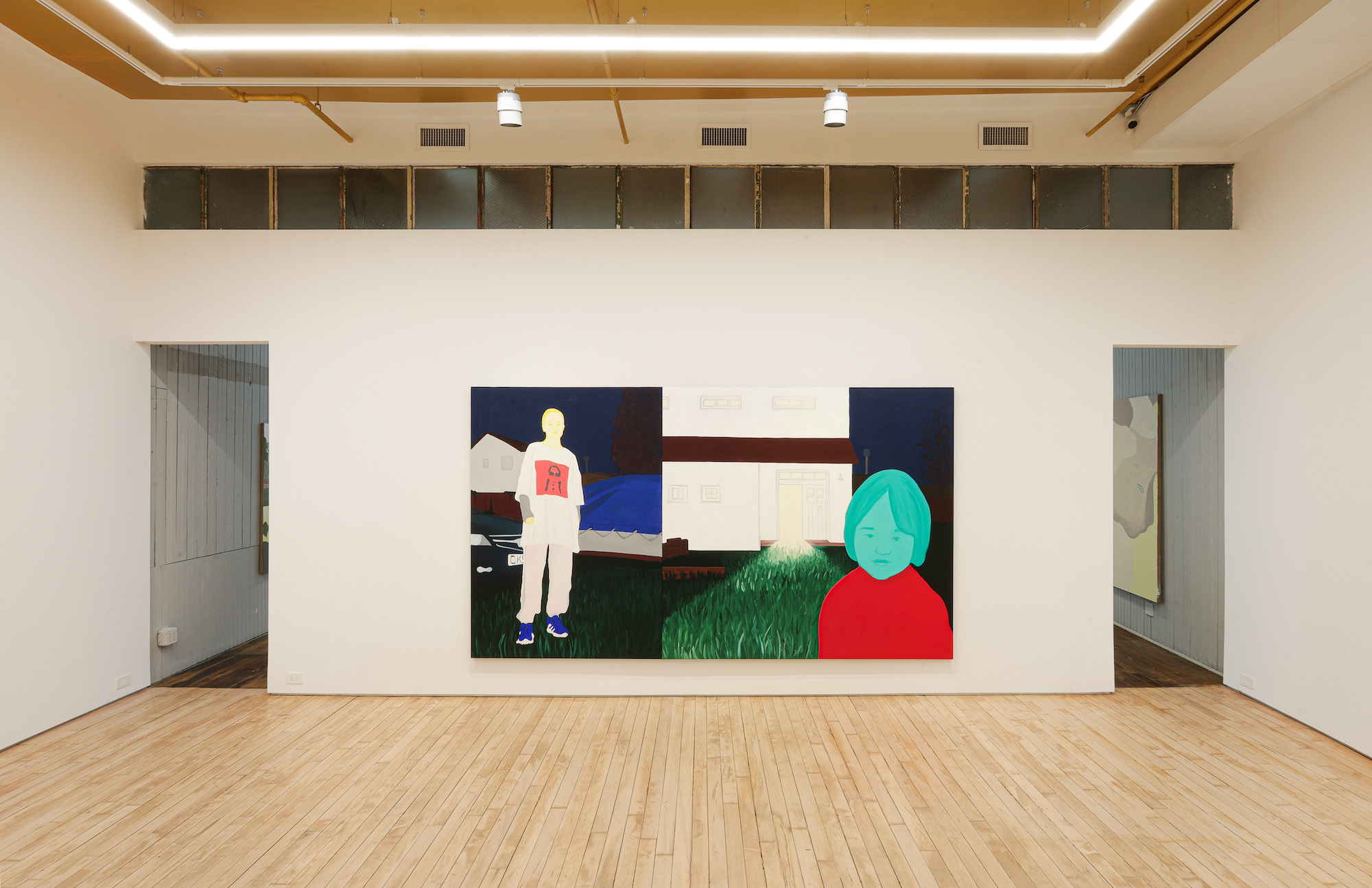
Anastazie: The idea of contradictions and complementariness is something that I always enjoy. Daytime is about routine; we’d spend so much time outside the house, just running around the greenery in our village. But then night is a very strange atmosphere for a child. When you’re a child and you’re allowed to stay up late, it’s usually because there’s something special going on. I wanted the feeling of you don’t quite know what’s happening. My boyfriend is from a very small English town. He once said that when he was a child, nothing exciting happens in that rural place. And he like to think about escaping: what if I went outside now in the middle of the night and had an adventure? I like this idea of night as a prohibited time, yet it’s also a time for possibilities.
The reason I separated the show in two is also because I wanted it to be about worlds rather than separate paintings. First the world of night and then the world of day. The large canvases can swallow you up and you can be fully immersed in them. A bit like when you’re leafing through a photo album and there’re pictures from a certain location or a time, they are always stuck together and have a similar atmosphere, and then you leaf to another page and you’re looking at the next day.
During my first year at RCA, I saw a Rothko exhibition of some of his darker works, and I loved how they affect your eyes that you had to literally adjust to see them. For me, it’s about slow painting and a slow subject matter. I then started thinking what slow painting in pop art is, as pop art is essentially fast painting. How can I connect the two? At the end of last year, I took the very dark paintings and combine them with very bright ones, while keeping that bold composition. By using the overexposed in the foreground, and the underexposed in the back, it has almost an effect of flash photography. It’s like celebrities having a polaroid photo shoot.
Yiren: What draws your attention to pop art?
Anastazie: I think it’s when I realize how huge the influence Alex Katz has on me that I start to think more about pop art, which is strange because I used to paint black and white and from photographs or film, like Gerhard Richter, but I guess the way he deals with the idea of image and consumerism also falls into the ideologies related to pop art. So, pop art was always there, with its impact gradually gaining prominence. What’s important to me about artists like Alex Katz is how he captures aura of pop but never the content. He can paint the most natural thing in the world like a tree but it’s still pop. I find myself situated between the realms of pop art and modernism, with the influence of Munch emerging strongly, especially in relation to the dreamlike quality evident in my paintings.
Yiren: Could you elaborate on the idea of dreamscape?
Anastazie: I’ve stopped using whole photographs and started to compose the image I’m going to paint; I think that’s why it becomes dreamy. I like to play with the composition, and I usually get my ideas through cropping and collage. Let’s see what if I reduce all the light or how about switching everything to a dark colour.
Last year was a big transitional period in my life. I was going through lots of personal stuff in my family. We were selling our family house, and saying goodbye to this place that I grew up with was a big deal and my childhood cat had recently passed away.
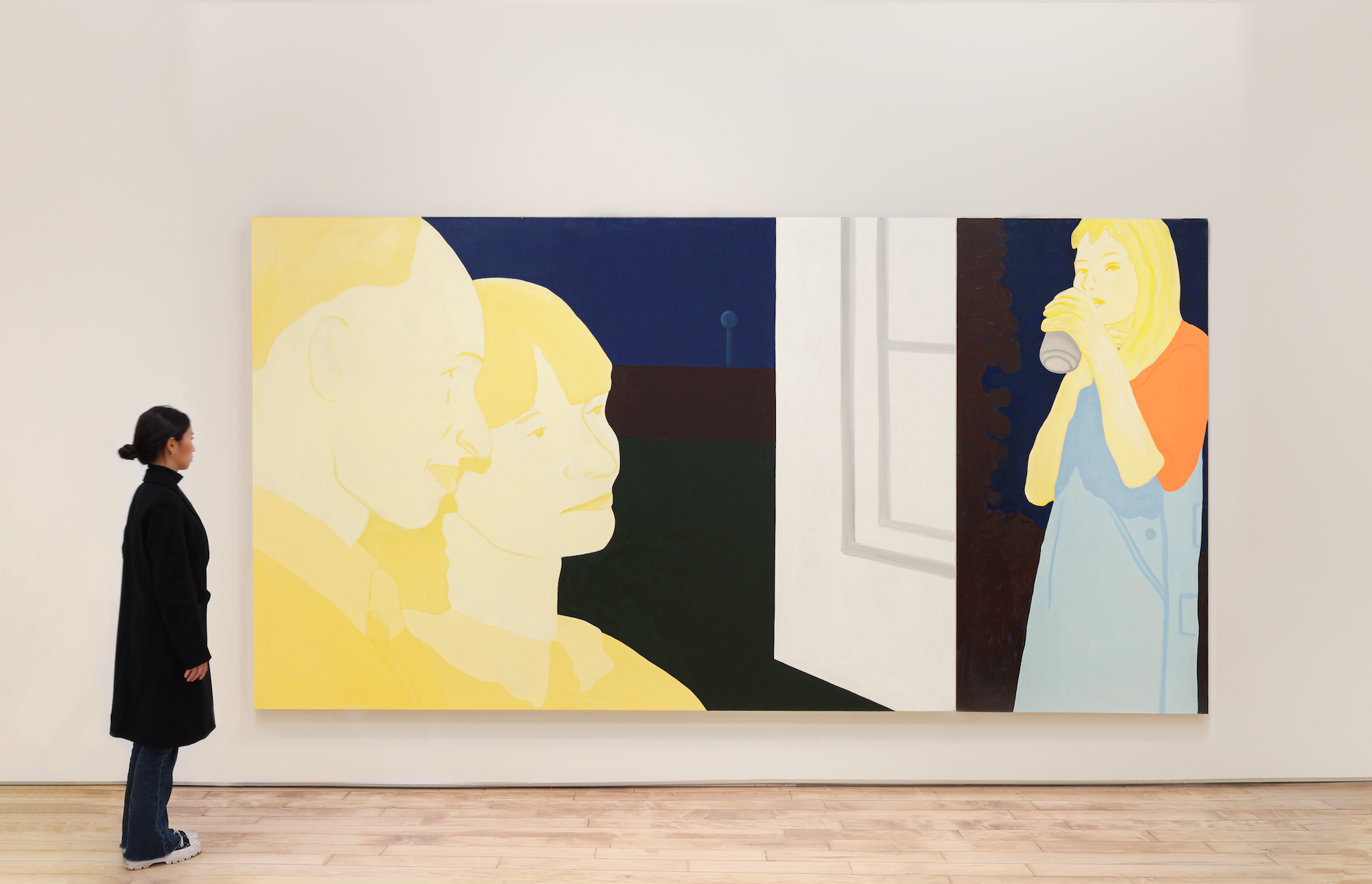
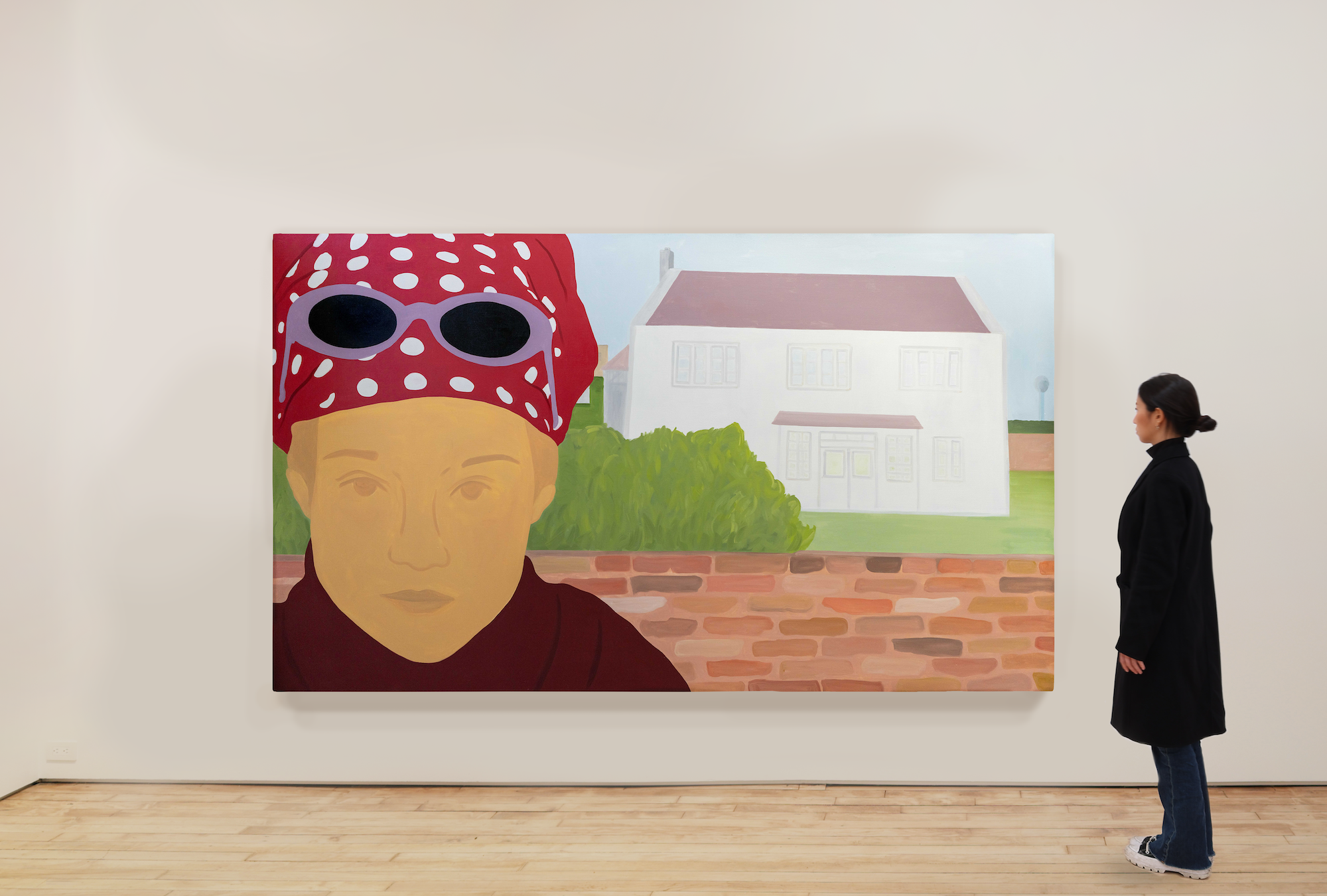
In “Ben, Jana, Martina,” I’ve placed my parents’ wedding photo alongside my sister. A wedding photograph is an emotionally charged image. And the shape of the house might be the most abstracted one so far; it doesn’t have any details. On the back, there is the water tower. So, the whole painting is very symbolic. The characters don’t necessarily need to interact with each other. I’m forcing them to accompany each other. That’s what I like about diptychs and triptychs – it makes the decision of adding the images together stronger. It’s an instinct, almost like a childish need to place things together.
Yiren: So sorry about your loss. Do you mind telling us more about the cat paintings?
Anastazie: I wanted to abstract my cat, which was inspired by Alex Katz’s recent paintings. He did these crops of a woman, and it’s quite hard to see what you’re looking at, because he crops them so tight. It’s so abstract, but when your brain processes these fragments and puts the individual paintings together, they create the total image of this woman.
I usually paint myself, my dad, my mom, my sister, my cat, and only a few times strangers.
This one is about my sister Matina. What I wanted to do here is to capture that strange light effect.
Yiren: It’s like hiking in the Cotswolds during sunrise, the landscape becomes misty, and you can see an almost picturesque village, feels unreal.
Anastazie: That’s how “Imitation of Life” resonates with these experiences. It has the allusion that these things aren’t real. These are just paintings, but because I paint in a naive way, they almost look a bit artificial. And I’m interested in the idea of authenticity. This is my childhood memory, but it’s also painted from a photograph. It almost looks like I made a model of my childhood and then painted it.
Yiren: How about the colour palettes you use in your artwork?
Anastazie: Let’s take Big Face as an example.
I wanted an overall washed-out effect. As she’s in the foreground, I thought she could be darker, almost like the orange tone in some Hollywood movies. I like to go back to movies to look at the colour palette. I recently rewatched Hitchcock’s “Vertigo,” and at one point even if someone looks red, it still feels normal in the surrounding. What colour can do is fascinating.
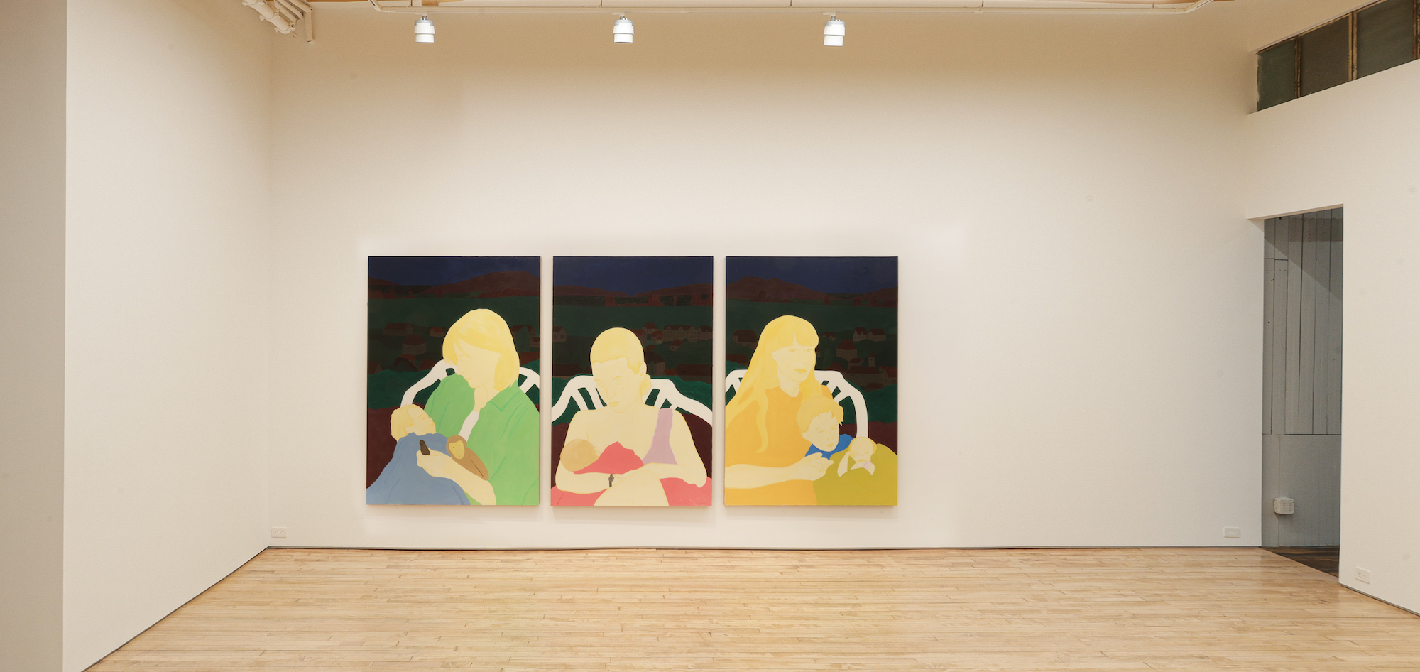
Yiren: And here we have the Mothers triptych. Even though they wear different clothes and are of distinct ethnic origins, they all look quite comfortable and content, and share the same gesture. In addition, the white plastic chairs common in Czech pubs or backyard are holding them like a big hug.
Anastazie: Exactly. This triptych consists of three photographs, one is from me and my mother, and the others are from friends’ family albums. I’m interested in painting a universal childhood. How does childhood feel, especially in 2024, when we have so much visual language and new technologies around us? I’m interested in the shape and the look of childhood, and in this painting specifically, mother and child. The mother-child gesture is the same everywhere. Obviously, it’s also a very important image in Christian iconography, but I wanted to secularise it.
Yiren: As a final note, could you tell us more about ‘mediated fantasy’, a term that appears in your artist statement?
Anastazie: These paintings are still very much like photographs, but they are not exactly the representation of those photographs. I think mediated fantasy was like my childhood being recreated through photography, through history of painting, through memory. It’s not just one direct thing. It’s a fantasy, a visual way of understanding memory. That’s how I started using that term ‘mediated fantasy’, which contains many layers. I feel like fantasy is an absurd word, there’s something bombastic in it that I like. I also like using “mediated” before it, which tunes it down a bit.
Anastazie Anderson, Imitation of Life, 16th March – 27th April 2024, YveYANG Gallery