As one of the leading figures of post-war abstract painting, Kenneth Noland’s commitment to line and colour is unparalleled. In this exhibition, his first solo show in London for two decades, Pace showcases a selection of works that exemplify an unwavering mastery of expression through abstraction.
At first glance, the paintings seem innocuous enough, having secured Noland a position in the canon of abstract art, but there is something much deeper, and ultimately more human, going on than in the work of many of his peers. Art historical comparisons abound: the horizontal canvases of stripes suggest Bridget Riley or Gerhard Richter; the criss-crosses bisecting planes of colour call to mind Piet Mondrian; the uninterrupted fields of saturated pigment with dashes of lines at the edges might put us in mind of a kind of Mark Rothko gone wrong or a misshapen Barnet Newman. But if art history teaches us anything, it is surely that there are only a few original ideas to go round, especially in abstract painting, where the idea is much less important than the effect. Consequently, we should not get too hung up on what it looks like and instead focus on how it makes us feel, which is where the magic really happens.
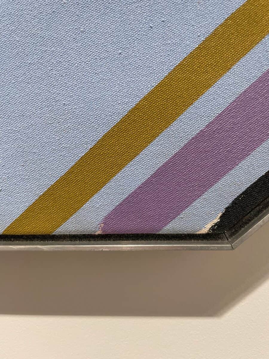
It is all too easy to stand and stare at paintings like Noland’s, searching, surveying, scrutinising as if there is some hidden mystery to uncover, which is why people often find themselves frustrated: there is, simply speaking, not much of anything at all to see. Noland, like Rothko perhaps, was more interested in the emotive qualities of form and colour, couched in the language of geometry. For the most part, the lines are flawless – sharp, crisp, economic expressions of the shortest distance between two points – but occasionally you spot a playful disruption, such as in Untitled (1978), where the black line and the mauve line are unfinished at their lower extremities. Or, in the same painting, where a thick green line fizzles off into a sea-like shore that reveals the canvas underneath. But honestly, this is clutching at straws – there is hardly a brushstroke out of place.
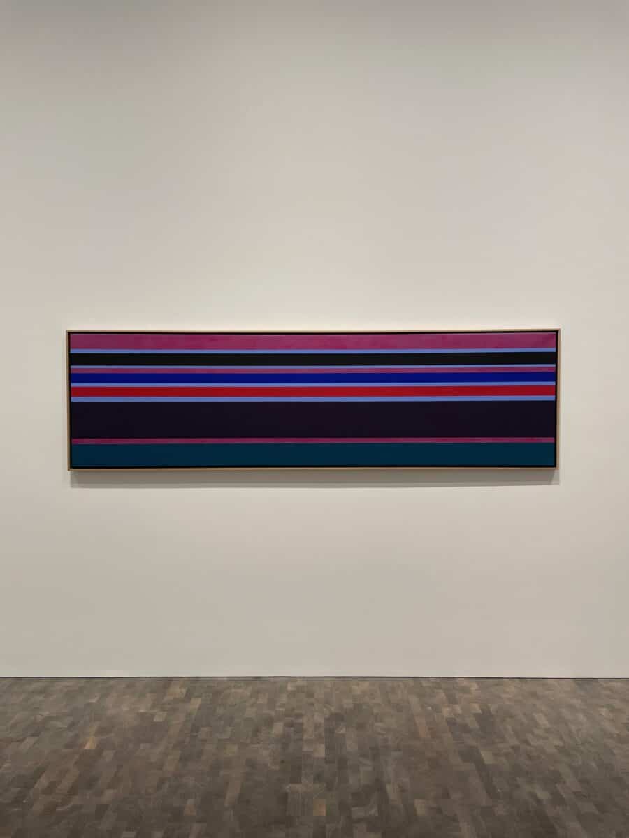
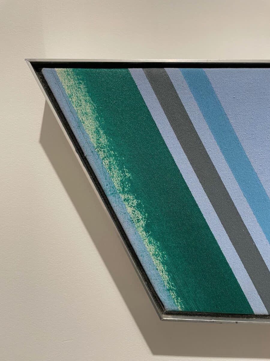
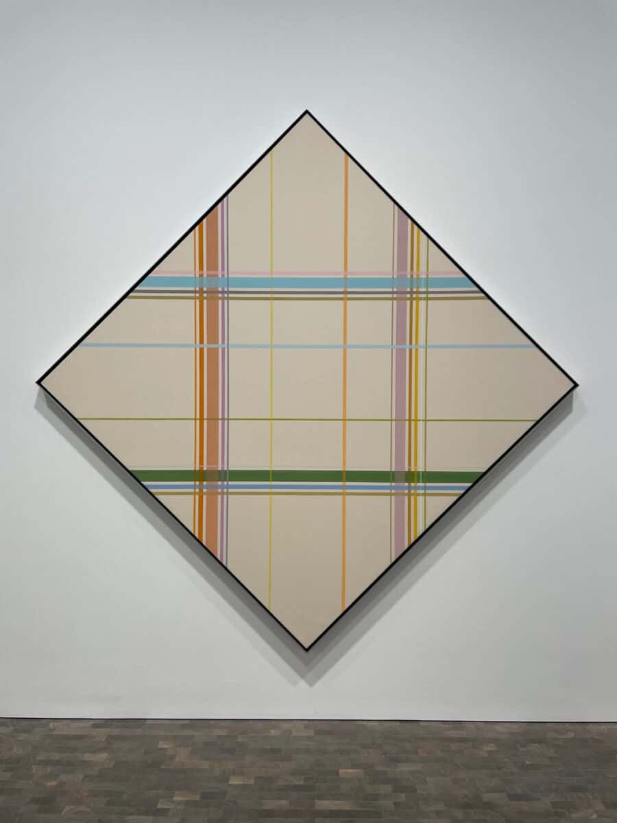
So, you might ask, if there is nothing much to see, what is there? These works are things you absorb more than you look at. They radiate off the canvas and into you, which is where Noland excels. Minted Morning (2003) glows through its muted pastel shades, giving out an enveloping warmth that is surprising considering the superficial lack of brightness. The effect of these Stripe works of the early 2000s is one of tranquillity and contemplation, the lines so comfortingly orderly that they disturb neither thought nor world. In the Plaid works of the 1970s, however, there is a controlled urgency, an assertiveness in the way the lines cross one another perfectly perpendicular, sometimes more or less translucent and sometimes resolute, such as in the elegant Interface (1973). The Shapes from the 1980s are another thing entirely: bold in stature, controlled in form, they feel displaced from some cosmic jigsaw puzzle, where works such as Reappearance (1981) obliterate our long-held sense of the canvas as a quadrangle, demonstrating that form – as pure geometry – is just an arbitrary expression of space.
Noland was a master of reiterating the same few core notions of line, colour and shape in ways that remain fresh, surprising and invigorating. He was not bound by rules, but was committed to the sincere evocation of feeling from a few simple principles, and this exhibition showcases some of his very best efforts.
Kenneth Noland: Stripes/Plaids/Shapes continues at Pace, 5 Hanover Square, London, until 4th March 2023.