
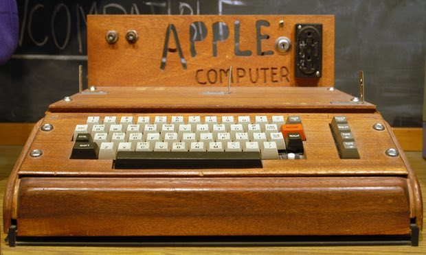
Wooden wonder … the Apple 1 computer. Photograph: Ed Uthman/Ed Uthman/Flickr
Next time you drag a document across your desktop and put it in a folder, spare a thought for acid. Organising your files might not seem like a psychedelic experience now, but in 1968, when Douglas Engelbart first demonstrated a futuristic world of windows, hypertext links and video conferencing to a rapt audience in San Francisco, they must have thought they were tripping. Especially because he was summoning this dark magic onto a big screen using a strange rounded controller on the end of a wire, which he called his “mouse”.
Like many California tech visionaries of the time, Engelbart was an enthusiastic advocate for the mind-expanding benefits of LSD. As head of the Augmented Human Intellect Research Center at the Stanford Research Institute, he and his team would drop acid under test conditions in the hope of inspiring new breakthroughs.
His own technological epiphanies while tripping seem to have been limited: in one session, after staring at a blank wall in fascination for hours, he came up with the “tinkle toy”, a potty-training aid in the form of a miniature water wheel that would spin and tinkle when peed on. But he remained convinced that the drug opened doors to alternative realities, including one where people could control computers through screens.

In a grainy black and white film of his 1968 conference demonstration – since known in the tech hall of fame as “The Mother of All Demos” – Engelbart calmly introduces the embryonic forms of what would become word processing, email, Skype and Google Docs, all shown on a screen with scalable windows controlled by a mouse. For computer scientist Alan Kay, who would go on to develop these ideas at the Xerox PARC research institute, it changed everything. “The demo was one of the greatest experiences of my life,” he later said. “To me, it was Moses opening the Red Sea. It reset the whole conception of what was reasonable to think about in personal computing.”
Engelbart’s video will be on display in the London Design Museum’s forthcoming exhibition, California: Designing Freedom, a show that aims to shine a kaleidoscopic spotlight on the cross fertilisation of counterculture and tech culture on America’s “left coast” over the last 50 years.
“Think of ‘California design’ and you tend to think of Charles and Ray Eames and the world of mid-century modernism,” says curator Justin McGuirk. “We wanted to focus on what came next, and show how the hippie movement combined with the hacker culture to develop tools of personal liberation.”
From skateboards and LSD blotting paper tabs to iPhones and Google’s self-driving car, the exhibition will unpick the west coast ethos that has fostered the development of devices for escapism and self-sufficiency. It shows how, as frontier territory on the edge of a continent, California has always incubated a culture of self-reliance and reinvention, as a place that attracts people fond of fantasy, freedom and rebellion – and how they have mobilised design to meet these ends.

The development of user interface design is one of the most fascinating threads in the story, and one of the least obvious, because it has become second nature to us all. “These things now seem so intuitive,” says co-curator Brendan McGetrick, “that a computer document looks like a white piece of paper with text on it, that it sits on an office-like ‘desktop’, that you delete things by dragging them into a trash can. It didn’t have to be this way – these are the results of specific design decisions.”
The now-ubiquitous desktop metaphor first emerged from Kay’s Xerox PARC work in the form of the Alto computer in 1973, and later the Star in 1981, the first device to use windows, icons and drop-down menus. It is shown in the exhibition as an early mock-up with pieces of paper pasted on to a slate. On a tour of the Xerox facility in 1979, a 24-year-old Steve Jobs was captivated. “I thought it was the best thing I’d ever seen in my life,” he said. “Within 10 minutes, it was obvious to me that all computers would work like this someday.”
It turned out that Jobs, Steve Wozniak and his hippie chums from the Homebrew Computer Club, who together founded Apple in 1976, had a better knack for communicating the potential of this new technology than the corporate folks at Xerox. A quick comparison of their TV adverts tells you everything you need to know about the importance of design and marketing to the commercial fate of the two companies.
While the 1981 ad for the Xerox Star is set in a workaday office, and methodically explains how the computer will revolutionise secretarial work and filing, Apple’s 1984 commercial for the first Macintosh was a thrilling teaser directed by Ridley Scott, showing a room of grey human automatons being lectured by a Big Brother figure on a big screen – which is then dramatically shattered by dashing female athlete hurtling a big hammer. Apple, it seemed to say, would provide salvation. The Mac would be the disruptive tool to achieving ultimate personal freedom.

In the grid-ruled notebooks of graphic designer Susan Kare, also on show, it is possible to see how Apple understood the importance of humour and familiarity in translating something that had always been the preserve of big corporations and the military into something people would welcome into their homes – and be able to understand. Kare famously developed the smiling Mac icon, displayed as the computer booted up, along with the lasso, paint-bucket and trash can, transforming the cold and intimidating early desktop computers into something friendly.
The Apple 1’s handmade wooden case, also on show, was a direct link to the hippie, maker culture of the communes. It is a theme that continued in the “skeuomorphic” design of Apple icons and software, with digital tools aping their real-world counterparts, be it calculator buttons or the yellow squares of sticky Post-it notes.
In a world where our smartphones are often the first things we touch in the morning and the last things we touch at night, and toddlers grow up pinching and swiping before they can read, priorities have changed. As Apple’s chief designer Jony Ive recalls, when he and his team sat down to redesign the iPhone operating system in 2012, it did away with many of the classic skeuomorphic elements: “We understood that people had already become comfortable with touching glass, they didn’t need physical buttons, they understood the benefits. So there was an incredible liberty in not having to reference the physical world so literally. We were trying to create an environment that was less specific. It got design out of the way.”
Having ignored design for a decade, Google recently united the graphical language of its different platforms with the launch of Material Design. In an exhibit that comes as a surprising time-warp, the paper and cardboard mock-ups of its new icons are on show, revealing how the design team modelled the new interface and developed lighting rigs to cast accurate shadows, with the aim of creating an illusion of layers of paper-like cards sliding around inside your device. It was a process that produced some interesting outcomes: why should buttons appear to press down when you touch the screen, when there’s no sense of pressing something beyond the glass? So instead they hover upwards, as if subject to a magical magnetic attraction from your finger.
With Silicon Valley tech companies pumping increasingly hefty resources into voice recognition technology, McGetrick says the next frontier for user interface will be aural, building on our new surreal world of people shouting across the room to summon help from Siri, Alexa and Cortana.
“We’re entering a new phase where we decreasingly need screens,” he says. “The trajectory of miniaturisation is crystal clear, from computers to laptops to digital organisers to phones to watches. The end-game is that technology will become invisible and we’ll have Google inside our heads.”
- California: Designing Freedom is at the Design Museum, London, 24 May–15 October.
guardian.co.uk © Guardian News & Media Limited 2010
Published via the Guardian News Feed plugin for WordPress.