Now that there are two Serpentine galleries, they are able to put on double the number of exhibitions per year and gain greater exposure for this prime and valued exhibition space. I’m still not sure why they choose to open both exhibitions at once when there is the option of alternating openings per month.
When there was only the original Serpentine gallery, it was still a big draw for critics, collectors and the public alike so it’s not like they need the dual opening to make people take notice. I would argue that alternating openings would give people more reason to come back to the galleries and avoid the situation that tends to happen now – where reviewers focus on one of the exhibitions and reduce the other to a minor footnote in the article.
But we have two openings this month, both quite conceptual though radically different, and I’ve assessed each one in turn:
Over in the Serpentine ‘classic’ the first thing visitors will notice is that there is no introductory text to explain what the work is all about. Rather than this being a sign of the Serpentine taking minimalism in labelling to the extreme, we read that this is upon the artist’s request to ensure viewers don’t see her art in a pre-determined fashion. Furthering this theme of exploration is the opening of the double doors on one side of the gallery so visitors familiar with the gallery can enter via a different route.
I’m a big fan of breaking away from the norm and I admire this approach, but to make for an effective experience the individual pieces themselves need to also prove challenging – and this is where Donnelly proves less successful.
The sculpture and video works feel bland and uninspiring and the only work to give me pause was where a section of the white wall has been cut away to reveal the original brickwork of the building. This exploration of materials by Donnelly proved difficult to engage with and I struggled to see what this offered beyond the sense of experimentation that can be found in the work of many emerging artists today.
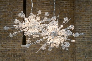
Since the Serpentine Sackler gallery has been open, I’m yet to come across at least one of the two shows at the Serpentine galleries that I haven’t liked. I had high hopes for the work of Cerith Wyn Evans as my last encounter with his work had been at the Light Show at Hayward Gallery – my number one exhibition of 2013.
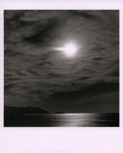
This exhibition opens with Wyn Evans signature works – cylinders of light. A neon sign runs around the edges of the gallery and speaks of how light impacts emotions while chandelier bulbs flicker and dim. In the inner chambers of the gallery videos show human forms slowly emerging from the screen while a pulsating soundtrack tries to add to the atmosphere.
Where this exhibition falls down is that nothing here is powerful enough to really prove gripping and if light art needs to be effective the gallery has to co-operate – and in this case having all the gallery lights turned up to full strips away any bite this exhibition could have had.
Verdict
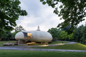
Overall I left disappointed with both exhibitions. They had great concepts but the execution is lacking from both artists and so both shows proved to be rather uninteresting. It’s a generally bad time for the Serpentine galleries as their latest pavilion design – the pod by Smiljan Radic – is a sterile affair and the worst one of the last few years.
Cerith Wyn Evans & Trish Donnelly are on at Serpentine Sackler and Serpentine gallery until 9 November. The pavilion by Smiljan Radic is on display until 19 October.
All images used are courtesy of Serpentine Gallery.
