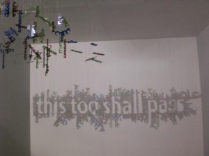
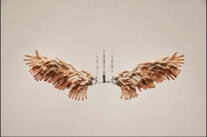
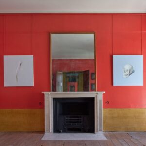
The Venice Biennale is essentially a World Fair for contemporary art that’s held every two years in Venice from April to November. This year 88 countries participated with numerous affiliated exhibitions and some that weren’t related but ran concurrently to bask in the reflected glory.
I was lucky enough to visit in the closing month of November. Just before it closes, I’ve summarised the highlights and lowlights of this year’s Biennale.
The Good
It’s always better to start with the good, so what were my top 5 for this event?
1. Smaller Countries
This year welcomed 10 new countries ranging from Paraguay to the Maldives, and even the Holy See (Vatican) had a pavilion. But just because a country isn’t renowned for art, doesn’t mean it can’t impress. I was blown away by the diversity of art in the Azerbaijan pavilion and the macabre labyrinth featuring albino rat hides made sure Macedonia was not easy to forgot. There were plenty of strong showings including UAE, Kuwait, Iraq, Kenya and New Zealand.
2. Affiliated exhibitions
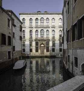
Countries may choose artists for the Biennale but that doesn’t stop other exhibitions popping up outside the national pavilions. There was a great collection of Korean artists in one exhibition and the Palazzo Brembo had an exhibition which as far as I can tell wasn’t even associated with the Biennale. It wasn’t on the map and I just stumbled across it but it had a brilliant selection of eye-catching art.
3. Classical Art
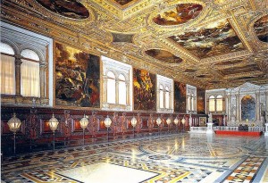
Strictly speaking this has nothing to do with Biennale, hence why it’s not at the top. But being immersed in solely contemporary art while in Venice is a missed opportunity when you’re in the home town of greats such as Veronese and Tiepolo. However, it was Tintoretto who blew me away with his paintings in the Doge’s Palace and the Scuola Grande di San Rocco.
4. Exploration
The majority of the exhibitions may be in the Arsenale and Giardini but it’s fun to break out the map, a smartphone with GPS and explore Venice to track down all the exhibitions outside these venues. I got to see areas of Venice a tourist would never see and it’s a great feeling when you think there can’t be anything down this dark side street only to explore and find a great exhibition. One improvement that should be made is better signage – I often found a location on the map only to still be unable to locate the exhibition itself.
5. Duration
By running for 7 months it gives you plenty of time to visit. Bear in mind that hotel and flight prices will rocket in April plus the Biennale will be very busy. Summer can be too hot to walk around in and then there’s avoiding peak holiday season as Venice is a popular tourist destination in its own right. By having such a long run, I was able to find a sweet spot when it was quiet yet the weather held up.
The Bad
Though it was a great experience and holiday, there is still room for improvement and here are my top 5 disappointments.
1. Labelling
The main exhibitions at the Arsenale and Giardini had atrocious labelling and everything I hate about badly written press releases was present. All labels started off telling me about the artists oeuvre and only ending with what the work is actually about. The first thing I want to know is what is the art I’m looking at and if I’m interested then I’ll come back and find out about the artist. I got to the point where I only started reading a label three quarters of the way down.
2. The Big Countries
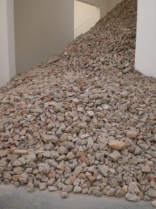
Established countries renowned for their art were largely disappointing. Great Britain came with the so-so Jeremy Deller, USA was rather bland and France wasn’t even worth entering. Some of the more established countries did deliver and Spain’s testament to the waste material used to create an artificial island (below) was excellent.
3. Video Art
There was a lot of video art on display but what struck me was how badly curated or selected it often was. There is no place for two unrelated video works with sound to be playing in the same room and when selecting a work to go into an exhibition with over a hundred other works, a 60 minute run time isn’t ideal.
4. The Theme
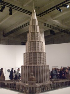
The theme of this Biennale was the Encyclopaedic Palace, an idea by one man to build a structure that housed all of the world’s knowledge and culture (scale model below). It’s a nobel theme but rather than showing the diversity of artwork from around the world, the organisers chose to interpret this as outsider art. Though I have a lot of time for outsider work, it didn’t really chime with the theme.
5. Artists as Curators
Curation is an art form in of itself but there’s no proof that being a successful artists enables you to be a curator or vice versa. This rule was ignored as Cindy Sherman was allowed to curate her own space and simply proceeded to fill it with artists like her. It was more a vanity project than a curated gallery.
That’s my round up of the good and bad of Biennale. If you were able to visit, feel free to leave a comment on your best and worst epxeriences.
