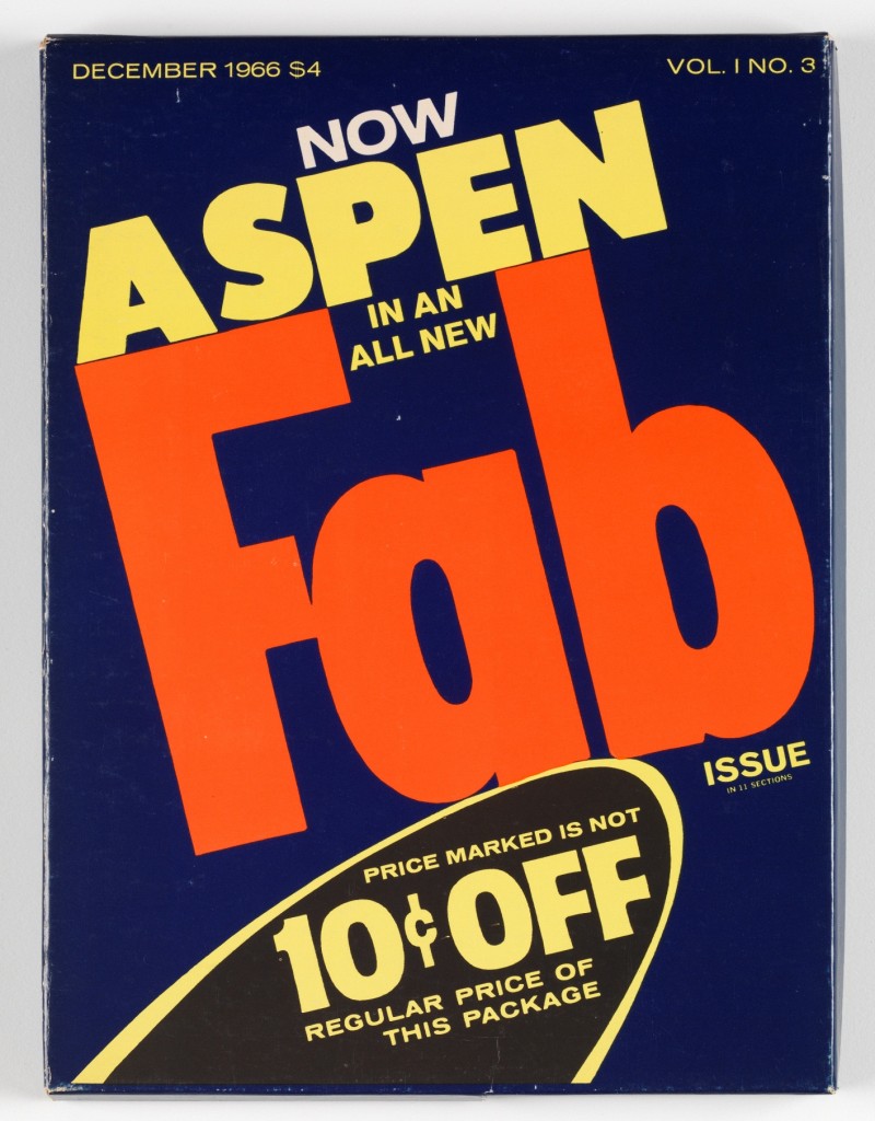
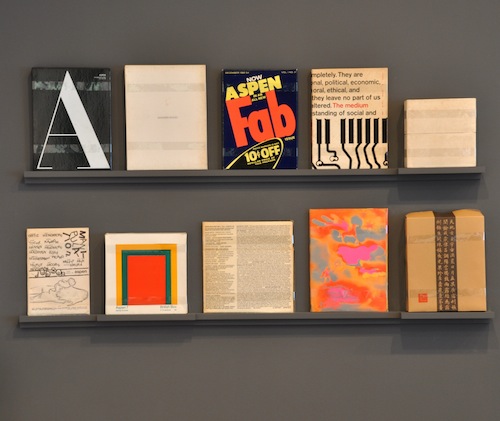
Aspen Magazine was one of the first multi-media magazines. It was about art and itself an art piece. Even the boxes that the magazines came in were like mini pieces of modern architecture. Each issue was themed, curated and beautifully designed. The issues were constructed by a plethora of artists and cultural innovators of the period, including; Peter Blake; Lou Reed; Bridget Riley; Jasper Johns and Marcel Duchamp. The contents encapsulated the exciting 60s art scenes and movements. This relatively unknown publication is currently on display in a free exhibition at the Whitechapel Gallery. The only thing that you need worry about is missing this hidden treasure.
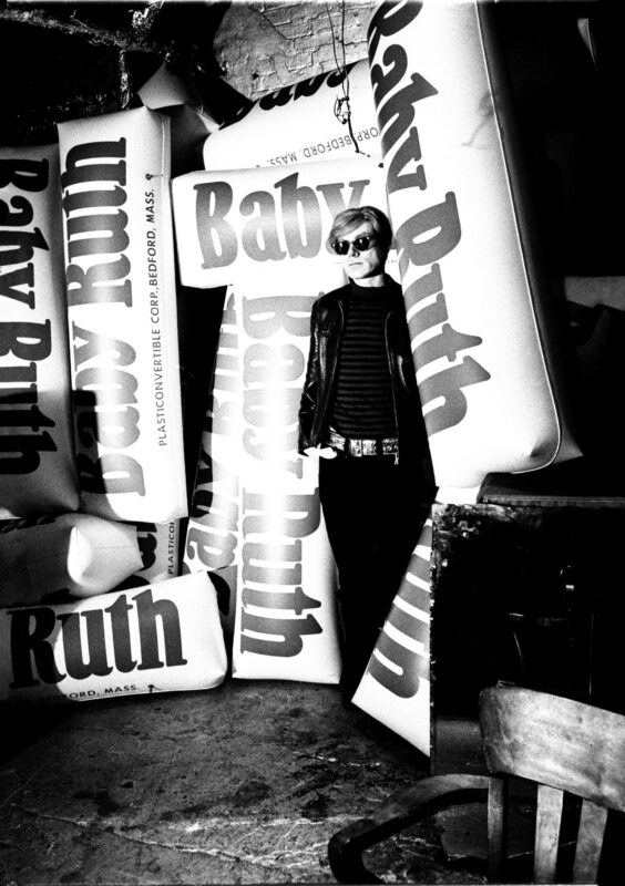
Inspired by the ski resort of the same name, the magazine was launched as a project for the wealthy editor Phyllis Johnson in 1965. Initially Johnson was a bit of a control freak but she slowly relinquished her power and allowed the artists of the time take the lead. The first issue, designed by George Los, covered ideas around life, health, culture and food; by the third issue the pop art movement had immersed itself in the magazine. This issue’s front cover featured the ‘FAB’ packaging image and Andy Warhol and David Dalton designed the magazine. An insightful interview with Dalton, by exhibition curator Nayia Yiakoumaki, and many other contributors are also included in the exhibition. By the tenth edition the fire had burnt out. Johnson didn’t need to continue with the editorial venture. Today the few magazines that exist protect mini art histories – they are special artefacts that intimately document New York scenes of the 60s.
The current trend for exhibitions is to wow the audience with theatre, moving image, music and holograms. This display doesn’t need such fluffy production. The drama is in the detail. The exhibition is breath of fresh air and should encourage the visitor to look rather than watch. Each issue is displayed in its entirety in separate cabinets. The contents are overwhelming, a fantastic memoir of the period. John Lennon’s ‘repetitive’ diary, William Burroughs’s flexi-disc and Ossie Clark‘s knickers pattern are crazily interesting. I would encourage any budding bloggers and journalists to take note of the engaging and non-repetitive material on display at the exhibition.
TORY TURK FOR FAD
www.whitechapelgallery.org
