


Suit you? … French ministers inspect the Musée d’Orsay’s new-look non-white walls. And some paintings. Photograph: Pierre Verdy/AFP/Getty Images
The first thing to be said about the refit of the impressionist galleries at the Musée d’Orsay that have reopened to the public this week is that it was long overdue. With a grand central hall formed out of a great 19th-century railway station, this Paris institution is a beautiful museum that set the pace for spectacular art galleries in reclaimed buildings years before Tate Modern came along. Yet the most important paintings in the whole collection – the works of the painters who gave birth to the avant garde in late 19th-century France – were stuck in a characterless and ugly set of rooms on an upper floor.
Now those rooms have been transformed into subtly lit, opulent interiors that give the art of the belle époque the rich setting it deserves. One aspect of the transformation is the abolition of white walls. The walls are now a variety of colours including a special grey whose tone changes in different lights. White, says the museum, is a terrible backdrop for any pre-20th-century art. Is this true?
Well, it depends what replaces white. The Wallace Collection in London never had white walls exactly, but in recent years it has renewed a lot of its wallpapers using incredibly elegant and flashy materials. Presumably this is supposed to recreate the original appearance of the house, but I find it incredibly distracting to look at a Fragonard painting against a background of brilliant, shiny, blue.
It is a subtle art, the painting of gallery walls. The National Gallery in London has no white walls but has also redecorated many of its rooms, to excellent effect, with deep, dark colours that allow the brilliance of a Titian to hold the stage. The advantage of white is that it saves the curator having to choose. Now that galleries are more conscious of such things, the taste of their decorators is on test. Yet white itself is not so simple. There are lots of whites, good and bad.
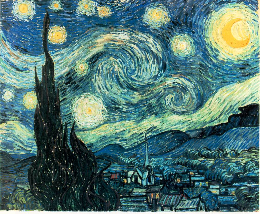
I’ve never seen the kind of late 19th-century art the Orsay treasures displayed to better effect than at the Museum of Modern Art in New York. The white walls of MoMA have always had a particular intense quality that serves art beautifully. They are not just crudely whitewashed. They are a perfect white. Van Gogh’s Starry Night suffers no ill effects at all from this white setting.
In the end, as with so much that agitates the curator, this may not matter very much. Art is not interior decoration. What I really want is to be able to see the painting, appropriately lit and without distractions. The best wall colour is drab – a dreary colour that the gallery-goer does not even notice. The colours you should remember are those of the paintings.
guardian.co.uk © Guardian News & Media Limited 2010
Published via the Guardian News Feed plugin for WordPress.


