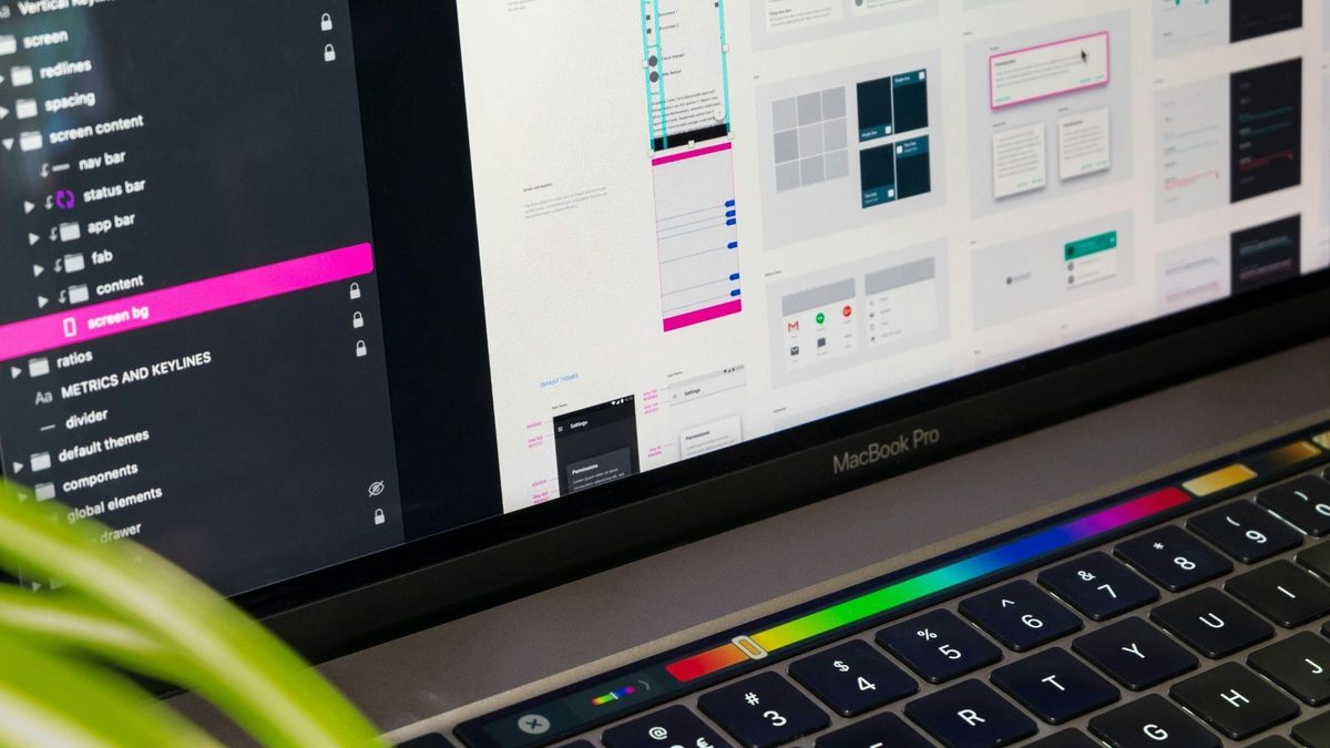
Flat design ran the table for a long time. Clean sans-serif type. Muted palettes. Interfaces pared down to whatever was strictly functional, nothing more. That was the default look of pretty much every digital product through most of the 2010s, and honestly it got a little exhausting. Something’s shifted in the last few years, though. Gold accents are creeping back in. Deep jewel tones. Serif typography with actual personality instead of yet another geometric sans-serif wordmark. Textures gesturing at velvet and brass instead of flat matte surfaces everywhere you look. Old-world glamour — the visual world of 1920s hotel lobbies, mid-century supper clubs, that whole vocabulary — is back, and it’s not staying in one lane.
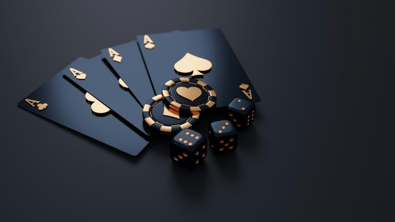
You see it most clearly on platforms built around a sense of occasion, where a brand needs an interaction to feel like an event rather than a chore. Online live roulette is a decent case study. A lot of platforms in that space have gone all in on Art Deco-adjacent identities — gold-on-black palettes, typography that looks lifted straight off 1920s casino signage. Not an accident, that. It communicates occasion and glamour in a way flat, minimal design never quite managed to.
Why Flat Design Lost Its Monopoly
There were real, legitimate reasons flat design won out in the first place. Faster load times. Clean scaling across screen sizes. It shed the skeuomorphic clutter — fake leather textures, drop shadows pretending to be physical buttons — that defined the era right before it. Fair enough. But minimalism eventually got so universal it basically stopped meaning anything as a differentiator. Every banking app started looking the same. Every productivity tool. Every streaming platform. Once that happens, a genuinely distinct look stops being a stylistic flourish and starts being a real edge over everyone else in the category.
Here’s what old-world glamour offers that flat design just structurally can’t: specificity, and a sense of occasion. A gold serif wordmark on deep emerald doesn’t read as generic the way a sans-serif logo on muted blue does. It just doesn’t. That specificity is worth something to a brand trying to say “this interaction actually matters, slow down for it” — a message minimalism, by design, was never built to send in the first place.
The Specific Visual Vocabulary Getting Reused
A handful of recurring elements keep showing up across the platforms leaning into this. Deep jewel tones — emerald, burgundy, sapphire — have replaced the muted pastels and grays flat design leaned on for a decade. Metallic accents, gold specifically, turn up in borders, icons, small typographic flourishes, doing the same job gilding did on actual Art Deco buildings a century ago: shorthand for luxury, instantly legible. Serif and display type with genuine character has edged out the geometric sans-serifs that flat design treated as basically mandatory.
Motion picked up on this too, not just the static stuff. Transitions on online live roulette interfaces, and platforms like it, tend to run slower and more deliberate than the snappy, efficiency-obsessed motion design everywhere else — a wheel spin that actually takes its time, a card reveal with a small theatrical pause built into it, instead of instant-feedback animation tuned for speed above all else. That slower pace is part of the aesthetic, not separate from it. Glamour was never about efficiency to begin with.
Where Else This Is Showing Up
It’s not confined to gaming platforms, either. Luxury fashion e-commerce has drifted back toward serif type and richer color after years of white-space-heavy minimalism. High-end hospitality apps picked up similar cues, chasing the same sense of occasion a real hotel lobby is designed to project the second you walk in. Even a few premium streaming and media platforms have started experimenting with richer color and more expressive type for their flagship content — a quiet break from the flat, utilitarian treatment covering the rest of their product.
Why This Matters for Design Broadly
This says something about where digital design’s headed generally, beyond any one category. As functional differences between competing platforms keep shrinking — everyone’s app does roughly the same thing now, roughly as well — aesthetic differentiation ends up carrying more of the weight. And old-world glamour offers a visual language with real historical depth that minimalism, by nature, mostly gave up chasing universality. Flat design’s dominance was never inevitable. It was a specific answer to a specific technical moment, and now that the moment’s passed, older aesthetic traditions have room to come back on their own terms.
Closing Thought
None of this is nostalgia for nostalgia’s sake. It’s a real response to a market where flat, minimal design got too universal to actually differentiate anything. A boutique hotel app, a luxury fashion site, an online live roulette platform leaning hard into 1920s visual language — different categories, same underlying logic. Specificity and occasion got harder to fake through minimalism alone, and it turns out old aesthetic traditions offer exactly the thing flat design structurally can’t.