There is a recognisable visual grammar for showing a win on a screen. Colour spikes suddenly, something moves outward from a centre point, and particles or coins or confetti scatter across the frame with sound rising to match. The whole sequence lasts perhaps two seconds and then subsides, leaving a scoreboard change or a level-up notification in its wake.
Almost every screen-based reward moment now uses some version of this vocabulary. Video games, casino products, mobile apps, notification systems, fitness trackers, streaming milestones, even fintech apps confirming a transaction. The costume changes, but the choreography is remarkably consistent.
What follows is a short reading of that grammar. Where it came from, how its elements settled into their current form, where it appears in contemporary screen culture, and what it might actually be communicating beneath the surface pleasure of the animation.
The Basic Vocabulary of the Win Frame
Break a typical reward moment into its component parts and five recurring elements appear across almost all instances. Colour intensity spikes (usually toward gold, yellow, or saturated green), outward radial motion from a focal point, and particle physics of small elements scattering. Sound-image pairing rises with the visual crescendo, and the timing envelope itself follows fast attack, brief hold, slow decay.
These elements are separable in principle but tend to arrive together. When a designer wants to communicate a positive outcome on a screen, reaching for at least three of the five is essentially reflexive. The grammar has calcified.
The Arcade Roots
Most of the vocabulary predates the screens we currently carry around. Arcade cabinets in the 1970s and 1980s worked out the initial versions under severe technical constraints. Limited colour palettes forced coarse saturated spikes, limited sprite counts made particle effects suggestive rather than literal, and limited memory for sound kept reward cues short, tonal, and instantly recognisable.
Pac-Man’s fruit-eating chime, Space Invaders’ descending tones, the coin-drop of any early cabinet game: these are the reward vocabulary in embryo. When home consoles arrived and technical constraints eased through the 1990s, the vocabulary elaborated rather than being replaced. More colour, more particles, longer sounds, but the same underlying structure.
The interesting thing is that when the technical constraints lifted entirely in the mobile and web era, designers mostly did not throw out the inherited grammar. They refined it, occasionally, but the fundamental structure survived intact. This is a common pattern in visual culture: forms that developed under constraint persist after the constraint ends because they have become legible.
How the Grammar Travelled
The grammar’s move from arcade cabinets into contemporary screen contexts is not a story of one industry copying another. It is more like a slow convergence, where every domain that needed to render a positive outcome on a screen ended up drawing from the same underlying vocabulary.
Mobile game designers pulled directly from the arcade tradition, since early mobile games were often literal translations of that lineage. Social media platforms picked up the vocabulary for streaks, badges, and milestone notifications, and fintech apps borrowed later for transaction animations indistinguishable from slot-machine win frames. The online casino PlayUK and other operators in the category run particularly dense versions of the grammar, since the entire product is a chain of reward moments in sequence.
Fitness trackers celebrating step goals, streaming platforms marking watch milestones, meditation apps confirming a completed session, learning apps rewarding a correct answer: all of these use variations of the same five elements. The convergence is now essentially total across screen-based consumer products.
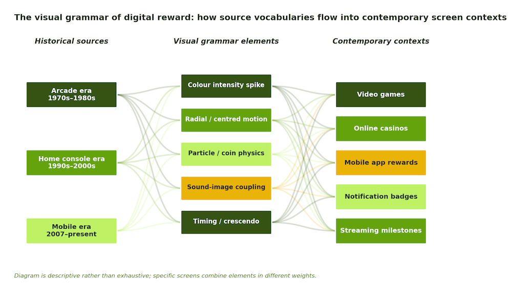
The diagram is descriptive rather than exhaustive. Individual reward moments mix the elements in different weights, and the boundaries between contexts are porous in practice. But the underlying pattern is legible even at this coarse resolution.
What the Grammar Actually Says
The critical question about any pervasive visual grammar is not whether we like it aesthetically but what it is communicating beneath the immediate surface pleasure. On the surface, the reward frame says: something good happened. Underneath, it also says something more instrumental: keep going.
The particle physics and colour spikes are calibrated to feel gratifying enough to reward the last action and to make the next action feel imminent. The design carries a directive that the animation itself hides. This is a general feature wherever the vocabulary appears, and it explains why the same design works for a game achievement, a slot spin, a fitness milestone, or a transaction confirmation.
Broader design writing has increasingly attended to this territory. A Frieze essay on interface aesthetics observes that digital operating symbols are among the most ubiquitous images of our age, despite being rarely discussed as visual culture. The visual grammar of reward is an overlooked branch of that broader interface aesthetic.
Reading it well is a small but useful form of visual literacy. Once the five-element structure becomes visible, the pleasure of the animation does not go away. It just sits inside a fuller understanding of what the pleasure is doing and where the vocabulary came from.
Not every visual grammar has to be resisted. Some can simply be read. The reward frame is now common enough across screen culture that reading it, rather than simply feeling it, is worth the small effort of paying attention.