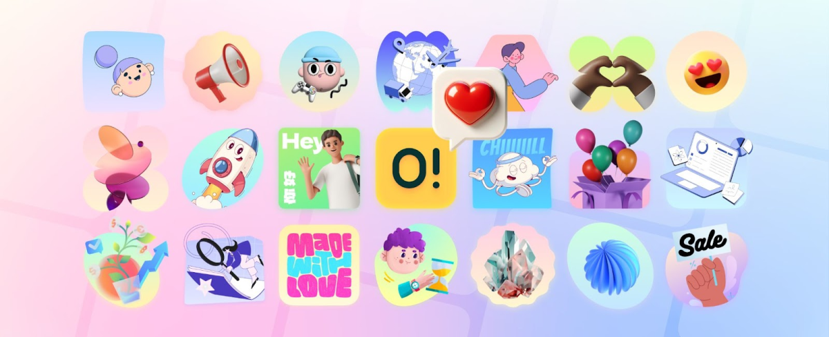
Icons8 launched Ouch in 2022 with 300 illustrations. Two years later, it houses thousands of visual assets across 21 styles. Most illustration libraries dump more content at you. Ouch rebuilt how design teams work with visual content from scratch.
The platform solved a specific problem. You find an illustration that’s 80% right. That last 20% breaks your brand consistency. You waste three hours hunting for alternatives. Icons8 built illustrations as modular systems. Characters separate from backgrounds. Objects move independently. Colors change globally across components. This sounds obvious. Nobody else was doing it.
Component Architecture Changes the Game
Stock sites treat illustrations like oil paintings in a museum. Look but don’t touch. Ouch tears everything apart. That workspace scene? The character, desk, computer, background all exist as separate layers. Character facing wrong? Flip it. Skin tone off? Change it. Background ugly? Delete it.
The technical implementation actually works. SVG files keep their structure when you modify them. File naming follows patterns that automated workflows can parse. File sizes stay small without manual compression. Your mobile site won’t die.
Last November, an e-commerce client rejected our custom illustrations with ten days until launch. Too clinical, they said. We grabbed Ouch’s Blush collection, tweaked colors to match their brand, rearranged some elements. Done in two hours. Their customers specifically mentioned how approachable the checkout felt. Error recovery rates jumped 32% after we swapped generic error messages for contextual illustrations.
Format Support That Acknowledges Reality
Every developer has lived this. Designer sends mockup with perfect illustrations. Those exact images don’t exist in any usable format. You waste half a day on Google Images. Ship something that looks nothing like the original design. Project manager asks why it looks different. You die inside.
Ouch ships everything. SVG for responsive design. PNG with actual transparency for that client still running IE11. GIF for social media. MOV for PowerPoint presentations. Lottie JSON for web animations that don’t destroy performance. After Effects files if you need to get fancy.
Technical documentation especially benefits. Generic clipart screams “we don’t care.” Custom illustrations cost $500 per image. Ouch sits in the middle. Companies documenting software workflows can use the same base components across 200 screens, just tweaking context. Educational publishers love the paper clipart collection for textbooks and course materials. Professional enough for university courses, approachable enough for elementary school.
Empty States and Errors Finally Communicate
Blank dashboards confuse users. Error messages frustrate them. 404 pages make them leave. Text alone can’t fix these emotional gaps.
A productivity app needed help with onboarding. New users hit empty dashboards and bounced immediately. We added Ouch illustrations showing progress states. Setup completion increased 24%. Not because the pictures were pretty. Because they communicated what text couldn’t: you’re on the right track, keep going, you’re almost there.
The modular system fits how modern design systems work. You don’t need the perfect “confused user” for your 404 page. Grab a character. Change the expression. Match your brand colors. Ship it. Component thinking, not picture hunting.
Marketing Teams Can Actually Use This
Blog posts need headers. Instagram needs daily content. Email campaigns need visuals that won’t trigger spam filters. Landing pages need illustration sets that match. Marketing teams have three options: expensive custom work, garbage stock photos, or Ouch.
Mega Creator runs in your browser. No Photoshop license. No IT tickets. Marketing managers edit directly. Change colors for seasonal campaigns. Rearrange elements for different audiences. Brand consistency happens automatically because you’re using the same base components.
Social media managers discovered something interesting. Static posts get ignored. Ouch’s Lottie animations load fast, play smooth, work everywhere. Not spinning logos. Actual storytelling animations that respect bandwidth.
Developers Get Real Integration
Most illustration libraries treat developers like afterthoughts. Here’s a zip file of images. Good luck. Ouch built an API. Illustrations become dynamic content. Generate contextual images based on user actions. Update visuals programmatically. Treat images like data, not decorations.
The desktop app (Pichon) integrates with VS Code. Drag and drop. Proper file structure maintained. Figma plugin works with your existing handoff process. Sketch integration doesn’t break your workflow. This isn’t innovative. It’s just competent, which feels revolutionary.
Performance matters. Files arrive compressed. SVG code stays clean. Animations follow web standards. Every kilobyte counts when you’re optimizing Core Web Vitals.
Education Gets Affordable Quality
Academic content needs accuracy. Students need engagement. Budgets need mercy. Copyright law needs respect. Most illustration sources fail at least two of these.
Ouch organized collections by academic subject. Anatomy diagrams that won’t get you sued. Geography visuals that respect cultural differences. Math explanations that actually explain. Teachers modify visuals for specific lessons without hiring illustrators.
Universities building online platforms report concrete improvements. Student engagement up 18% with consistent visual language. Course development accelerated by 3 weeks per module when instructors stopped hunting for images. Information retention improved in courses using systematic visual support versus text only.
Startups Can Look Professional
Your pitch deck needs to not suck. Your landing page needs credibility. Your app needs personality. You have $47 in the marketing budget.
Ouch’s free tier works with attribution. Remove attribution when you get revenue. Modify components as your brand develops. That fintech startup everyone’s talking about? They started with Ouch’s minimal style. After Series A, they evolved the base components into proprietary visuals. Same foundation, distinctive result. Engineering stayed focused on product, not redrawing illustrations.
Platform Evolution Reflects Actual Needs
Icons8 added AI generation in 2024. It maintains style consistency instead of generating random garbage. The AI understands each style’s visual logic. You get variations that actually match your existing assets.
The Icons8 ecosystem consolidation matters more than it sounds. One vendor for illustrations, icons, photos, audio. One invoice. One access management system. Large organizations care about this stuff.
Platform comparison misses the point. Some competitors have bigger libraries. Others have fancier effects. Ouch solved the actual problem: teams need to modify illustrations quickly while maintaining consistency. Everything else is noise.
The Reality Check
Ouch won’t replace custom illustration for brands that need unique visual identity. Highly specialized industries might not find appropriate content. You need internet for web editing. Some styles feel samey.
But for routine design work? For teams shipping weekly? For content that needs visual support without breaking budgets? Ouch works. Not because it’s revolutionary. Because it’s practical. Because it respects how people actually work instead of how illustration libraries think they should work.
The platform acknowledges something fundamental: perfect is the enemy of shipped. Teams don’t need more choices. They need better control over the choices they make. Ouch provides that control through modular systems, comprehensive formats, and integration that doesn’t fight your workflow.
Digital design keeps evolving. Visual communication grows more critical. Platforms that understand workflow reality will survive. Those selling pretty pictures won’t.