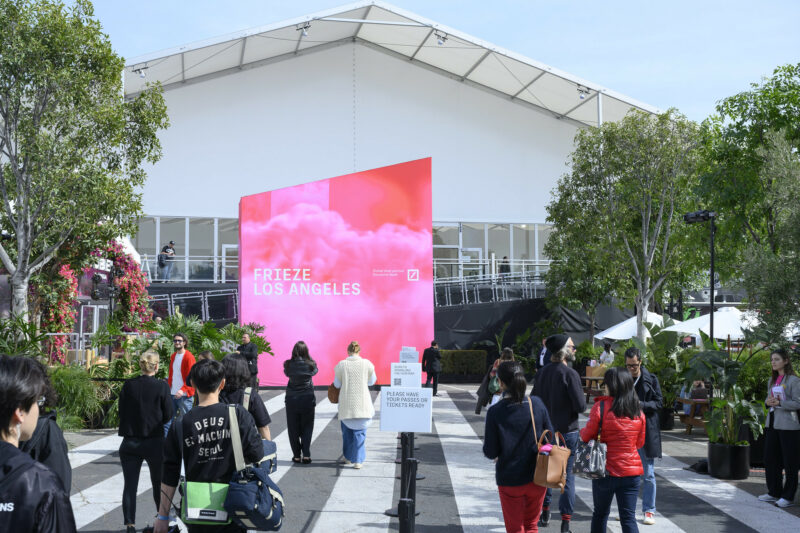
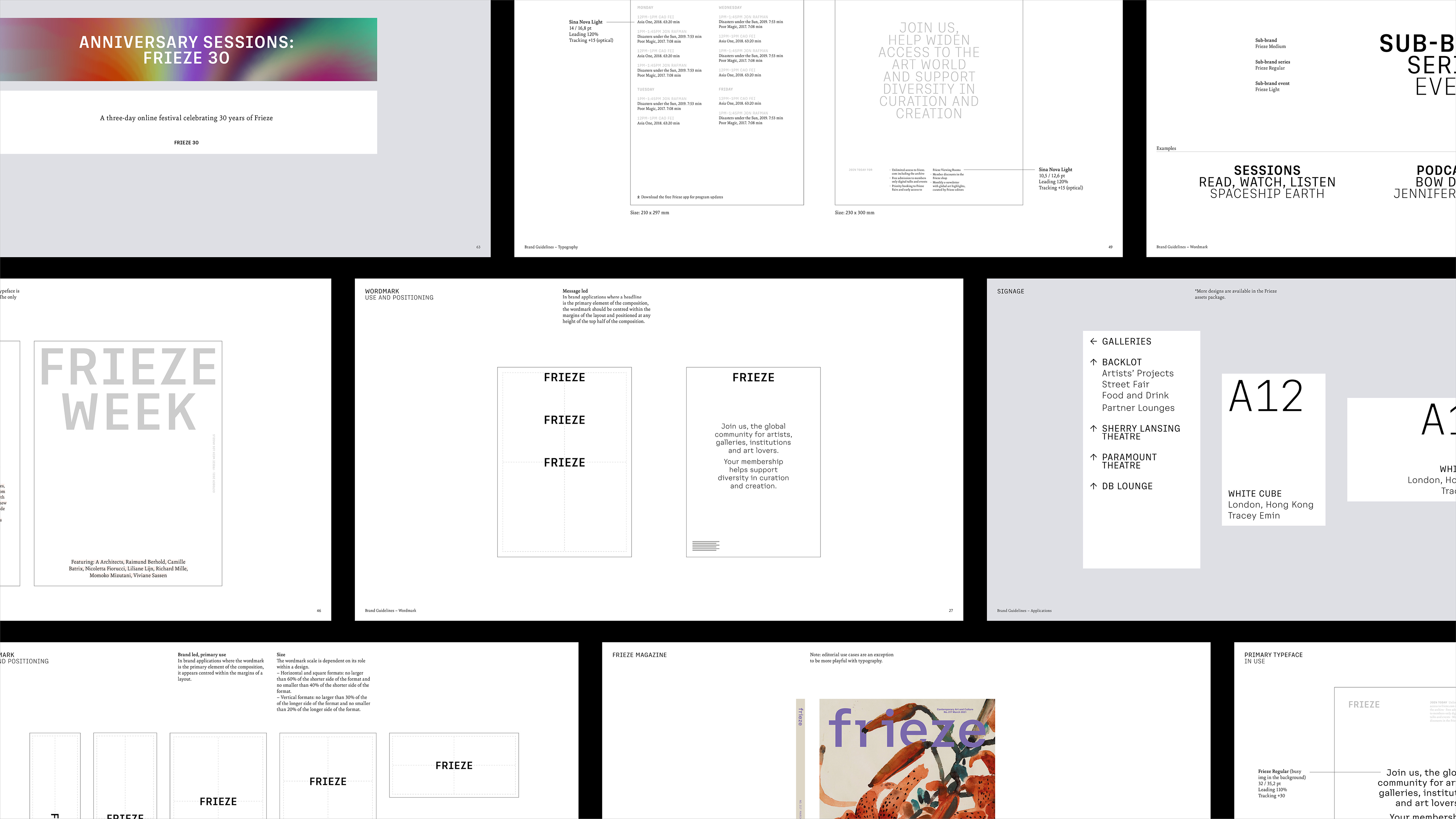
Frieze have unveiled a new visual identity in celebration of the art organisation’s 30th anniversary. Designed by leading studio Pentagram Design, Frieze’s new brand unifies its sub-brands under one coherent brand architecture.
The introduction of Frieze’s new identity recognizes the growth of the organisation over the past three decades, and is tailored to reflect its current breadth of its offerings and activities. Founded in 1991, Frieze comprises three publications – frieze, Frieze Week and Frieze Masters Magazine – and four leading international art fairs in London, New York and Los Angeles. In recent years, the organisation’s scope has expanded to include the digital platform, Frieze Viewing Room, alongside a host of editorial initiatives such as podcasts and talks.
‘Frieze has a strong and well-respected design heritage and so the purpose of the rebrand was not to simply update this. It was, instead, an exercise in organisation that had become increasingly necessary as the company grew. It was a true design problem – how to bring together disparate visual identities into one coherent system that retains the DNA of what has come before. Branding cultural organisations is hard – too much personality and you overshadow the content, too little and you end up with something void of individuality. Having the pleasure of seeing the new system in use across multiple applications, I can say that we found our sweet spot.’
David Lane, Creative Director, Frieze,
New Custom Typography and Brand Design System:
Designed in collaboration with typographer Luke Prowse, the brand’s new custom typeface honours the brand’s heritage, using the unique features of the frieze magazine masthead (created by Tom Gidley and later redesigned by Paul Barnes) to create a modern, sophisticated and ownable typeface suitable for use across the whole organization.
The new brand design system has also been conceived to give artwork the space to breathe, with a typeface that is characterful and distinctive but does not dictate the layout. The black and white palette that has been employed, similarly, allows the colours and textures of visual content to play a prominent role.
The Frieze brand appears across a variety of physical and digital spaces and mediums. As such, Pentagram developed a design system that is open, unrestrictive and can be aligned in many configurations. Although the Frieze typeface performs at small sizes, it has been paired with Sina Nova, a supporting serif typeface that has a high legibility and lends a warmth and intelligence to the designs.