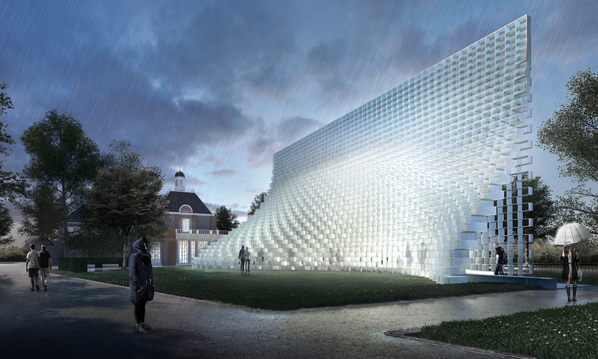
‘Cartoonish gyrations’ … Bjarke Ingels Group (BIG) architectural impressions of the 2016 Serpentine pavilion.
The humble brick wall, that most London of architectural elements, is the inspiration for this year’s Serpentine Gallery pavilion, according to designs unveiled today. But in the hands of the Danish architectural conjuror Bjarke Ingels and his firm BIG, it won’t be any old brick wall. It’s a wall that will be stretched open and hollowed out, its oversized fibreglass bricks stacked up to form a paraboloid enclosure that will taper high above the park, transforming from a bulging cave to a slender screen as it undulates across the lawn.
As usual for an architect who describes his voracious approach as “bigamy”, the structure is trying to be everything at once, containing allusions to some of the 15 pavilions that have gone before and mashing them up into a heady cocktail. It will be “free-form yet rigorous”, says Ingels, “modular yet sculptural, both transparent and opaque, both solid box and blob”. It sounds like every architectural tic at once, every design meme sublimated into an amorphous heap.

But a beguiling heap it may well turn out to be. From some angles, the stack of fibreglass brick frames promises to dissolve into a transparent grid, from others it will appear like a mountain of ice cubes. Pulled open, or “unzipped” as Ingels has it, the inhabitable wall will house spaces for events inside, with the translucent fibreglass structure giving it the feeling of stepping into a glacial cave.
In its cartoonish gyrations and pixelated form, the pavilion alludes to various other BIG projects currently under construction around the world. The practice is working on a new home for Lego in Billund, in the form of a stack of oversized bricks, while, in one particular view, the pavilion looks disarmingly like a scale model of their West 57th Street project, a pyramidal skyscraper in New York – which might be no coincidence, given the scheme of luxury apartments launches soon. What better billboard than a pavilion in Kensington Gardens?
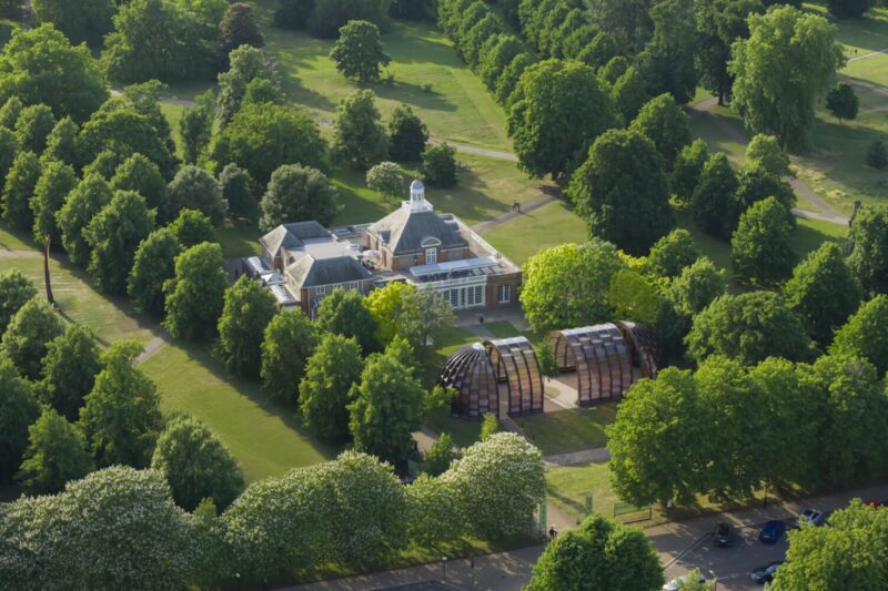
This year, for the first time, the main pavilion commission will be joined by four smaller summer houses by a range of other architects, who have each been asked to respond to Queen Caroline’s Temple, a classical stone summer house that sits a little to the north, built by William Kent in 1734.

Nigerian architect Kunlé Adeyemi has focused on the proportions and weighty mineral mass of the temple, concocting a structure of sandstone blocks that plays with solid and void. Described as an “inverse replica” of Kent’s pavilion, it takes the temple’s spaces and rotates them to create an abstracted room, window and doorway, with spare chunks of stone left scattered around, giving the impression of a ruin or a set of children’s building blocks.

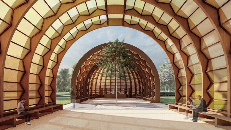
Berlin-based Barkow Leibinger have performed a kind of reverse archaeology of the site, discovering that a second pavilion by Kent once stood on a manmade mound nearby, made from the spoil dredged in the making of the Long Water reflecting pool. The pavilion was designed to rotate 360 degrees, providing ever-changing views of the park, a principle that their structure of wooden loops aims to reflect. Apparently generated by a “blind contour drawing” – a kind of sketch made without lifting the pencil up from the paper while only looking at the subject – the result looks like tangle of rubber bands floating above some benches.

London-based architect Asif Khan also looked into the history of the temple and realised, by tracing the sun’s path, that Kent aligned his pavilion to catch the rising sun every year on Queen Caroline’s birthday. His pavilion promises to play with sunlight, shadows and reflections, composed of a polished metal canopy surrounded by a curving fence of wooden staves, designed to cast changing shadows across the structure.

Finally, Yona Friedman, the Hungarian-born French architect and theorist, departs furthest from allusions to Kent’s temple, with a proposal for an intersecting lattice structure of steel rings. The hooped frame represents a fragment of his dreamy conceptual project for La Ville Spatiale (Spatial City), a theoretical inquiry he began in the 1950s for a multilayered and endlessly expandable city that would float above the ground, suspended in a modular space-frame. It’s only a shame that Friedman’s conception of an endless grid was already built in a much more compelling form, in Sou Fujimoto’s startling 2013 pavilion.
It is a feeling of missed opportunity that sadly hangs over the whole endeavour. Together, these dinky structures stand as a diverse range of responses from a group of international architects aged from 36 to 93, but they promise to do little more than provide a brief diversion for wandering park-goers – or act as tabletop centrepieces for sponsors’ parties. Each one feels like a sketch of a pavilion that could have been, a hastily drawn idea limited by the pressures of time and budget, and the absence of any real function.
Begun 16 years ago in the midst of millennium fever, when faith in the iconic power of architecture was at its peak, perhaps the Serpentine pavilion programme has now run its course. Founded on the idea that great architecture can happen entirely independent of use or purpose, it has produced a series of intriguing structures – some beautiful, some less so – but it has never managed to go beyond its conception of architecture as a collectible artwork, commissioning some of the world’s best architects to make fundraising-party baubles. As the pavilion programme’s originator, Julia Peyton-Jones, leaves the Serpentine Galleries this year, perhaps BIG’s greatest-hits mashup is a fitting note to end on – or at least a moment to shift gear, and start commissioning structures that could have a useful afterlife beyond Kensington Gardens.
guardian.co.uk © Guardian News & Media Limited 2010
Published via the Guardian News Feed plugin for WordPress.
