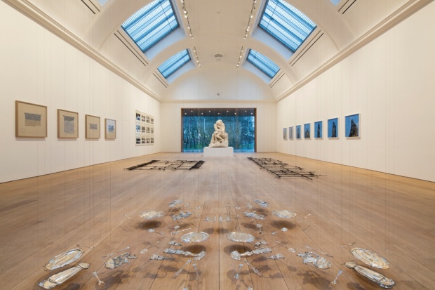
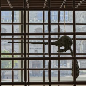
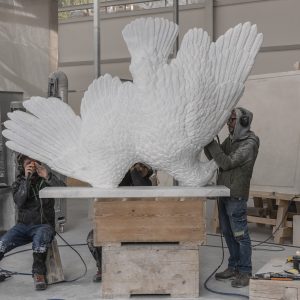
Cornelia Parker’s Composition with Horns (Double Flat) at the new Whitworth Art Gallery. Photograph: David Levene
“The existing provincial art gallery is the most unsatisfactory of earthly institutions,” scoffed the Manchester Guardian in July 1890, when the body of work that would form the core of the Whitworth Art Gallery’s permanent collection first went on display. “Such galleries are governed by committees of businessmen whose knowledge of art is, from any serious point of view, either nil or that of a respectable amateur.”
The article concluded that the Manchester gallery would likely fall foul of being “choked with rubbish”, describing the collection of casts as “almost ludicrously bad”, and the overall effect as affording “little or no ground for hope” for the future of the institution. In keeping with critical tradition, the author seems little concerned that among the local worthies guiding the gallery were none other than the Guardian’s then editor, CP Scott, and its owner, John Edward Taylor.
Visiting the same site this weekend, when it reopens after a £15m remodelling, the Victorian critic would be in for a shock. The Whitworth has since built a weighty reputation, acquiring the first Picasso of any public collection in 1922 and being described as the “Tate of the north” in the 1960s. Since 2006, it has been propelled by the energetic leadership of Maria Balshaw to become a dynamic international centre of contemporary art, seeing visitor numbers double to 190,000.
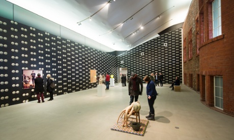
But despite its repute, the Whitworth’s building has always retained a rather provincial air, along with the institutional feeling of being the University art gallery. Described by contemporary reviews as “hard, mechanical and uncompromising” when it opened in 1908, it stands as an imposing pile on Oxford Road, looking like part of the Edwardian hospital complex across the street. A number of refurbishments over the decades have had mixed success, leaving a dingy muddle of interiors.
“It was quite austere,” says Balshaw. “A lot of people weren’t even sure if they were allowed in, which is a big barrier – especially when you’re on the edge of Moss Side, one of the most deprived wards in the country.”
The latest remodelling and extension, by Glasgow-trained London-based architects MUMA, makes its £15m budget go a long way, finally opening the building up to its parkland setting. At the front, they have softened the forbidding entrance with a sculpture forecourt and an inviting sequence of steps, ramps and benches; but the real meat of the project is saved for the back, where MUMA have extended the symmetrical composition with a pair of wings that project out into Whitworth Park, framing a new sculpture garden. “It’s about having open arms and saying: ‘This place belongs to you.’” says Balshaw. “Before, we turned our back with a blank brick wall – now you can see what’s going on inside.”
Thrusting out into the trees as a hovering glass bar, one of the new wings contains a cafe where you can eat Manchester’s finest brownies while suspended among the leaves. A children’s learning studio lies beneath, where activity can spill out into a courtyard garden, to be landscaped by Olympic Park flower expert Sarah Price, in the style of “Zen garden meets English meadow”.
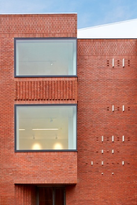
At the other side of this garden stands a taller redbrick wing, housing a more grownup study centre and conservation rooms, whose wall will provide a surface for outdoor projections. The two learning spaces face each other, says Balshaw, “so you can look across to where you once came, or will come back, aged 6, 16 or 60.”
The open competition (which attracted 130 entries) could easily have fallen foul of the icon syndrome, procuring a jazzy bauble in the park to lure people inside with a twinkle. But thankfully much of MUMA’s work will go unnoticed to the first-time visitor, their skills deployed on fixing functional issues and making the place work as a whole, as they did so successfully for the V&A’s medieval and renaissance galleries, completed in 2009.
A good deal of intelligence has been deployed in the three temporary exhibition galleries, removing suspended ceilings to reveal beautiful, top-lit, barrel-vaulted halls. Much of the 1960s interior is protected, as a notable example of Scandinavian chic by architect John Bickerdike, but in translation across the Pennines he seemed to forget that the power of Scandi-modern was in its careful modelling of daylight. Before MUMA arrived, just 16% of galleries had natural light; now over half do.
There is great care evident in the details, from the triangular, polished stainless-steel window mullions, designed to dissolve into the view of the park, to a huge openable facade for oversized deliveries and a freight lift that can hold an entire class of children. It is all wrought with precision worthy of the Victorian philanthropist and gallery founder Joseph Whitworth himself, whose achievements included developing a standardised system for screw threads and designing a rifle so accurate it became known as the “sharpshooter”. He would no doubt have cooed over MUMA’s delicate steel sun-shading screen, which dances in 5mm-thin fronds across the glazing like a fine lace fringe.
The lure of textile metaphors is, regrettably, one place where the project gets a bit clumsy. The daunting task of composing an expansive blank facade along the side street, necessitated by gallery walls within, has pushed the architects to search for allusions in the sewing drawer – a ready source of reference, given the Whitworth’s important textile collection. The result is a “slash and stitch” brickwork pattern, where deep folded clefts in the brick wall have been “stitched” back together with bands of white ceramic faience, placed at irregular intervals to give the impression of “slubs”, the lumps found in woven silk. But they look more like plastic burglar alarms, hung with random abandon.
Still, given the Whitworth’s lively rota of meteor showers and naked people rolling down the stairs, the fussy facade will no doubt soon be taken over by another bold act of artistic intervention.
guardian.co.uk © Guardian News & Media Limited 2010
Published via the Guardian News Feed plugin for WordPress.
