Last year I wrote an article on FAD about my issues with video art, the mistakes being made with it and how it could be improved – have a read in the first in the series of what’s wrong with video art? But now something else is gaining favour in the world of art and the moving image, and that is the multi-screen installation.
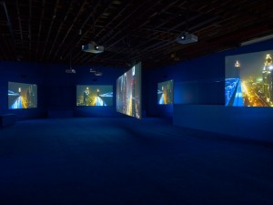
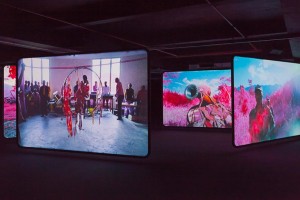
The critically appraised, if somewhat ponderous, Playtime by Isaac Julien at Victoria Miro was set across seven screens and the excellent Richard Mosse’s Enclave has gained a screen in migrating from the Irish pavilion at the Venice Biennale to a car park in London – now beaming out across eight screens.
Why so many screens?
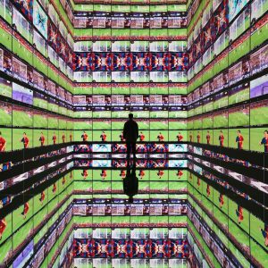
The claim by both artists and galleries is to make the experience immersive, as all the screens don’t show the same image the viewer will feel enveloped with the artist’s creative vision. The fact that the viewer can’t stay in one place and has to move around will make them more engaged and hopefully prevent anyone from zoning out, like they often do when watching television at home.
Cynics may say having such a complex set up negates one of the points from my original article, namely that I’d rather watch it at home on television on my comfortable sofa rather than some backside numbing box in a gallery that we all know can afford better. With a multi-screen installation, there is no way to replicate this at home unless you’re very wealthy and have a very large living room.
Why is it bad to have so many screens?
Humans have binocular vision so can only truly focus our eyesight on one thing and so having other screens in our peripheral vision serves only as a distraction. Knowing this, most of these multi-screen artists ensure the key story stays on one constantly shifting screen – this all begs the question of ‘then why bother with multiple screens?’
If the aim was to be truly all encompassing then the screen would wrap around the viewer completely so they felt they were actually there.
A multi-screen installation wouldn’t be so bad if you were the only one watching and walking around leisurely was an option. But these videos tend to last 40 minutes or more and so a crowd of people accrues as it goes on, thus seeing the screen becomes tricky as you have to peer between people’s heads. This all serves to take you out of the experience and make it rather frustrating in that you may have missed a key part as it was on a different screen.
At worst it’s a cheap gimmick to keep people interested such as when movies throw in scantily clad women and needless gore to ensure people overlook the lacklustre plot. A work of art should stand on its own and not rely on the novelty factor to keep the audience hooked – worst of all the two examples I’ve highlighted are good enough as they are and so the multiple screens actually detracts from the experience.
Conclusions
Despite highlighting the failings of a multi-screen layout, it can work to great effect and a recent example was the 360 degree screen at the UAE pavilion at last year’s pavilion that actually gave you sea legs if you watched it for long enough.
The multi-screen installation is a tool that can make video art a more engaging experience if used properly, it’s just that lately its improper use seems to be designed without the audience in mind.
