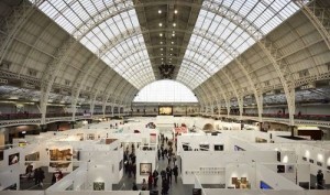
Last year Art13 received multiple plaudits for offering something fresh and different from the existing London art fairs and pitching themselves in the sweet spot of not feeling too commercial yet also avoiding the inaccessibility associated with Frieze. The spacious feel of the fair gave the works room to breathe and made it a good epxerience for both collectors and browsers alike.
After it’s successful debut the fair has grown in size and Art14 has arrived to much fanfare. But can it repeat the sucess of it’s predecessor? I’ve summed up the high and low points of Art14:
The Good
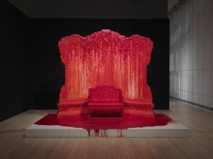
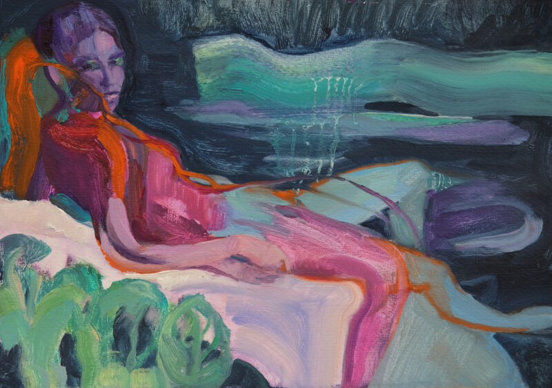
Projects: They are exciting, engaging and well placed to create focal points where people were taking pictures and discussing the works. They include interactive seating, a stage for perfomers and thrones dripping with red wax as if it were blood. Many of the best works in the fair are part of the projects.
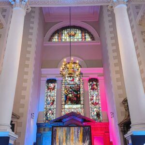
Layout: Normally most fairs give token entry to the smaller and newer galleries but tuck them away in a corner of the fair while the big names take centre stage. Art14 has placed the Emerge and London First regions in the heart of the fair and given them a distinctively coloured label of pink or blue so they stand out from the rest of the stands.
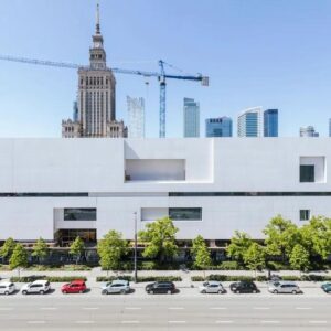
International scope: The growth has made it a more international roster with galleries from countries as diverse as Pakistan, Nigeria and Indonesia. 182 galleries from 42 countries is a statistic that speaks for itself.
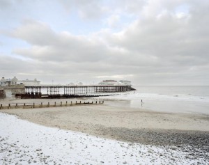
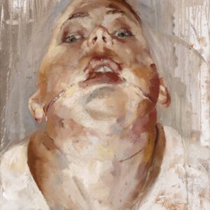
London galleries: Despite the multitude of foreign galleries, two of the most impressive stands belonged to two local galleries. Flowers had their strongest artists on display including the kinetic art of Tim Lewis and the Pierdom photography project of Simon Roberts. In the emerge section, Bearspace also impressed with their solid stalwarts Jane Ward and Suzanne Moxhay.
The Bad
Loss of Individuality: What made Art13 stand out was that the galleries that participated were those that you wouldn’t find at other fairs – this made it a great alternative to Frieze and London Art Fair. But this year there are galleries here that have featured in the Affordable Art Fair and even at this year’s London Art Fair, which is still fresh in the memory.
Lack of space: The increase in galleries has led to a reduction in space and the fair felt a lot more congested. This meant that it felt more commercial, akin to a bustling art marketplace, but this made it harder to enjoy the works on display.
Now I know we may be nitpicking about these two points as after all this is a commercial affair. But these were two of Art13’s unique selling points and what made it stood out last year. Without these it becomes just another art fair and no longer an event to look forward to.
