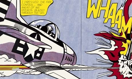
A detail from Whaam!, 1963. Photograph: © Estate of Roy Lichtenstein/DACS 2012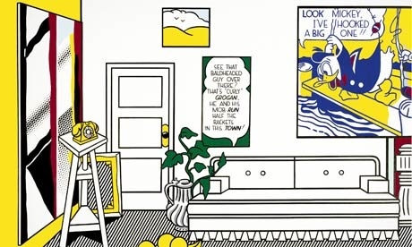
A detail from Artist’s Studio No. 1 (Look Mickey), 1973. Photograph: © Estate of Roy Lichtenstein/DACS 2012.
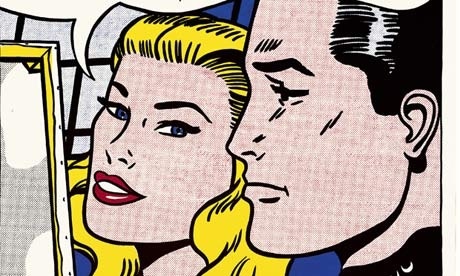
A detail from Masterpiece, 1962. Photograph: © Estate of Roy Lichtenstein/DACS 2012
!– GUARDIAN WATERMARK –>
Whaam! goes the painting, as the rocket hits, and the enemy fighter explodes in a livid, comic-book roar. Thud! goes the exhibition catalogue, with its earnest appraisals of Roy Lichtenstein’s achievements, and its diligent chronicle of his life and works, all the awards and all the shows. Pheww! goes the critic, approaching the end of this retrospective at Tate Modern.
Lichtenstein’s show just keeps on coming: from early pop-art reworkings of comic-book strips, via stiffened up and Benday-dotted versions of Monet’s Rouen Cathedral, Picasso’s Femme d’Alger and Matisse’s glum goldfish; from art-packed, implausible interiors and empty mirrors, to nasty reworkings of Chinese landscapes and awkward scenes of girl-on-girl bedroom lassitude.
It all starts off so well. The exhibition opens with a room of mid-1960s drooling brushstrokes, rendered flat and graphic, the charge of all that writhing, painterly splatter caught in mid-stroke, outlined and frozen. The brushmarks, or rather their cartoonish equivalents, just hang there, suspended between accident and invention, and between life and its depiction. These paintings are a sort of mime, a parodic acting-out. A few years earlier, in the late 1950s, Lichtenstein was himself making brushy, rough and jumbly abstractions, but even then he never quite let go. In the early 1960s, he learned detachment, and with it came a different kind of sophistication.
When the American pop artist took all the heroism out of abstract expressionism’s lunges and swipes, and repainted them with a flattened, graphic panache, he cauterised all the blather and mystique of an earlier generation of American artists, voiding it of all its posturing masculinity. I think he began to question the whole idea of authenticity and self-created myth. But what started out as salutary ended up a sort of trap.
I would have been happy to have lingered in those first few rooms. The second room takes us back to early pop, with paintings derived from comics and adverts, the charming vernacular of mis-registered blocks of colour, wonky line and hokey imagery lovingly blown up, edited and repainted. These paintings have a fond regard: a woman’s hand sponges down a yellow wall and wipes away the grime. A shapely female leg and foot operate a labour-saving fliptop bin; a manicured hand wields an aerosol can. Pphhhht. Is it fly spray? Air freshener? Is it a phallic symbol?
I don’t know if Lichtenstein had much use for the psychological implications of his work. Everything is in and on the surface. There’s a sort of blankness to his regard. Emotions, as well as his surfaces, are kept unerringly flat. Unlike Warhol’s studied and affectless gaze, or Claes Oldenburg’s humour, or James Rosenquist’s weird excessiveness, Lichtenstein stays cool. He is ever the mannerist, even in his painted explosions and through all that comic-strip weeping.
In 1961, he repainted an illustration from one of his infant son’s books, an image of Donald Duck and Mickey Mouse fishing, the duck catching a hook in his jacket and thinking he’s hooked a big one. It’s a dumb joke. Mickey laughs at the duck’s mistake. If we laugh, it’s because we recognise how dumb it is: what a daft subject it is for a painting, which then becomes a joke about art and the status of imagery, and what’s fit to paint. This became perhaps the most familiar trope and strategy of pop: its elevation of the commonplace, the unregarded. The gag kept doing the rounds, from Warhol’s soup cans to Richard Prince‘s reworked Esquire cartoons and beyond. Artists are still at it now. We live in an age of multiplied ironies and dead echoes. The depletion of meaning is a work that’s never done with.
Lichtenstein went on to paint the covers of notebooks and car tyres, liver salts fizzing in the glass and sparkly engagement rings, sunsets and beaches. All these are genial, funny paintings. What he is best known for, however, are his paintings derived from comics, almost all of which have a sort of subtext. “Why, Brad darling,” says the blonde, as they stare at a painting whose back we see, various meaningless shapes grinning through the canvas, “This painting is a masterpiece! My, soon you’ll have all of New York clamoring for your work!” Brad wears an “I know” expression. This work, Masterpiece (1962), whose image and speech bubble he borrowed from elsewhere, might have mirrored Lichtenstein’s own career ambitions (that year, he held his first show with top New York dealer Leo Castelli), while also being ironical about success and the socio-sexual status of the hot young artist.
After this, it was all downhill for me. We encounter the first of Lichtenstein’s several unfortunate forays into sculpture – their brass shapes harking back to the high days of New York art deco – and an increasing preoccupation with the work of other artists. There is a sense that this is all both homage and critique, though I don’t think he adds anything to Picasso, to Matisse, or to any of the other artists he appropriated and reworked. Picasso kept evolving, and never degenerated into style. With Lichtenstein, it’s pretty much all style and manner, never mind the multitude of references he plays with. I felt bludgeoned by his arch-sophistication; his detachment becomes an icy, stylish chill.
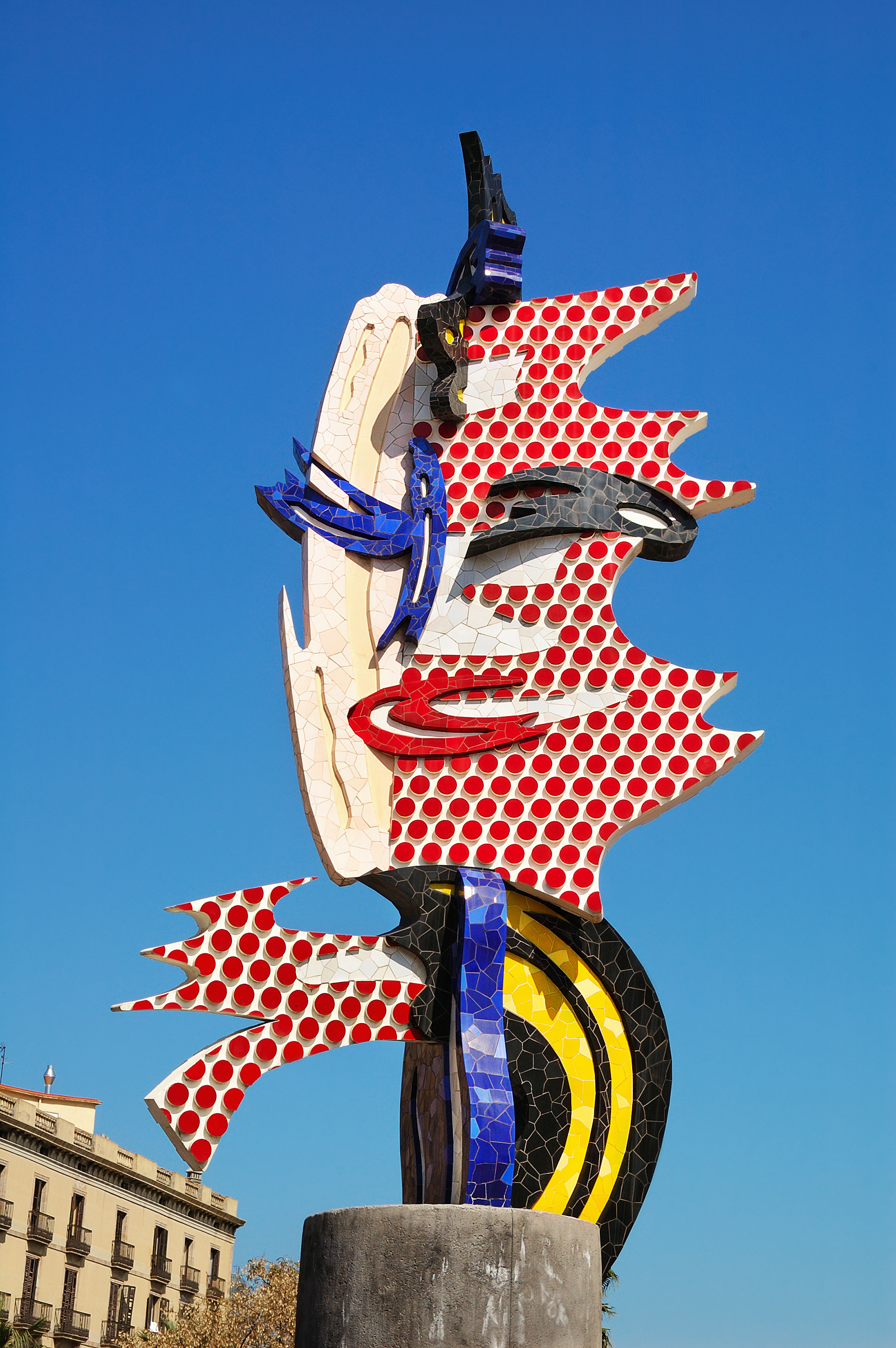
Whenever I pass one of Lichtenstein’s paintings in a museum I keep my distance. Why get close? The stencilled dots and lines and fillings-in don’t get more interesting when you do, and in any case the shrill insistence of the colour and tempo are so shouty you want to hang back. There is a sculpture in Barcelona’s Port Olympic that has annoyed me for 20 years. Before it says anything else, it shouts “I am a Lichtenstein!” In his later work, where he plays on various kinds of abstraction, the paintings look like the props used to dress stage sets. What he is doing here is as arty and contrived as the very things he’s taking a pop at. His versions of Chinese landscape painting, with their dotted mists, self-conscious and unconvincing swirls of weak brushy colour, their tiny comic-book boats and coolie-hatted people are just horrible. You want to run away and look at the original works he is referring to.
At his height, Lichtenstein was never afraid of the vulgar. He just dealt with it with a very long pair of tongs, and used his style as a form of quotation marks. He bleeds the inner life dry. His work makes you wonder if you have one. Warhol’s work never had that effect. Everything turns about style in Lichtenstein, and for some reason this saddens me. The cumulative effect of seeing so much of his work together is to inure me to his undoubted gifts. Before the end, my spirit had sunk so low I wanted to creep away, all exclamation marks spent.

![]()
guardian.co.uk © Guardian News & Media Limited 2010
Published via the Guardian News Feed plugin for WordPress.


