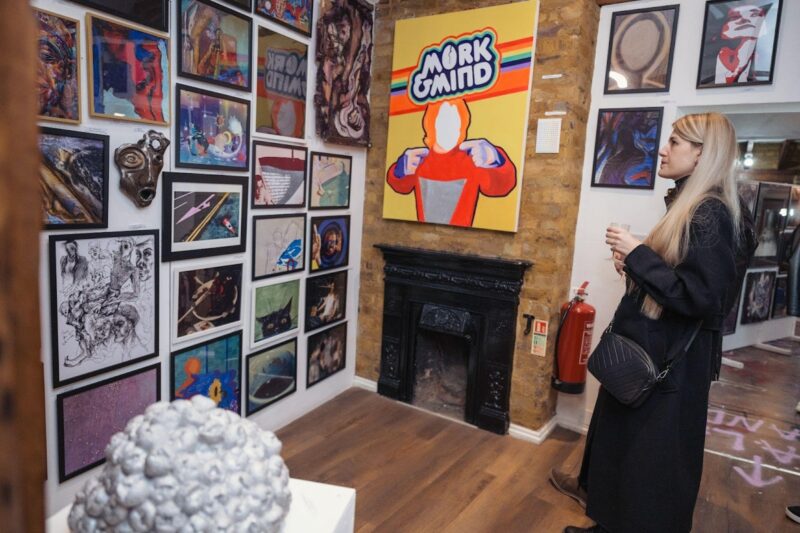

Israeli born, London based artist Yulia Iosilzon recently sat down with art historian, writer and curator Hector Campbell to discuss how her sculptural background influences her paintings, her exploration of colour and narrative, and her current exhibition Paradeisos at Carvalho Park in New York, curated by Kate Mothes of Young Space, which runs until November 24th.
Hector Campbell : During your period of undergraduate study at the Slade School of Fine Art (London), your interested moved from sculpture to painting, although your works retain a sculptural quality through the introduction of mixed media such as silicone, latex and faux fur. How do you feel this use of material collage adds to your paintings? And are there any other aspects of sculpture that still inform your two-dimensional works?
Yulia Iosilzon : It was an exciting period when I moved from sculpture to painting. Very scary though. I still remember the anxiety of entering the unknown painting void, going from the Slades’ lower ground floor sculpture space to the third-floor painting studios. I felt very confident in that move because I always felt a two-dimensional presence in my sculptural works, so re-configuring my practice felt quite natural. Yet, thinking as a sculptor when I made paintings, from that day I decided to be honest with myself, asking different questions and figuring out what was important for me in painting.
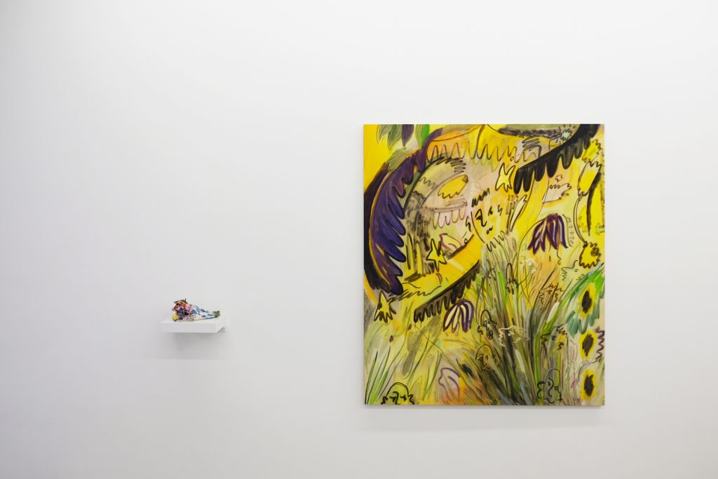
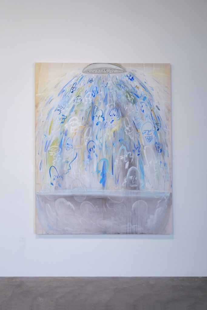
At that time I was really into Mike Kelly’s massive paintings created with toys and other ephemera, which gave me an incredible sense of joy and colour. I was moved to try something crazy kitsch and my sculpture background kicked in when I started to experiment with faux fur, silicone, glitter and latex. In The Fear of Orange Water (The Shower), for example, I wanted to make this steamy, glittery, almost foggy atmosphere and the silicone with glitter water drops felt very organic with everything else there. It gave me the atmosphere I was seeking. Every time I feel like the painting needs an exclamation mark and more tactile appearance, three-dimensional elements always do the job.
H.C : Having completed your BA at the Slade, you went on to study for an MA at the Royal College of Art (London), graduating this past summer with a degree show centred around the theme of ‘Grand Celebration’, featuring paintings, ceramic sculpture and elements of installation. How did your practice evolve during the course of your post-graduate study? And could you expand upon this concept of ‘Grand Celebration’ as a thematic representation of your work?
Y.I : At the RCA I started to be interested in emblems, symbols and metaphors. I preferred to see my paintings as a metaphor or a joke that you have to resolve like a charade. I’m still obsessed with Philip Guston’s Nixon drawings series, you can almost feel him laughing or being angry when he made them and I wanted my paintings to be “felt” and “experienced”. I am mainly focused on stories, metaphors or humour in my paintings but back then I felt that I needed to have a special communication route with the viewer. The emblems and symbols were catalysts for those visual reactions.
I was always drawn to the emblematic and emotional side of celebrations. It was one of the themes I kept repeating in my works and that I explored a lot. Celebrations excite me! Especially the unseen veil of emotional pressure, adrenalin explosion and symbolism. I paint as I think, I start with a conversation with someone and then I just put my thoughts into symbols and colours on paper to create the inner world of the metaphorical reality of celebrations, traditions and stories.
At the RCA I was exploring the painting’s quality of vulnerability, permission to change the narrative and to twist it as much as you want. When I made the whole installation of a crazy celebration, with the bright-glazed cakes and acid- figured paintings, I was feeling that the sense of permission into the painting was necessary. I wanted the whole atmosphere to feel on the edge of welcoming and repulsive.
H.C : As we’ve touched on, your paintings maintain a strong physical, tactile identity through the incorporation of various mixed media. This investment in materiality is further emphasised by your use of transparent silk canvas, which you’ve previously spoken of being in part inspired by Karla Black’s abstract sculptures. Could you explain further your interest and experimentation with these semi-transparent surfaces? And how this concept of transparency is also evidenced within your subject matter?
Y.I : The important thing that transparent paintings give you is a sense of vulnerability, intimate and yet distance, and these contradictions always form a part of the narrative. The painting doesn’t feel locked or too revealing, but always on the way to one or another. I imagine this process as sand swapping sides of an hourglass. One day the transparency is a part of the conversation, the other day only mark-making discussion is happening.
Karla Black’s works were very moving to me, as well as Sigmar Polke’s paintings. I was drawn to the confidence of orchestrating strong, vibrant colours on unusual and transparent surfaces. They just felt so cinematic, you almost imagined yourself on the set of a movie or a cartoon. They helped me to understand the world around us and the duality of things.
The same anchors I found in transparency, it’s very comforting. Seeing the stretchers behind gives me a sense of control and gravity. It feels more real than any other surface, maybe because I can see the wall behind it. I do paint a lot quicker on transparent fabric, I think because of the comfort too. Comfort zones are a very important subject of my paintings, I always keep them in mind when I paint anything. I feel more confident to touch base with controversial social narratives on my paintings when it’s via transparency. Nothing is certain yet everything is out there with a lightness of the line.
Maybe it’s about the feeling of touch or because it allows me to calligraphically enter the world of my stories and get them out of my system. I can’t fully describe how I feel when I enter the transparent painting. It feels very different from painting on canvas. There’s always a way back.
H.C : A commonality throughout both your paintings, sculptures and installations is the strong command of colour, often bright and vibrant yellows, oranges and blues balanced against more muted, washed tones and detailed black or grey line work. How has your relationship with developed over the course of your art school study? And where do you look for inspiration in regards to colours and their combinations?
Y.I : As long as I remember myself, I was always colour-driven. With every work and every painting, the colour combinations come first. They are my primary research and I spot these ‘juicy’ colour combinations everywhere, in the most unusual places, from fashion to advertising but also hospitals and police stations, as well as observing weird clothing combinations on people on the street.
It’s an ongoing effort, thinking about the colours, tones, undertones and how they will exist on the canvas. I analysing what emotions I can express with these colours and tones. The colours in my works have their own language, they live their own life and they help me to orchestrate the mood of the painting. They exaggerate emotions and instantly change the narrative of the painting, painting pink shoes on a black and white painting, for example, adds a seductive, feminine and consumption element to the whole scene.
H.C : Your works are undeniably narrative and figurative, however, through the use of often predominating colour and the inclusion of those sculptural, material elements, preserve an element of abstraction that allows the viewer to impart their own interpretations onto the scenes. How do you approach this construction of narrative within your work? And how do you balance between creating an entirely prescriptive portrayal and one open to elucidation?
Y.I : I start with a story, a funny metaphor, and try to make as many drawings as possible. Ella Kruglyanskaya has said that drawings are “forgiving” and I can’t agree more. I always try to find the balance between composition, figurative elements and colour combinations when I make drawings. These drawings are my mental-emotional diary and the people in them are people I happened to meet, people from stories or some anthropomorphic creatures that find their presence in my drawings very freely (such as the ‘little devil’ character who keeps reappearing in my drawings and paintings.)
I do enjoy the ambiguity of abstraction with the sculptural elements in front, it reminds me of the cinematic moment of driving the camera to the front, only capturing the first figure and making the background blurry. These cinematic, cartoonish ways of portraying stories are very natural for my paintings. It makes the narrative build-up freely and focuses on the emblems and details.
H.C : ‘Searching For Peace’, your painting that is currently included in the prestigious annual New Contemporaries exhibition surveying recent graduates, embodies your use of dark, sardonic subject matter depicted in a delicate, affectionate manner, as well as the recent recurring motif of tattoos within your work. What influences and draws you to these more ironically twisted themes? And could you discuss a little the impetus behind your exploration of tattoos?
Y.I : In my practice, I do have two theme fields that I love exploring. It is like moods, one day you wake up listening to AC-DC, the next day you feel like Rihanna. It’s natural for me to have this duality in my works, I enjoy switching one to another and filling each with more details and inspirations. They are like two sides of one coin. The first is more poetic, emblematic, romantic and more on the feminine, fantasy side. The second is more very attentive to detail, uncovering the sinister elements behind the narrative, social issues, everyday problems, humour and seduction.
The tattoo series keeps re-appearing in my paintings. It’s a universal and emblematic visual language that I have always been keen to understand. It all started with Eastern European movies about life in the dark neighbourhoods, where people could identify themselves through their tattoos. The same can be said of prisons, and I was especially into the gangster who when entering the room, everyone understood everything about this him, just with a glance at his tattoos. It was just so exciting to me that this visual language exists, as I could tell the life stories of the characters on my paintings with just the tattoos.
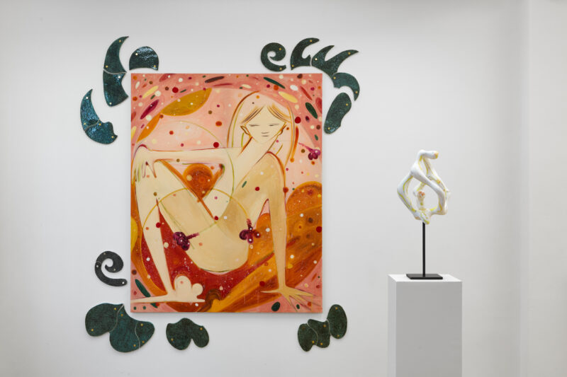
H.C : Finally, your current New York solo exhibition ‘Paradeisos’ at Carvalho Park, curated by Kate Mothes, draws upon many of the material and conceptual concerns we have discussed, with these new paintings considering the irony and contradictions inherent within seemingly utopian environments. Could you talk a little about this new body of work, and it’s underlying ideas or influences?
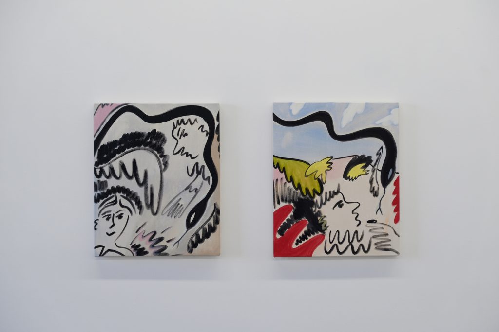
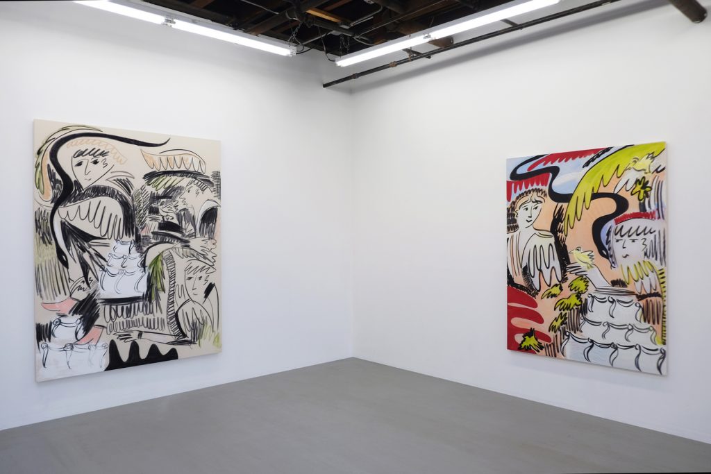
Y.I : I was very happy with the opportunity to make a new body of work for the show in a short period of time. It gave me full visual completeness of the ‘paradise’ and let all my thoughts out. The Paradeisos, to me, is an endless visual conversation, within the emblems and symbols in the paintings. These emblematical milestones act like the “keys” to make it to the highest level of the charade. I was interested in the mixture of a utopian world and some true, real objects, like multiple-layered cakes or shoes.
The prime readability of it refers to Adam and Eve exiling heaven. I wanted to collect all the association fragments of paradise, Adam, Eve, the Snake and maybe the childhood memories about this biblical moment. That’s how we started brainstorming and figuring out the key points of the visuals. Kate Mothes and I started analysing what ‘paradise’ means nowadays, were Adam and Eve living now what indulgences would they face? Excessive consumerism, flooding of information, overeating or any other idealised 21st-century vice? I couldn’t stop thinking about the serpent as the cause of the exile and made it a prime figure. It exists in almost all the paintings. It is also a very significant compositional element that keeps the visual conversation between the paintings.
In this creation of a fantasy environment, the colours interfere with the chaotic charcoal lines on the canvas and the dreamy birds co-exist with the wondering re-appearing human faces. For me, this show was a challenge to find a balance with colour, composition and different symbols in order to re-interpret already known story and re-enter it again.