
Alien aesthetics … Prey. Photograph: Bethesda
Think of the most impressive, memorable video games of the last 40 years and they tend to have one thing in common: unity of vision. From the sludgy corridors of Doom to the vast art deco chambers of Bioshock, great games take place in intricately realised worlds where every aspect – from armour to architecture – reflects a consistent visual theme.
As in the movie industry, the creation of detailed virtual worlds often involves the production of concept art – reams of sketches and paintings, based on early script drafts and discussions, fashioned to provide a target look for designers, artists and coders.
“The idea is to establish the big picture of the game, like a visual pitch, not only for artists and designers, but pretty much everyone on the team,” says Emmanuel Petit, lead visual designer at Arkane Studios. “I believe this helps in keeping us energised, and gives us something concrete and exciting to work towards.”
Creator of acclaimed first-person adventures Dishonored and Prey, Arkane produces some of the most fascinating, atmospheric and idiosyncratic worlds in the modern games industry. To find out how they are envisioned, we took a tour through a series of Prey concept sketches with Petit. The game, set aboard a space station beset by shape-shifting alien invaders, is filled with fascinating artefacts and architectural flourishes. This is how they came about.
The Lobby

This is the entrance lobby of the Talos 1 space station where the game takes place. According to the backstory, the Moon-orbiting craft was originally built in the 1960s but has been refitted many times since, most recently by the evil Transtar corporation.
It’s now 2032, and the grand hall reflects the station’s long history. “This is was one of the first places we started designing, which makes sense because the lobby concentrates and encompasses a lot of the station personality and acts a bit like an interior facade,” explains Petit.
Arkane’s Sébastien Mitton came up with the term Neo Deco to describe the look and feel, combining mid-20th century design and futuristic elements. “The space station building is inspired by Hugh Ferris’s concepts, art deco or neo art deco skyscrapers such as the South Ferry Plaza project, John Berkey paintings and early NASA spacecrafts,” says Petit.
At Arkane, concept art is produced throughout the whole development process, because the team continually comes up with new ideas, says Petit. Often new levels are documented and prototyped before concept art is produced to explore richer visual ideas.
“Before (artist) Fred Augis started painting it, most architecture, colours and some materials were already present, but lacked a bit of personality,” continues Petit. “He refined a lot of things like the lighting, materials and wear of textures and made the atmosphere smoky. We also have a team of level architects, who work together directly with the level designers to do a lot of the conceptual architecture work. This has a tremendous value to us, as it allows us to combine the beauty of a space and make sure it’s fun to play in it.”
As for specific influences behind the furnishings and interior styling, Petit cites a range of real-world influences. “The Lobby was inspired by a Spanish bank called Caja Granada,” he says. “Its monumental interior conveyed the feeling of power we were looking for. Over time it completely changed aesthetically, as we drew inspiration from Art Deco interiors such as the Viceroy hotel in New York, especially for the materials.
“Most of the furnishings are inspired by 60s interior design. For instance, the railings include some patterns inspired by Frank Lloyd Wright’s work; those spherical lights are inspired by a very famous Bauhaus lamp design by Wilhelm Wagenfeld. The sofas are a mix between a Chesterfield design and ‘traditional’ deco club chair. The idea was to reflect the personality of the individuals who created Talos, their taste for power and luxury, but also a certain enthusiasm for modernity.”
The Neuromod

Based on technology developed by experimenting on alien captives, the Neuromod device injects a serum into the user’s brain, changing its structure and allowing the recipient to learn new skills and abilities; it’s a central component of the Prey game design.
According to Petit, Arkane wanted all the technology on Talos 1 to have the look of unfinished prototypes, so that it contrasted with the slick, polished interiors and architecture. “In this regard I really liked the photographs from Stanley Greenberg’s book Time Machines,” he says. “They showed very intricate and shiny apparatus that conveyed the experimental, intriguing feeling we were looking for in our devices.
“Later, I also found that Cern published a large visual database documenting their experiments and labs, a lot of them dating from the 1960s and 70s. Those rare, high-quality photos had a wealth of ideas that helped us inform the look and feel of our technology.
“It wasn’t only about the devices, it was also great seeing these scientists at work, like engineers at their drafting tables, or holding meetings, receiving shipments of computers and installing them. It showed more of the big picture, what life could be like in a research facility.”
Lead designer, Ricardo Bare provided a written description of how the neuromod would affect the user, and then artist Dmitry Sorokin began sketching the device. The overall look came from an old 8mm Braun camera, but the team also added a pronounced eye-piece and elements that would remind players of an inhaler to enhance the invasive nature of the tech.
Petit said: “To support the disturbing nature of this idea we wanted it to look experimental and unnerving, so we retained many elements from the early prototype-looking iterations such as deliberately apparent tubes and circuitry.”
Alien design

The aliens in Prey are known as the Typhon and come in various forms during the game. The disturbing phantoms are shadowy, hunched humanoids with tentacle-like limbs.
“Raphael Colantonio wanted a large creature, something that would barely fit in the corridors, and be really imposing and terrifying to encounter,” says Petit. “Typhon creatures are completely black and lack all recognisable features so most of their personality is conveyed by their behaviour, which we wanted to be creepy and disturbing. Etienne Aubert, the lead animator, and I tried to come up with something that would remind players of a praying mantis.
“When Fred painted this we already had a good idea of how the creature would look as it had already been roughed out and prototyped by Etienne. The purpose of this image is to establish the ‘personality’ of the creature. We were aiming for something supernatural or paranormal, which movies can depict very well by not completely revealing the creature to the viewer. However, that trick is very difficult to translate into our types of games, as we do not use cinematics or cut scenes, and also the technology we use has limits that movies don’t.
“Part of the solution lay in the sound and visual effects and behaviours of the creatures, how they move through a place, how wispy they are, how their silhouette constantly shifts. A good visual analogy would be motion time-lapse photography, such as Frederic Fontenoy’s Metamorphosis series.”
Poster designs

Arkane filled the Talos 1 space station with logos and posters produced by the Transtar Corporation, which takes over the facility after it is abandoned by US and Russian researchers. “Early in the project I found this interesting book called Offices Construction and Design Manual by Ansgar Oswald that highlighted how a brand identity or personality permeates the workplace,” he says.
“We made a lot of in-world posters, decoration and advertisements. Their style has a direct impact on the player’s perception of the world. They help make the setting more familiar. It’s another way to tell a story, or show a facet of the world. For this propaganda poster, we combined influences from art deco posters, constructivist painting and 60s advertisements. After analysing the visual language of selected references – like vintage General Dynamics posters – we retained some rules like the simplification, gradients and flat colours and abstraction.”
Espresso machine

Petit argues that in an explorable 3D space, every object, no matter how obscure, has to reflect the look and feel of the game and, “show the player something beautiful, interesting or weird.”
“This espresso machine, like many of our designs, is inspired by several interesting looking vintage objects from early to mid-20th century,” he says of this sketch series by concept artist, Cagatay Ugurlu. “The use of primitive shapes, the tilted planes and the beautiful materials are recurring features in our neo-deco designs. Those could be considered as rules that were established when looking at 60s high tech designers work like Jacob Jensen or Dieter Rams.”
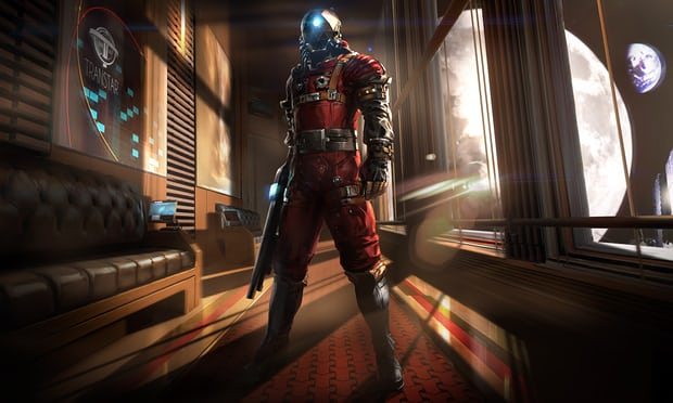
The space suit

“This is the first illustration Fred Augis did for the project, shortly after we had agreed on designs for the player outfit,” says Petit, of this space suit design. “The idea was to nail down part of Prey’s visual identity, at a point where everything was very much in flux. The very first concepts of the suit were done by Colin Fix, inspired by the Dune movie stillsuit, Derek Stenning paintings and vintage space suits.
“He then integrated the Transtar logo which was designed by Zach Haefner, our UI artist. It makes sense to me to have an actual expert in iconography design the company logo. We started from classical examples we could find in Trademarks and Symbols by Yasaburo Kuwayama and worked from here towards something that would feel like a science-fiction company logo.
“Even though everything in the world is fictional, we want the player to believe it’s real.”
guardian.co.uk © Guardian News & Media Limited 2010
Published via the Guardian News Feed plugin for WordPress.